Multi-channel martketplace
Sell More Everywhere
Zibbet exists to help artists, makers and creative entrepreneurs sell more. Now you can list a product once, sell it everywhere and grow your sales faster.
01
Overview
About the Project
Zibbet was traditionally a Handmade Marketplace for creative entrepreneurs, however they managed to get some investment back in 2018, they hired me to do work on a few different projects with them, I was gonna help them get the first version of the product to market and find a market fit, run a discovery session and look at the market for competitors and find out a good direction for the company to go towards. My role here was UX research, UX design, Design System development, UI design and a good old traditional front-end development in Bootstrap 4 and Ember JS.

02
Research
Finding Our Marketfit
Since we were starting from scratch I wanted to see the competitor landscape and see what everybody else was doing and find what Zibbet could do to stand out in this saturated market market, so I ran a thorough competitive analysis and looked for where other companies were strong in and what they were lacking, find out where Zibbet could standout as a product.

03
Objectives
The Challenge
Zibbet Marketplace was not doing so hot, but we had a really loyal customer base, thousands of people, and we wanted to merge Zibbet Marketplace with a few other marketplaces like eBay, Amazon Handmade, A.C. Moore Marketplace (which we were developing for them), Etsy and more. The idea was that you can post and manage items all in one place, however this is a hard thing to do when you have to deal with things like, how different marketplaces treat different data different. For example a user might want to sell an item in 2 different Marketplaces, but the fees at Amazon are higher than eBay, so do they sell the same thing in 2 different marketplaces at different price points and different descriptions but manage them from one place, what becomes the source of truth? and so many other things to consider, therefore we had a lot of product thinking and testing to do in this discovery session.

04
Research
Background
We did as much preliminary research as we could and it was time to do our best to get the product out to our users as fast as we could so we could learn from it. We started by whiteboarding ideas and straight away getting into product design.

05
Product Development
The Product
You might be wondering about all the different items like user personas, stories, vision and more, where did the all go? Well we had an idea of who our users where, 90% women between 27 and 59, but that’s all we had to go with, we didn’t have the time or the budget to run interviews or do testing. We ran a couple Facebook sessions to see what users wanted and to see if it matches what we wanted to deliver to them and that’s it. From here however I’m gonna go through every single stage thoroughly, so bear with me.

06
Product Development
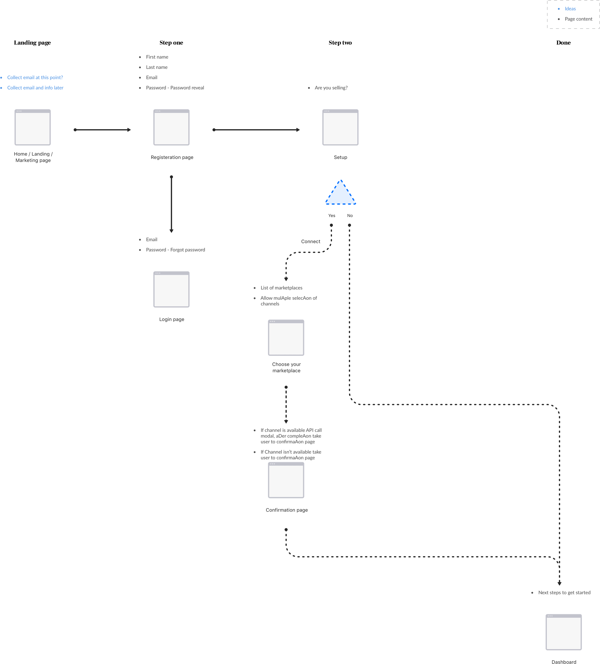
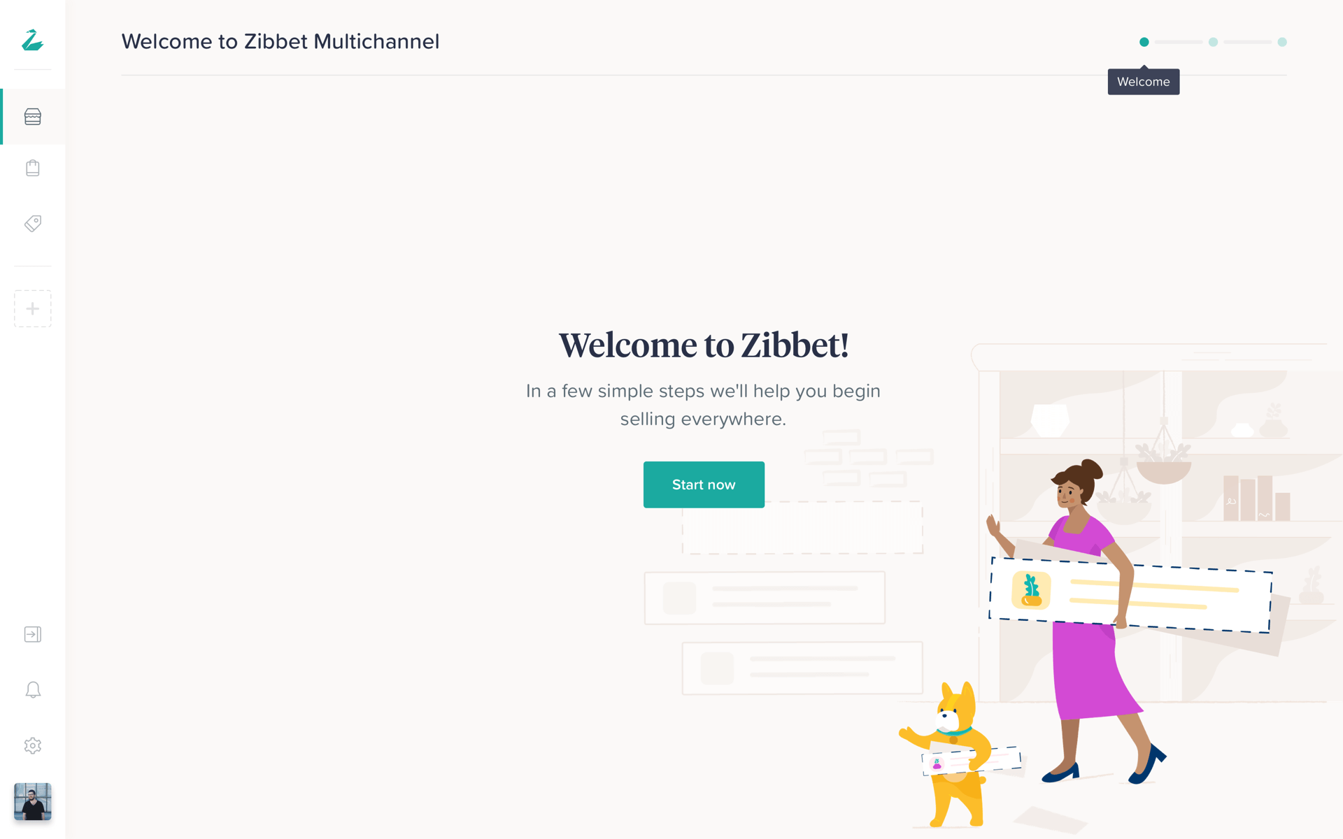
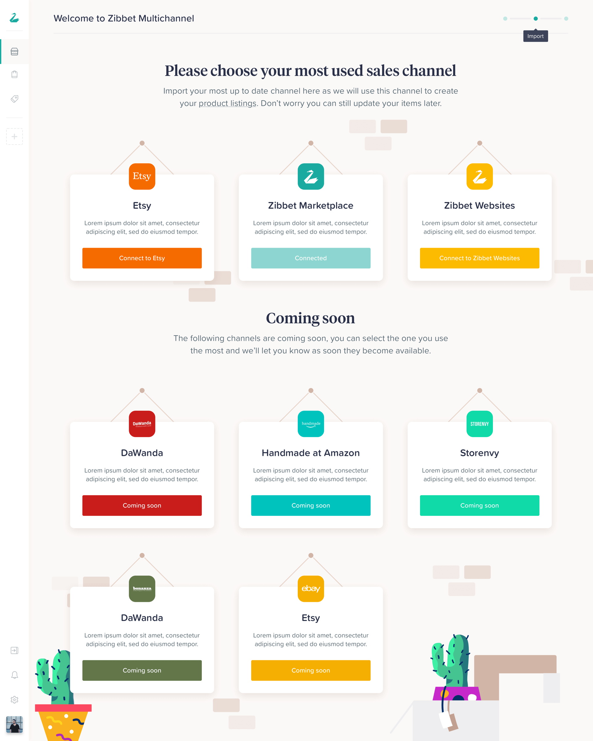
Initial Obnoarding Flow
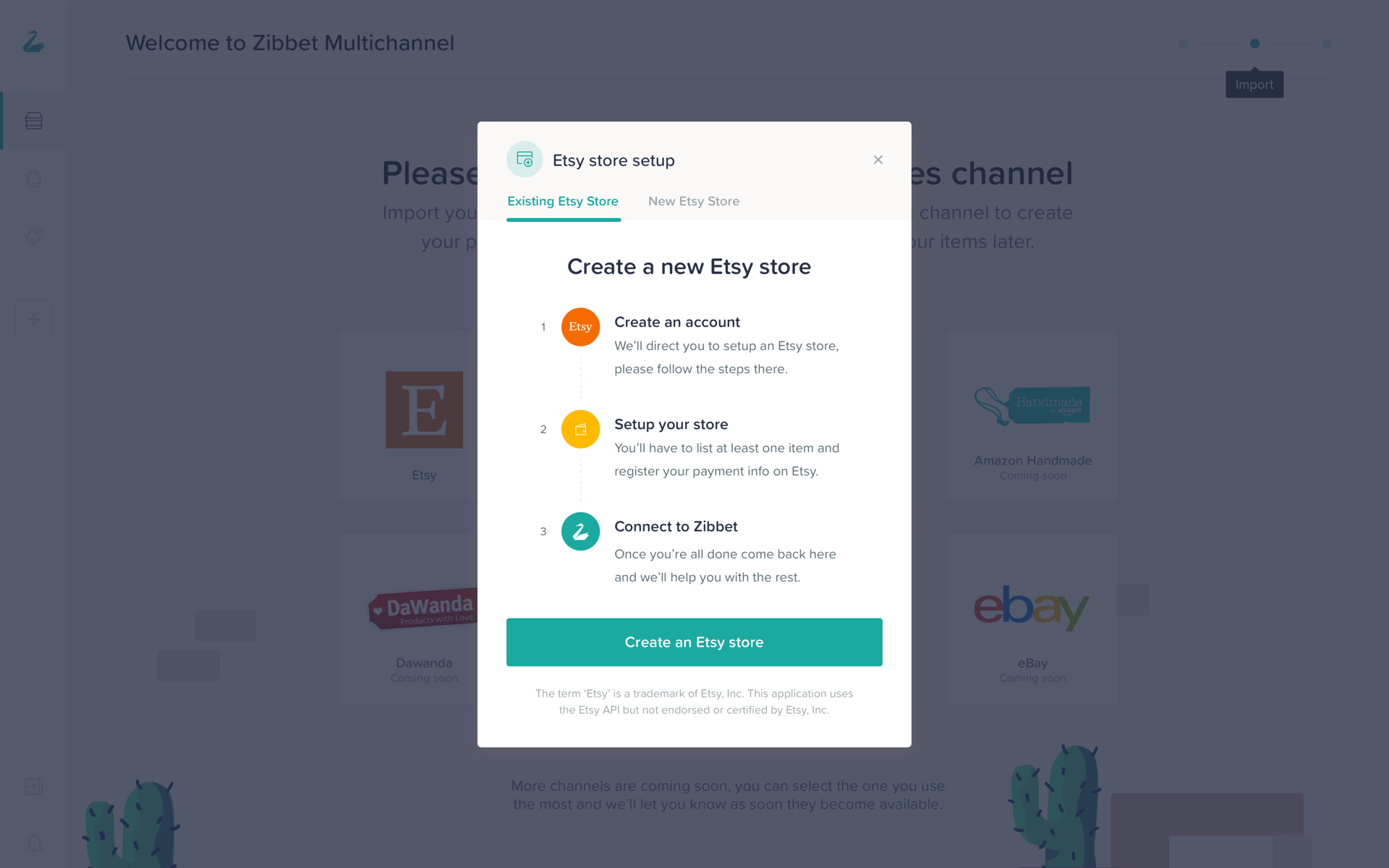
How do we get our users who have no idea what inventory management is onboarded onto the platform and teach them about the multichannel concept? How do we generate leads? Well this flow will walk you towards that.
07
Product Development
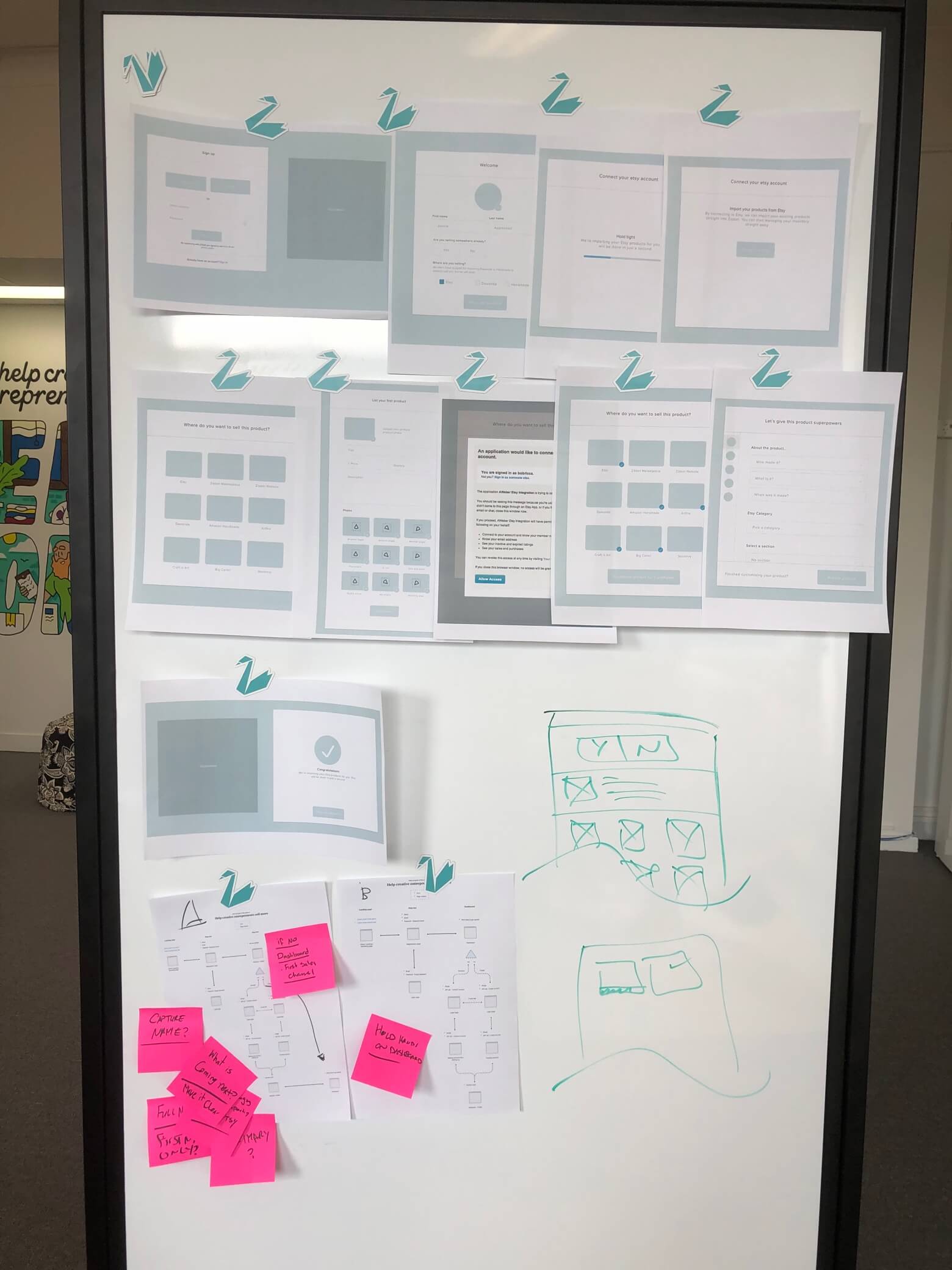
Onboarding Whiteboard Session
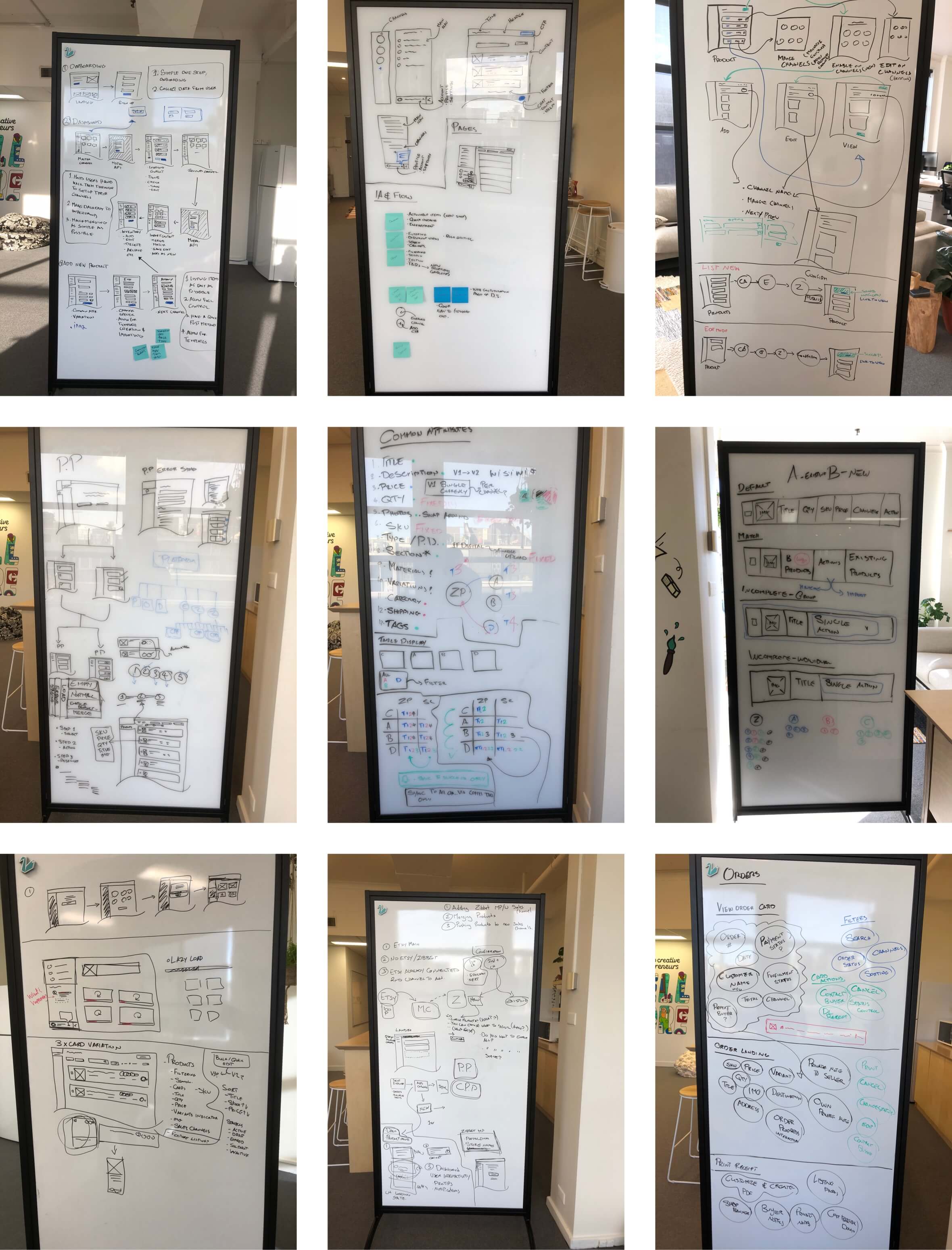
The flow of our work was for the design team to work with the product managers to come up with the base, ideal situation and we discussed the session in our group and agreed on things that did make sense for the product and business and discussed the things that required changing.
08
Product Development
Ongoing Product Development
As I mentioned before, this is one of the most complex products I’ve ever worked on, so we ran a lot of workshop sessions figuring out what was possible and what wasn’t. How can we merge and sync every item, how do users import their existing inventories from different channels? How do we support merging them? How do we manage adding and editing new products? What if they want different information on different channels? How do we handle different currencies and so many other hows and these sessions always helped us to get closer to some sort of hypothesis that made sense and we would build these and quickly test them with a small number of users.
09
Wireframing
Wireframing
We wanted to develop a design system, so we decided to create the entire UI in wireframes to get a good idea of how many different components we need and build a modular system so we could develop and move faster. There were literally hundreds of scenarios we needed to take into account and hundreds of states to make.
10
Design system
Style Guides
We wanted to stay true to the classic Zibbet look but add a bit of feminine flair to it, the result is what you see below.

11
Design system
Typography
We wanted the typography to represent a fun but professional brand and we chose to mix our serif and sans-serif together.

12
Design system
Color Palette
We had a few different sections to our product, our Marketing site and the dashboard. We wanted each of them to fulfill a different task. Our Marketing site had to look fun and engaging and dashboard had to be usable for a long period of time and the following palettes were produced.

13
Design System
Component Library
As mentioned before we wanted our design system to rely on a nice modular component based system and we created the following to achieve exactly that. Everything was made 1-1 to our code base, this made it easy for us to very quickly put the front-end of our product together.
14
Ui Design
Outcome
The outcome was our complex but yet beautiful and useful dashboard and our super engaging marketing site.

15
UI Design
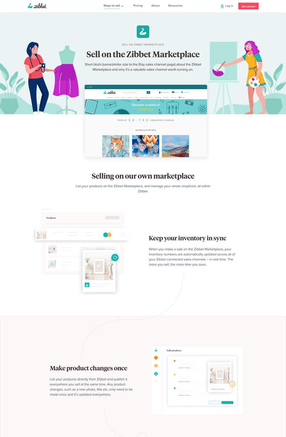
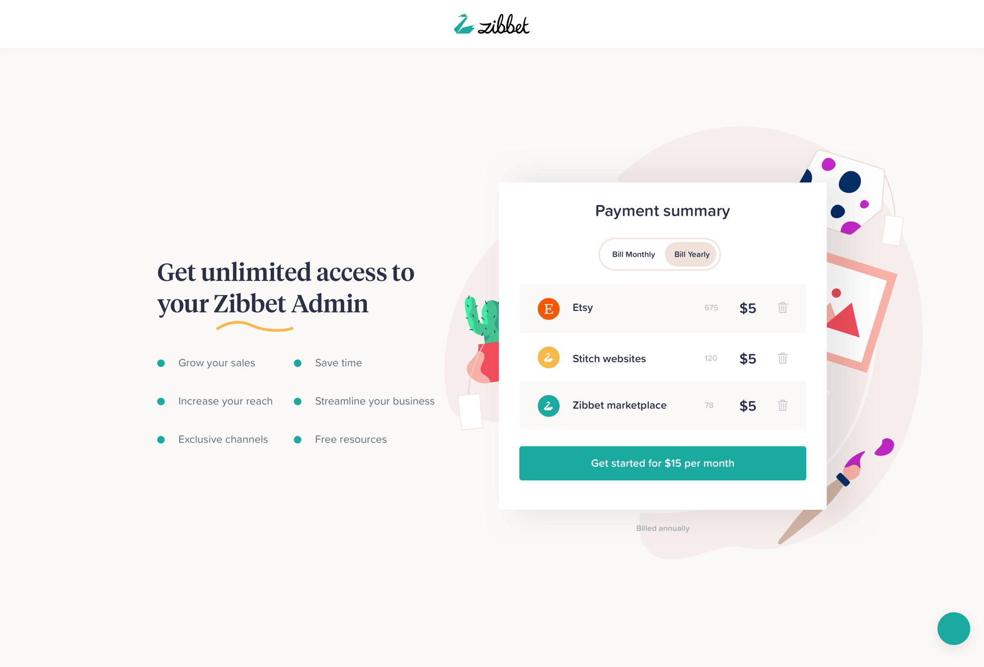
Marketing Site
As mentioned before the idea of the Marketing site was to inform people of what Zibbet is and excite them about the product, it was also used a funnel to make the sale and it also linked to our educational elements of the site.
16
UI Design
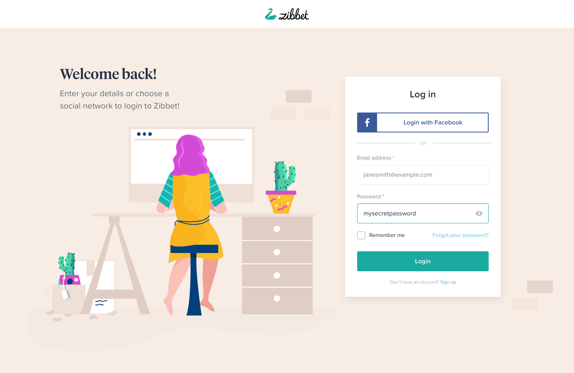
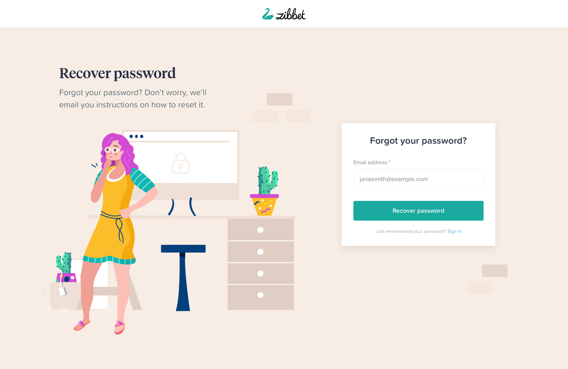
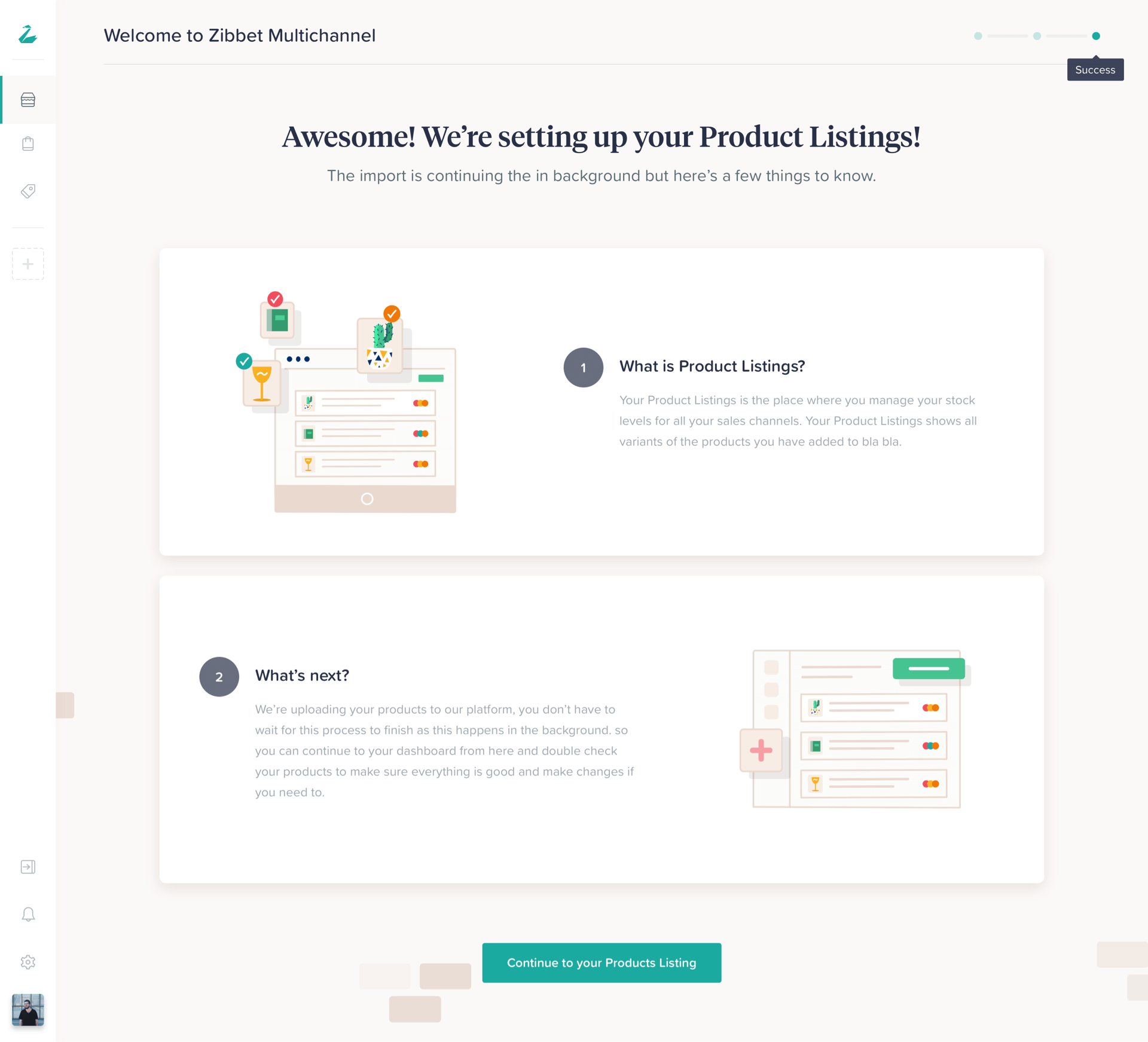
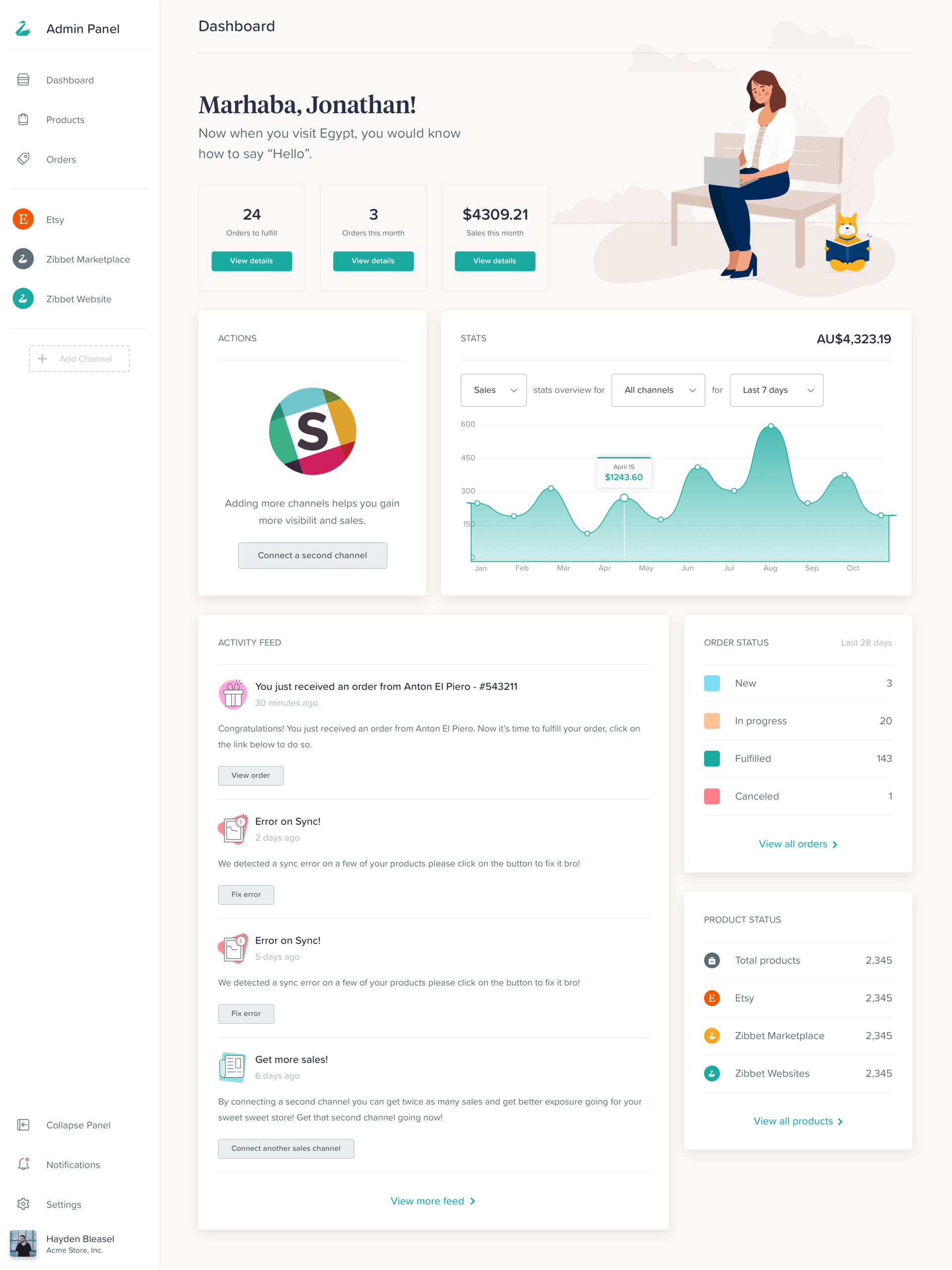
Dashboard Onboarding
The first part of this is the onboarding flow, our mission was to onboard users and ease them into the dashboard as smoothly as possible.
17
UI Design
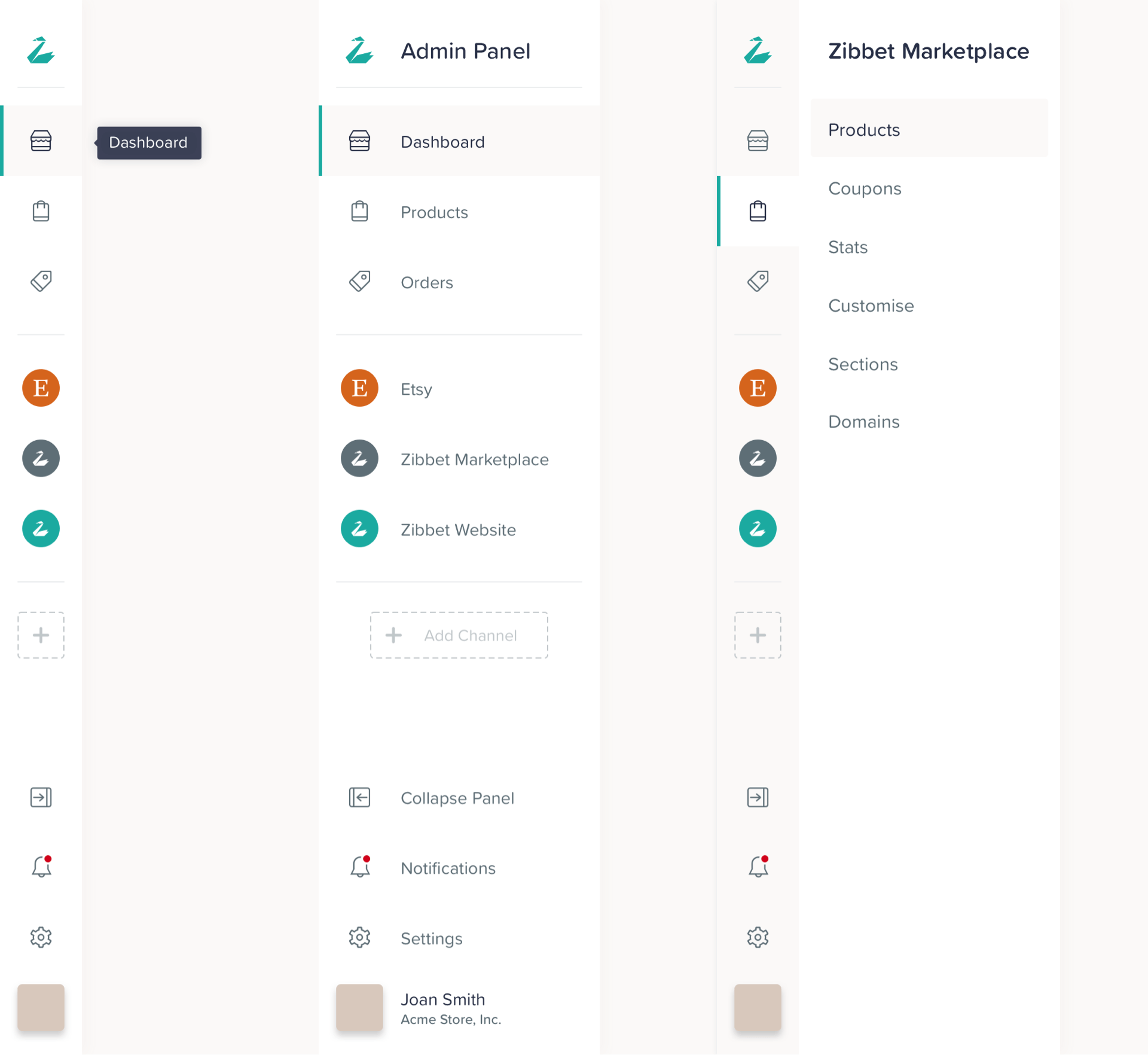
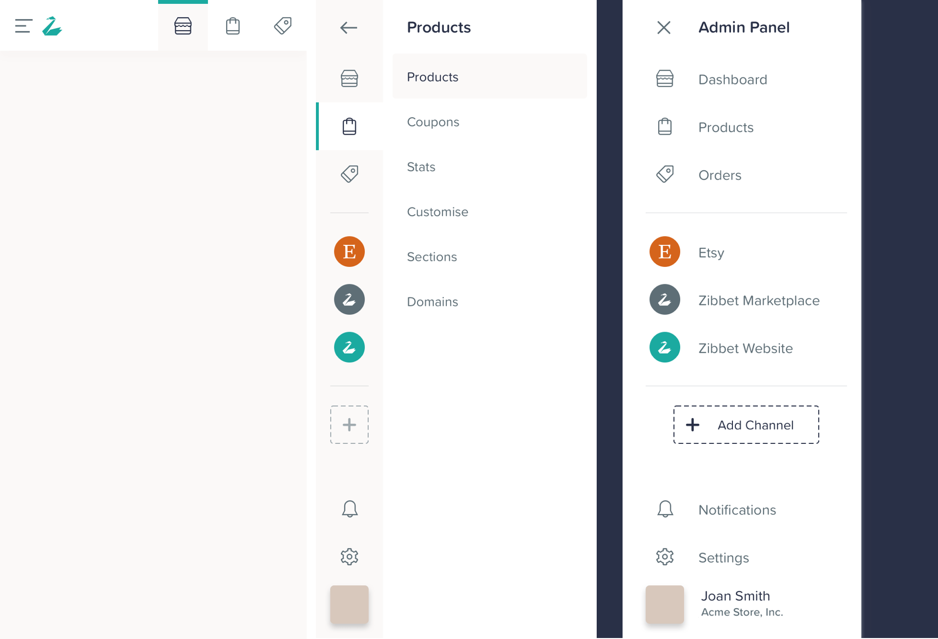
Navigation
We designed everything with scalability and mobile in mind, one the most challenging elements however was the navigation.
18
UI Design
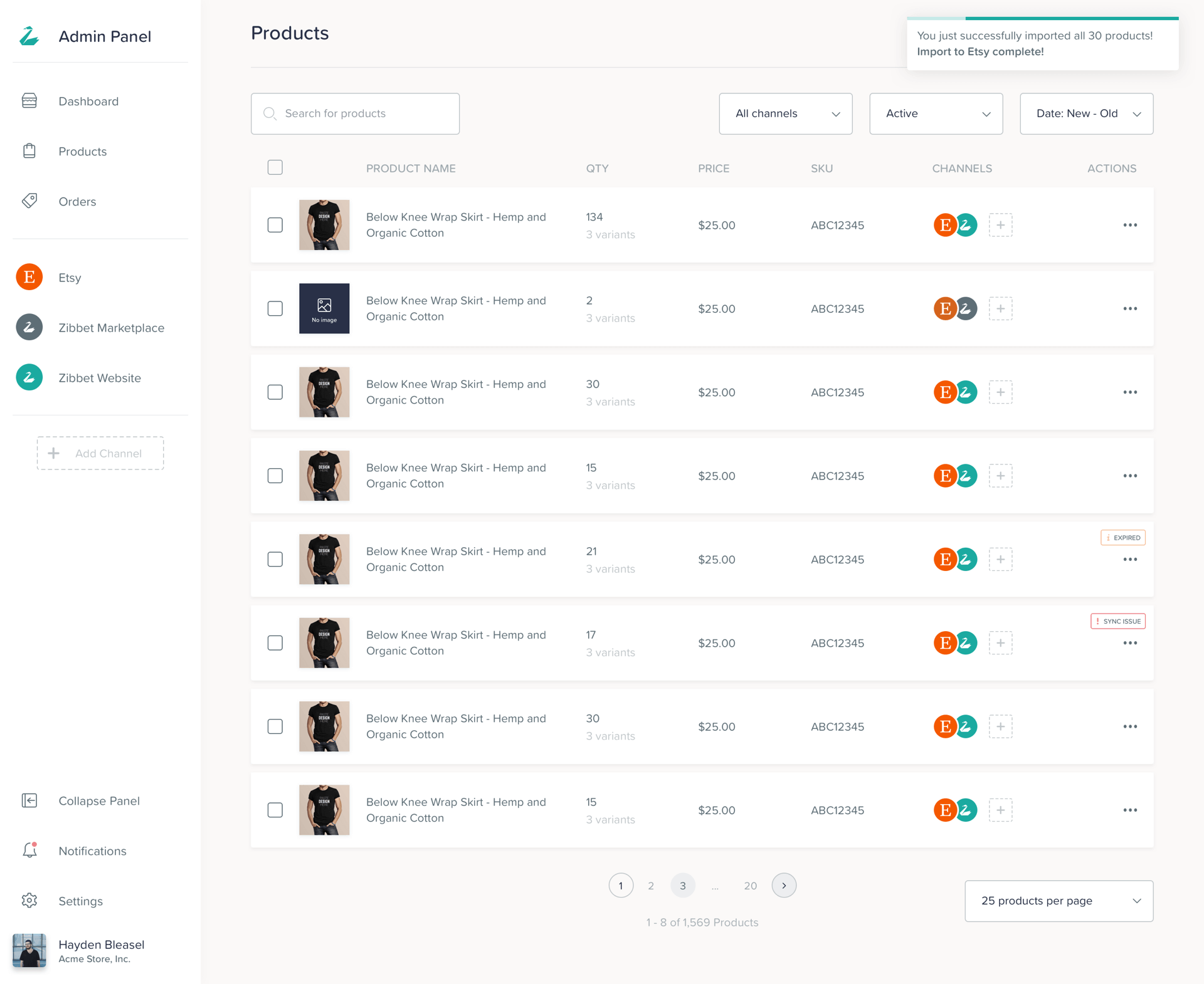
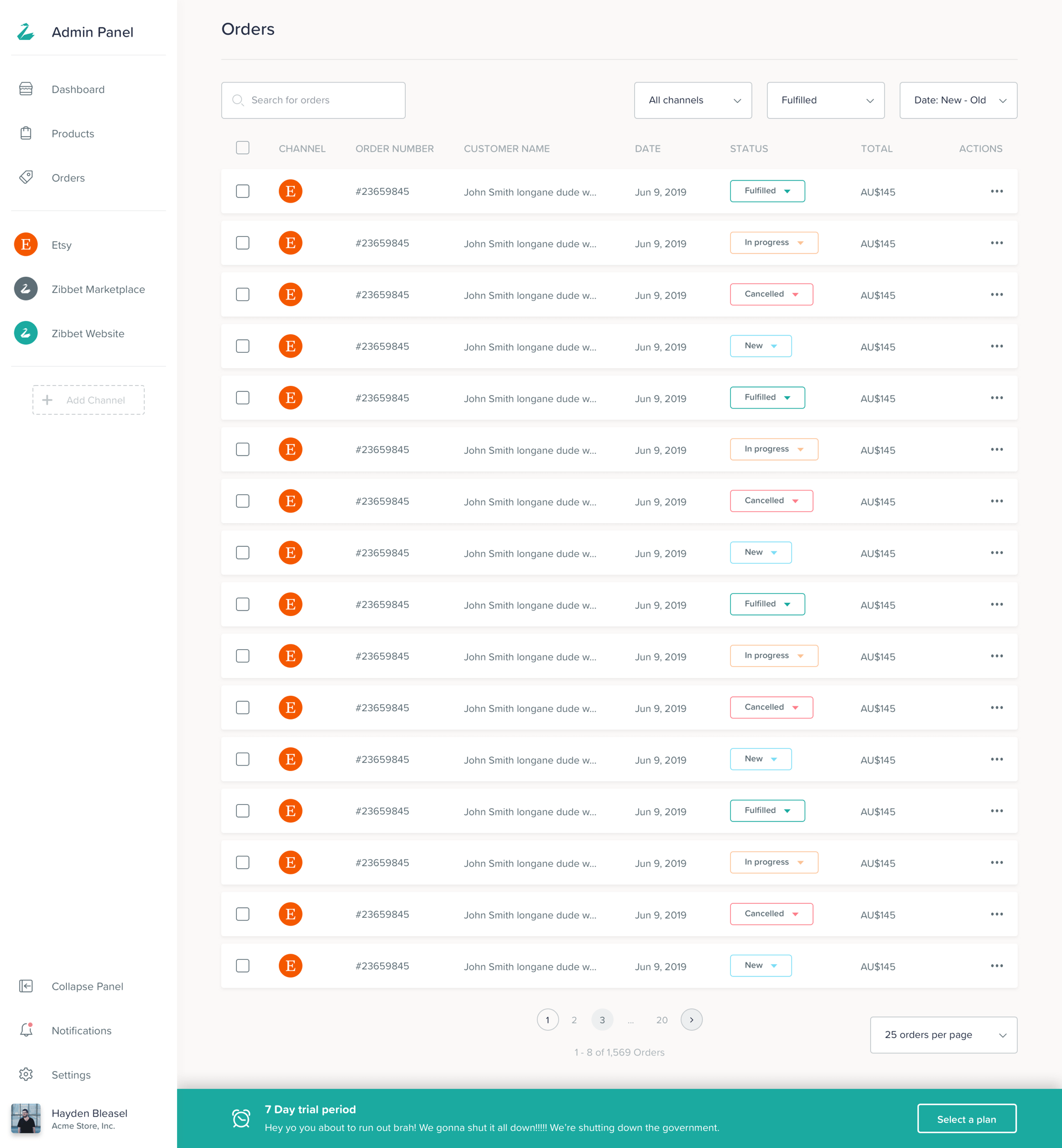
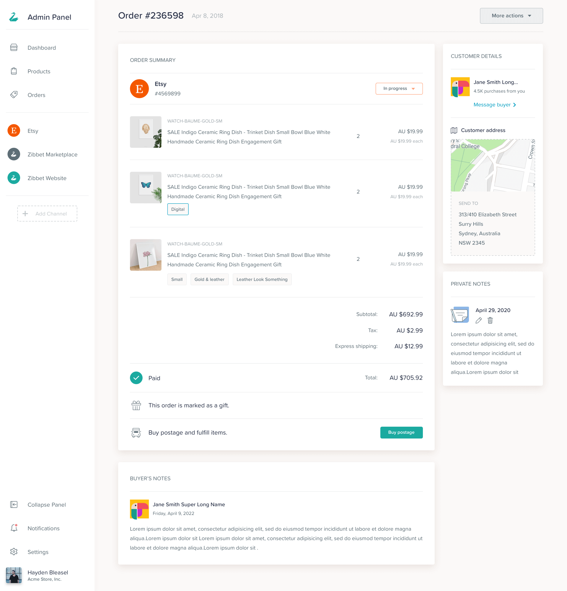
System Elements
This is the most complex part of this project, this is where users engage with the most and get their daily tasks done.
19
UI Design
Small Details
Small details matter, that’s why we spent time on small delights like interactions, animations, loading states and personalisations.
20
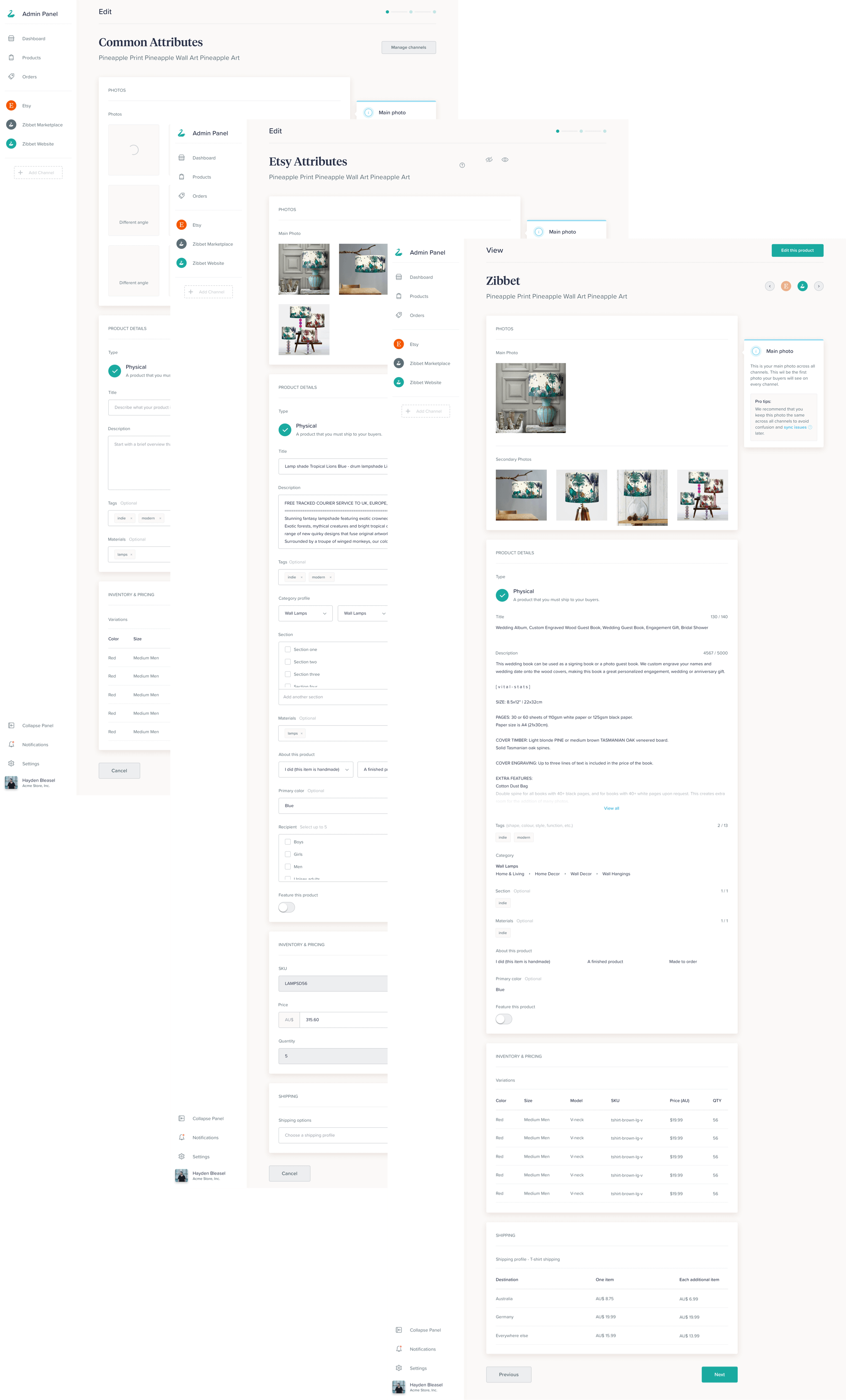
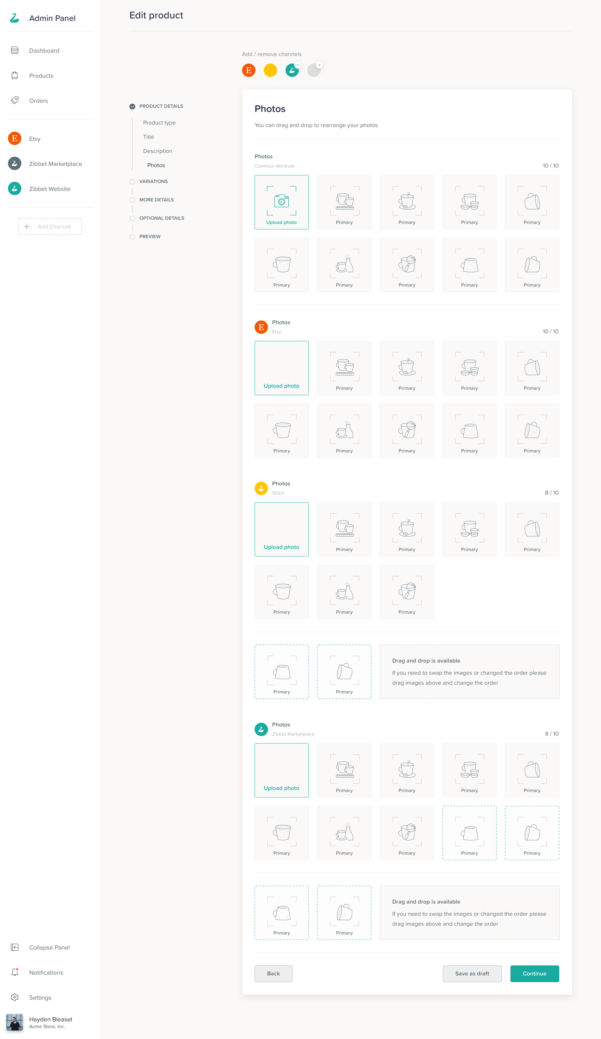
UI Design
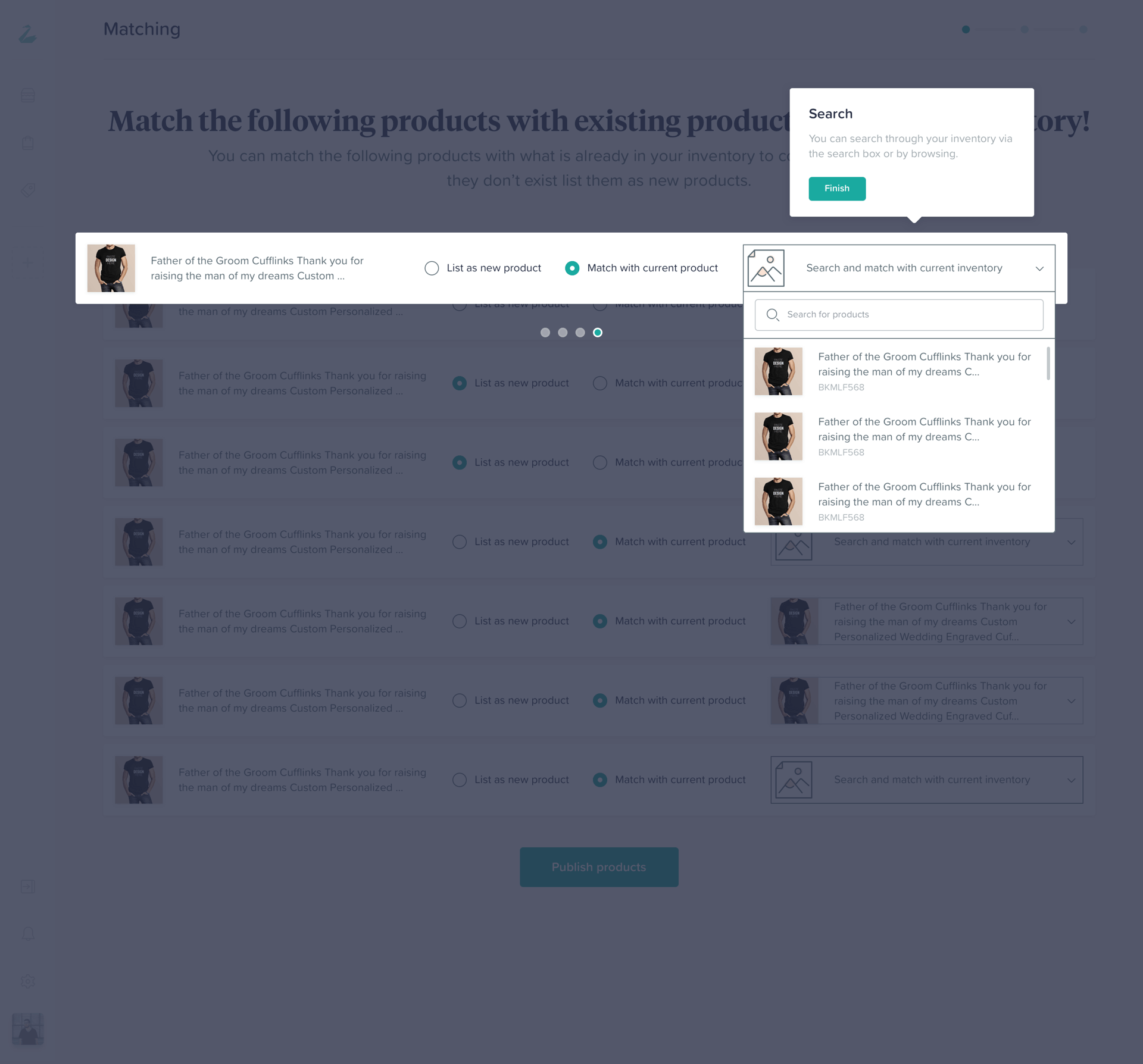
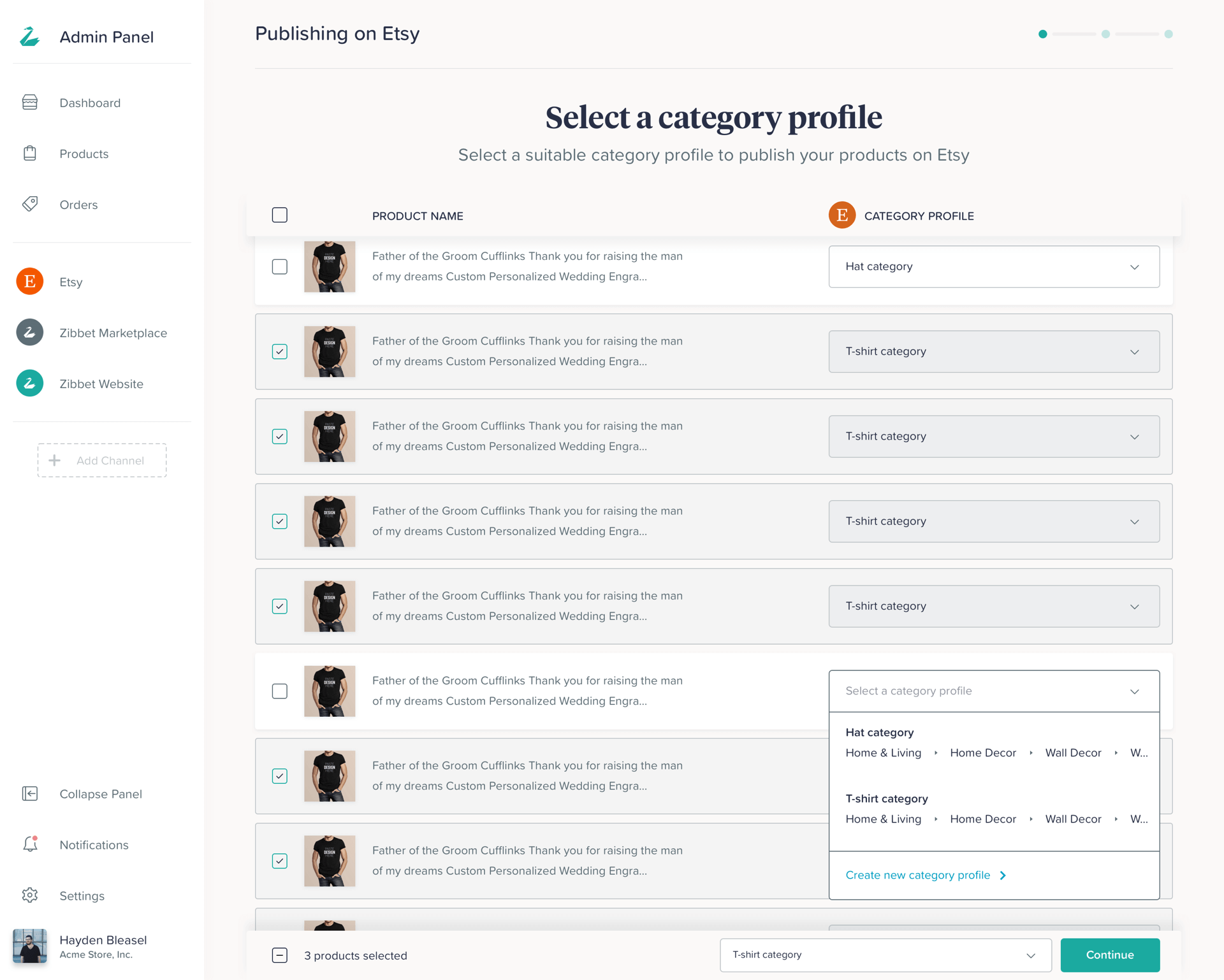
Our old ways
One of the biggest discoveries and changes that we made based on our learning and customer feedback was to change and reverse engineer the way people were listing or editing their items from our app. Below is the traditional way of us solving this issue, we would place the user in a linear flow and allow them to have a bunch of common attributes and then every unique thing about every channel is taken care of step by step.
21
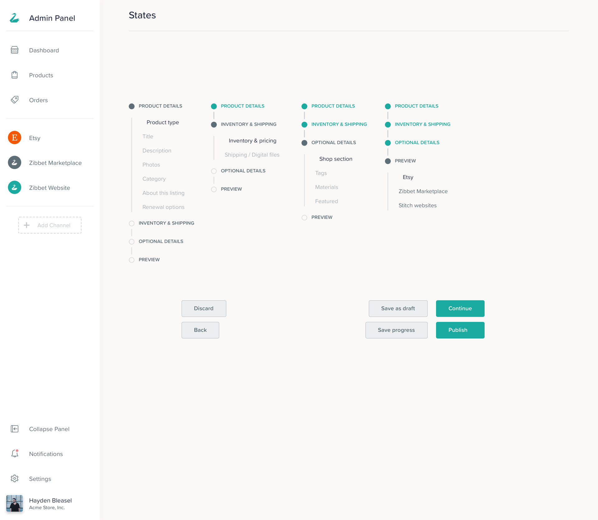
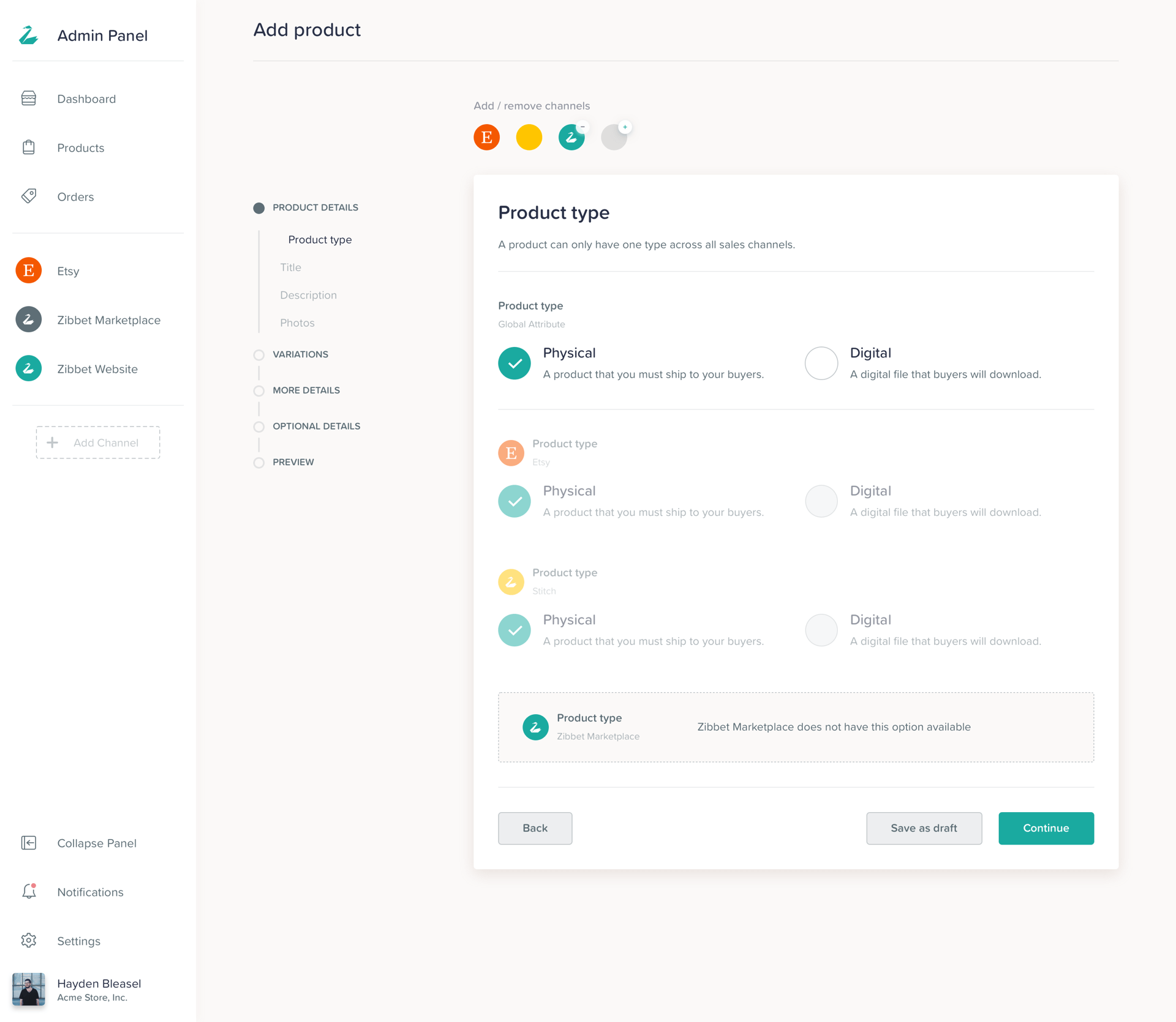
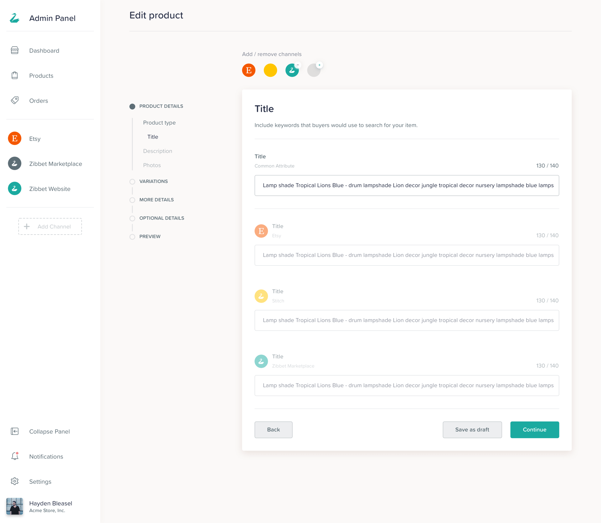
UI Design
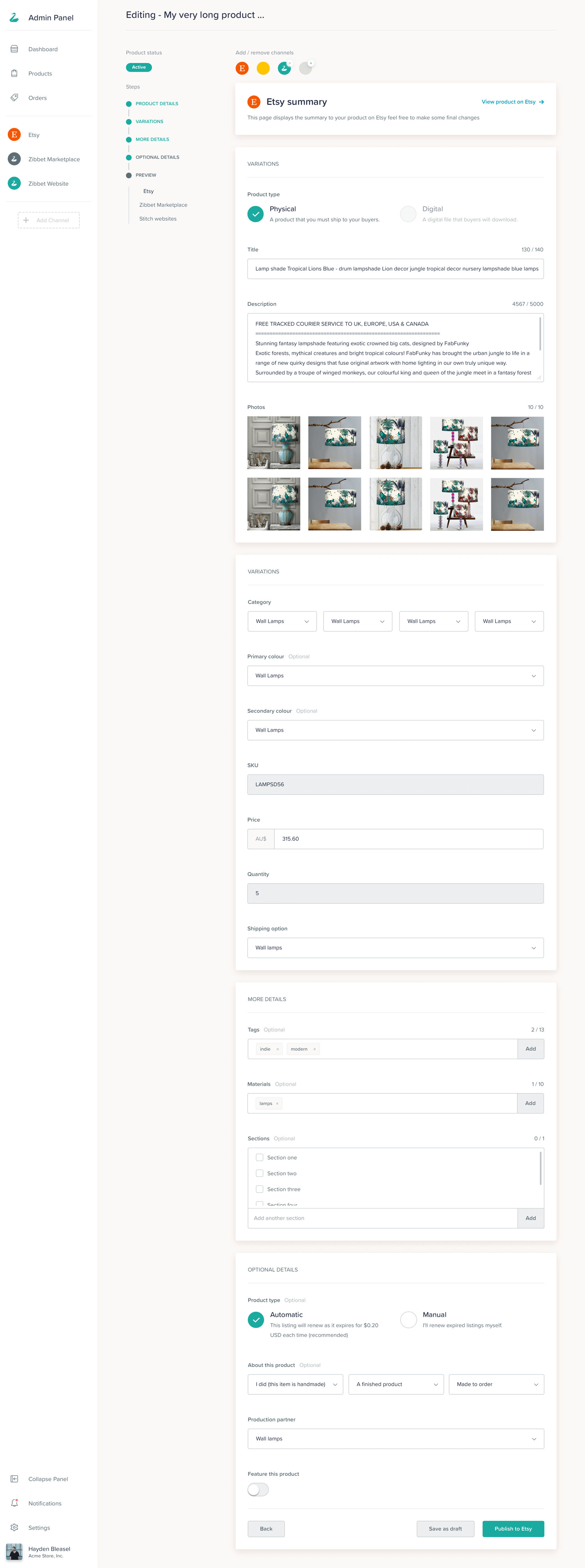
Learnings and Changes
We reverse engineered this entire flow by combining every chanel step into a single page, this allowed the user to choose their own journey and once they get used to the process they can then jump into different sections, this allowed us to deliver a quicker and less confusing flow to users and they were happy.
22
The End
Up Next
Wow! Time really does fly when you’re having fun. I’m afraid this case study is just about over. But I’ve prepared a few more for you so there’s no need to panic (yet).