E-Commerce
Quality Furniture
Koala makes furniture for the digital age. They are a young company combining two of the best inventions in the last 100 years... furniture, and the internet. This lets them replace awful industry practices, like overpricing and showrooms, with a complete experience, from high-tech design through to instant delivery.
01
Overview
About the Project
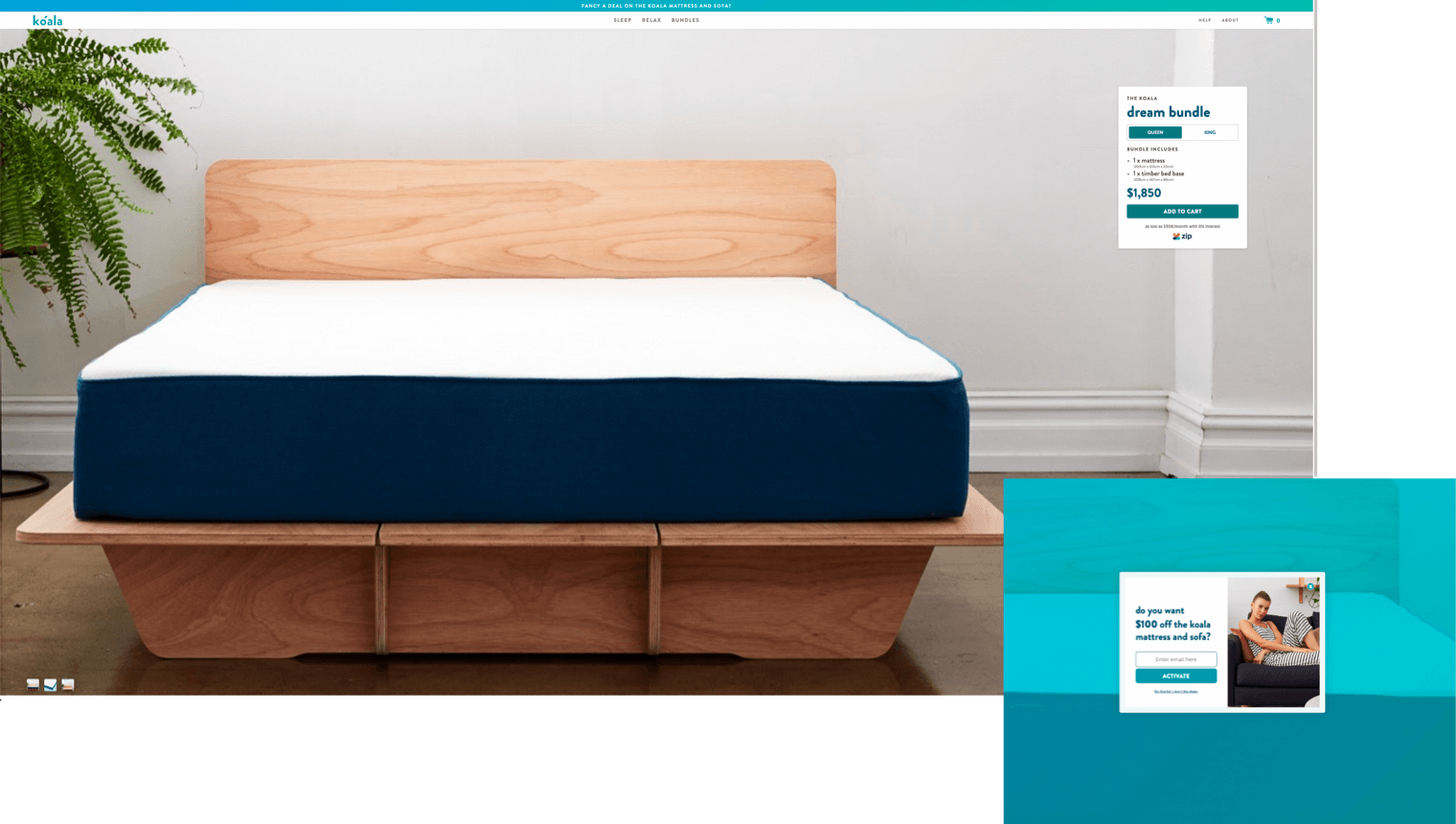
Koala has a great experience design surrounding their brand. The current “Dream Bundle” bundle page is lacking a captivating experience. It doesn't give any info on the products and fails in educating the user.
They currently don't offer a native discount to the dream bundle, but would like to offer the user $100 off the bundle for their email address.
They also want to give the user the option of selecting what color bed base they would like in this bundle (white or timber), so this will need to be worked into the solution.

02
Objectives
Identifying the Problem
Currently the moment a user lands on this page, (this flow is straight from the email link or entering the URL directly into their browser) the initial thought on this page is that what the heck is this page? There’s no clear heading, no clear breadcrumbs or anything. It also lacks a bit of inspiration. Quality of the image isn’t great cause we’re going full width with this.
Then as the user is browsing the page they are faced with this popup that is annoying, takes user out of their journey and distracts them and it feels very ad driven. When the user tries to close it, the interaction is a bit distracting and pulls me away from the initial purpose of the page and grabs my focus towards the navigation area.
However after looking around the page trying to make sense of it, a widget is found on the right side of the screen. It’s far to the right on a big monitor like mine, I didn’t notice the CTA or What I'm supposed to do with it. The ZIP Money button grabbed my attention a lot cause of it’s colour difference and I clicked on it, instead of getting a modal, or opening content in a new tab it just took me away from my current flow. The widget itself does not feel vert interactive for example, changing the product type doesn’t change the image, I can’t even change the colour of the base. I don’t have all the photos I need to help me make a decision here?
Later I realised the page is scrollable and all the marketing values that I would get by purchasing this is below the fold. This is also a great place to get users introduced to potentially other products.
03
Research
The Challenge
There are a couple of challenges here, I need to think about how to make the CTA stand out more, how do I show the user what they need and educate them without overwhelming them? Allow the widget to be more interactive so the user can engage with it more? How to get user’s email address for the discount? How to educate the user? How to make the components a little bit more on brand and consistent with the rest of the site? Potentially adding sharing capabilities to this in case they need to share this with the roommate or partner that they’re buying this item with?

04
Research
Competitors
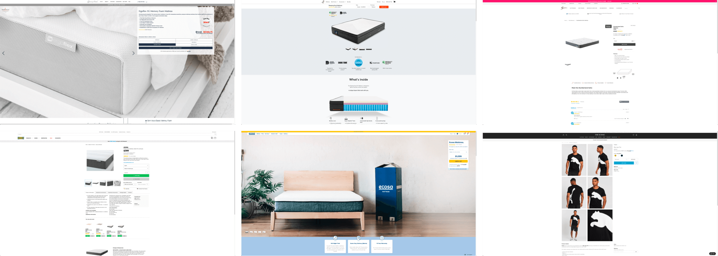
Looking at competitors is always a great place to start to get an understanding of the landscape and to see what they do when they face similar challenges. It also makes sense to look at direct and indirect competitors in order to potentially find different sorts of inspirations or solutions to the problem. It is interesting to see how some straight up copied Koala, some were very inspired by Koala and some were just doing their everyday retail thing.
05
Product Development
User Flow
In order to understand the flow better let’s map it out, to me at the moment there are 3 possible flows to get to this page, via Email, via natural architecture or via a possible Google search. This shows me that since I can just randomly arrive to this page I need a better page hierarchy to understand the purpose of the page better.

06
Product Development
Concepting & Ideation
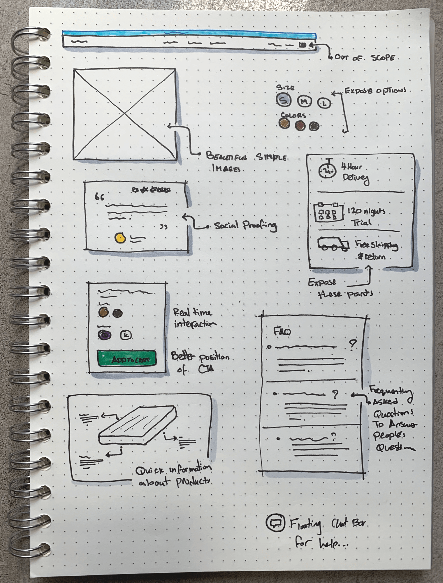
Now that we have a better understanding of the flow let’s concept some ideas, a few bullet points that I’d like to bring to life are, change of a grid system for a more concentrated and controlled experience, I noticed a few different components, let’s componentize those and create a pattern, let’s fix the widget to be a bit more friendly to use and look at with a better focus, let’s make the page a bit more 2019 while staying true to the brand and go from there and let’s fix the hierarchy of the page. I also want to add more social proofing elements to the page as well, bring up the marketing materials a bit further up the fold and provide more information if people need them, I also see an opportunity to add more engaging material underneath with FAQs.
07
Product Development
The Product
With the changes the page looks quite a bit different from the rest of the site, however it still looks on brand to Koala and the idea behind this is to improve the current page and hopefully reapply to the site a bit.

08
Design System
Style Guides
The Koala branding and look and feel is quite on point and on brand, it’s fun, it doesn’t take itself seriously, it’s vibrant and feminin which I believe hits the target audience really well, so we’re not touching this part.

09
Design System
Typography
The typography used on Koala is pretty versatile and looks on point with the brand and it’s tech focus drive, so we’re going to use what they currently have.

10
Design System
Color Palette
For the purpose of this project the colors that come branding seem to be enough and should work well with our design, the only problem here is that branding doesn’t mention any guidelines around the usage of these colors, so we’ll have to make that up as we go.

11
Design System
Components & Grid System
As mentioned before to allow for a more controlled environment everything will be componentized and we’re going to start implementing a 12 Grid, Grid System layout to manage our content and user’s viewpoints better.

12
Ui Design
Outcome
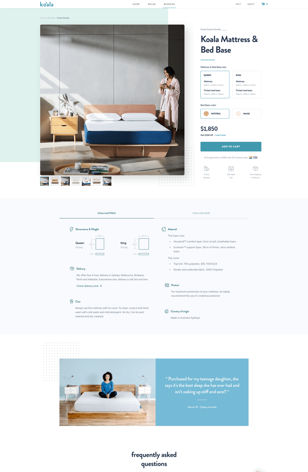
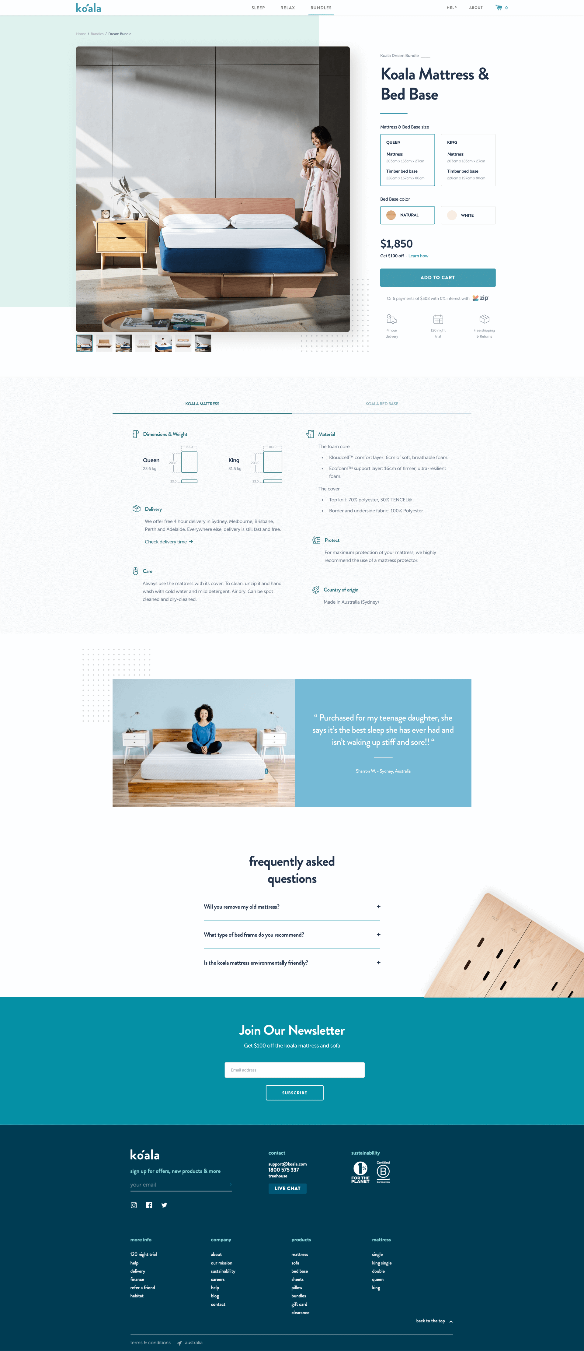
The final result is what you see below, the idea here was to implement what I’ve explained above and also to try to have the important CTAs above the fold as you see here.

13
Ui Design
Landing Page
Getting the final design right was a bit challenging, to access good quality image asset was difficult, the current site had a lot of inconsistencies and therefore it was hard to make decisions on treating components and design patterns, I decided to break the page up a bit and create a big attention to the CTA, make it easier for users to interact with the widget and understand what they need to do in order to purchase the product, at the same time if users scroll down they can find out more about the product or get more social proofing to help them make the right decision for themselves.
14
The End
Up Next
Wow! Time really does fly when you’re having fun. I’m afraid this case study is just about over. But I’ve prepared a few more for you so there’s no need to panic (yet).