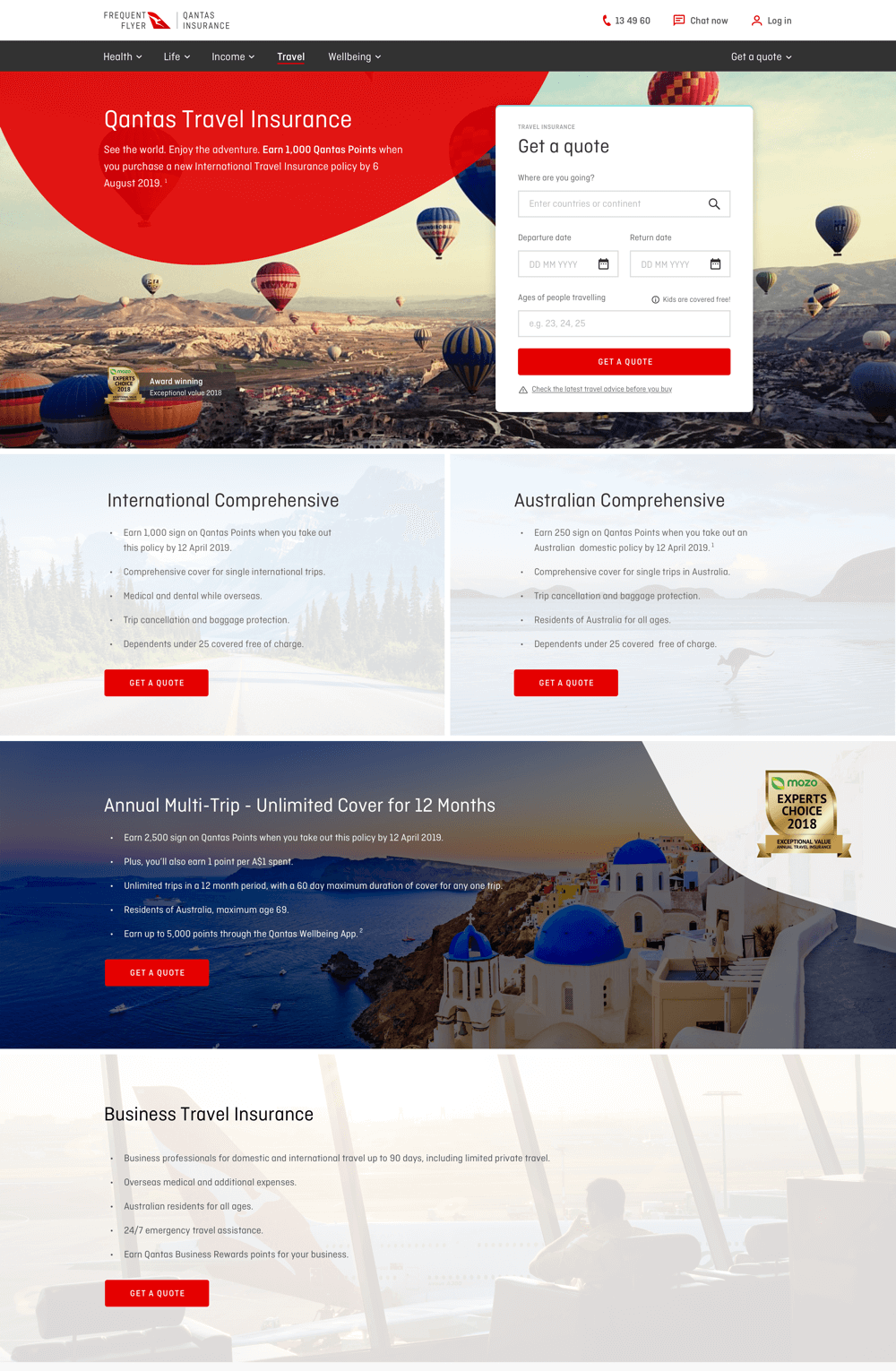
Travel Insurance
Travel Quote Widget
Qantas Insurance is the only health and travel insurance company offering a wellbeing program that rewards you for being active.
01
Overview
About the Project
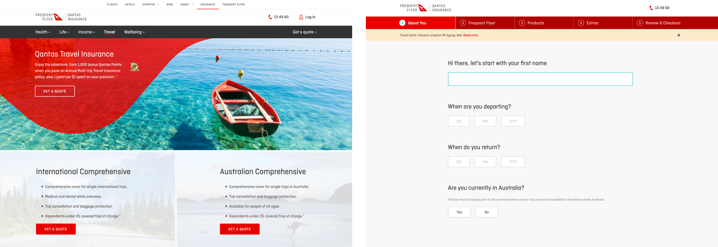
This story is all about optimization, our travel insurance product was seeing a huge drop off from the landing page to the first step, over 80%. We had the hypothesis that if we reduce the input information we ask from customers maybe we could reduce the number of bounce rate. Less friction, better conversion. So we decided to grab everything in the first step of the funnel and place it into this widget on the home page.

02
Objectives
Identifying the Problem
Currently when people land on the travel home page they are presented with this get a quote button, then they click on it and they are taken to the second step which is a page filled with information we don’t even need, and we can also collect a whole bunch of it by being smarter with the UI.
03
Research
The Challenge
We faced a lot of challenges, from inconvenience all the way to legal. For example travel insurance quoting is complex, you can’t insure more than 2 x 70+ year olds, so we currently ask, are you travelling with someone 70+? How many? If the user chooses more than 2 then they can’t purchase an insurance policy, but then later we ask them to insert every traveller’s age into the form, and this was one of our aha moments, we decided to wait for the user’s input and if their input includes more than 1 x 70+ year old traveller then we through out the error. There was a lot of small decisions made this way to make this widget as easy as possible to use.

04
Research
Competitors
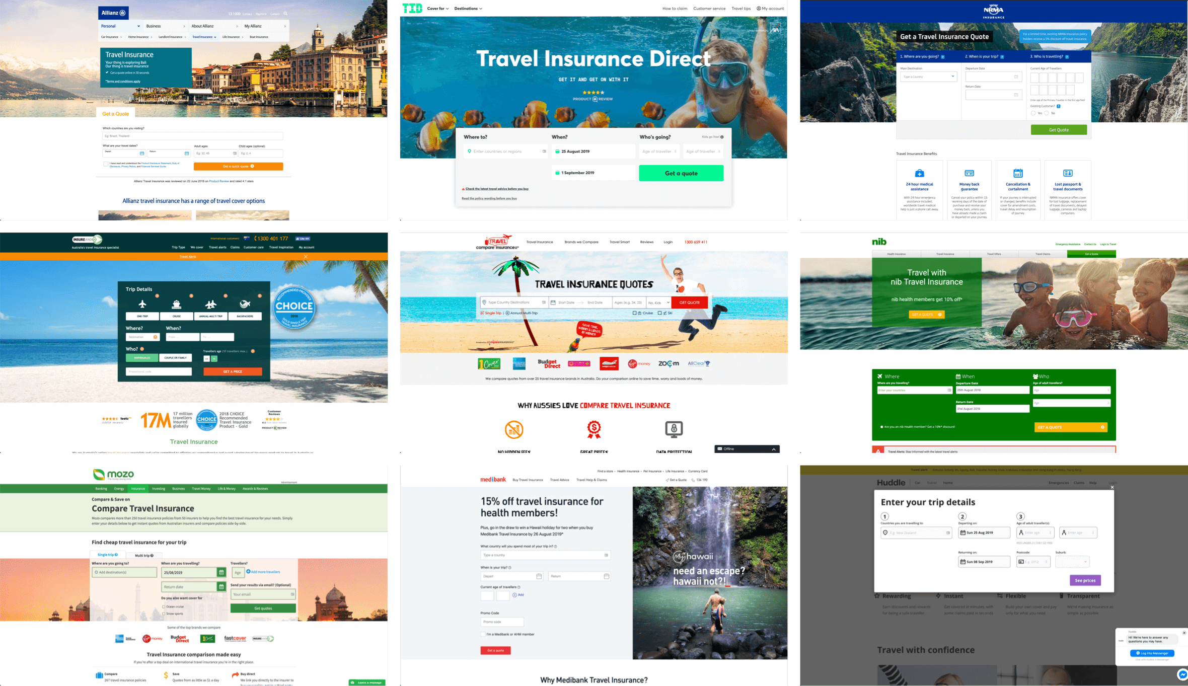
There are a lot of competitors in Travel Insurance, and that is a good thing, that means I could study a whole bunch of them and understand what they do things and how they do them and why they do them in certain ways. Basically every single successful travel insurance company had some sort of a widget to ease the flow for users, get some leads and sell the right product to the user.
05
Product Development
Concepting Ideas
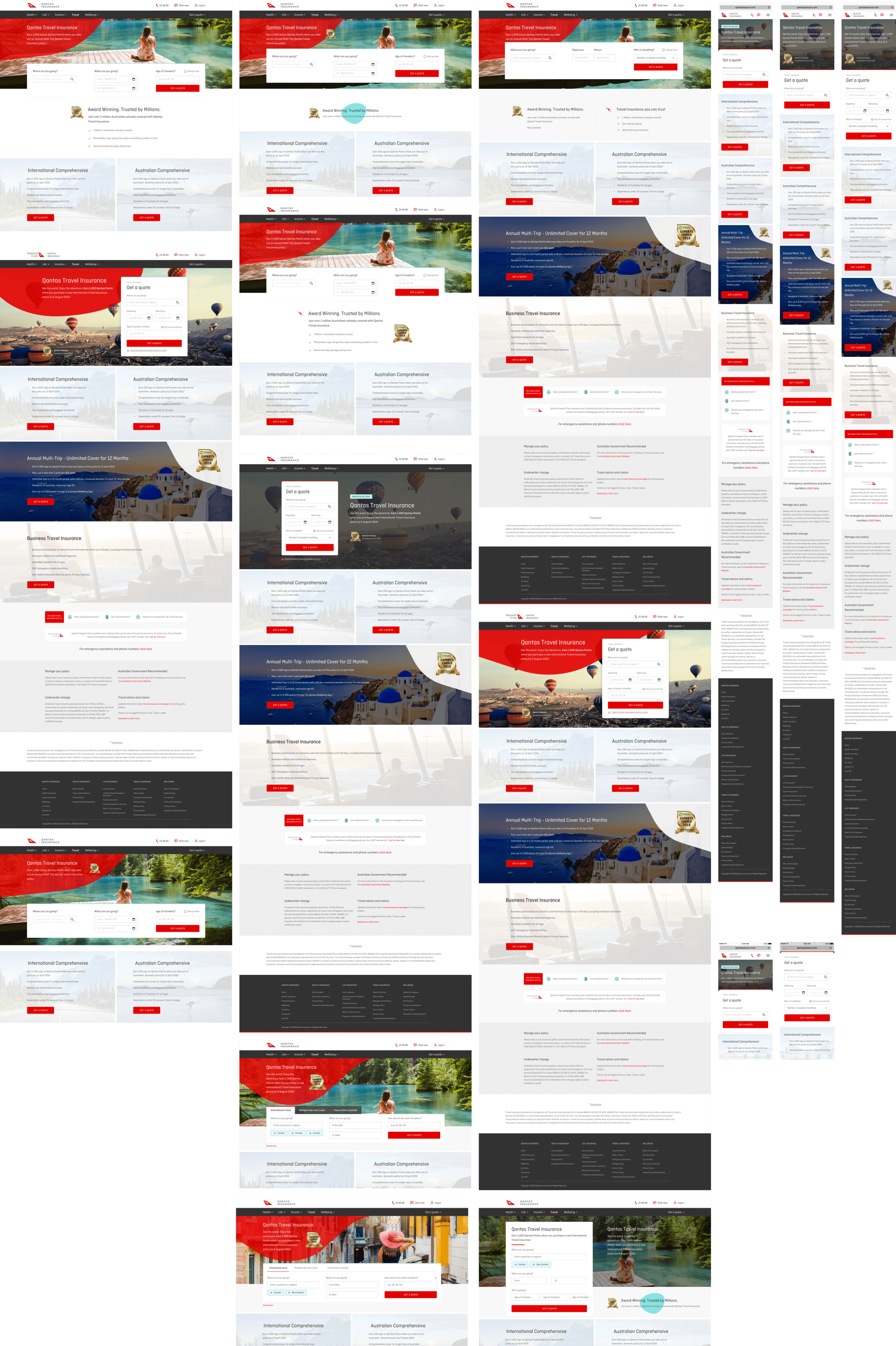
We played around with a whole bunch of concepts and it was tough to create this, we needed a solution that is scalable and on brand with Qantas, but accessible to users, this was a hard thing to achieve in the amount of space we had.
06
Ui Design
Outcome
We decided to go with a vertical solution as it was easier to scale this and add/remove fields from it, it was also a lot easier to scale this into a mobile solution.

07
UI Design
Widget States
As mentioned before the widget was complex to develop, we had to think about so many different scenarios. Below are a few examples of that.

08
UI Design
Desktop Widget
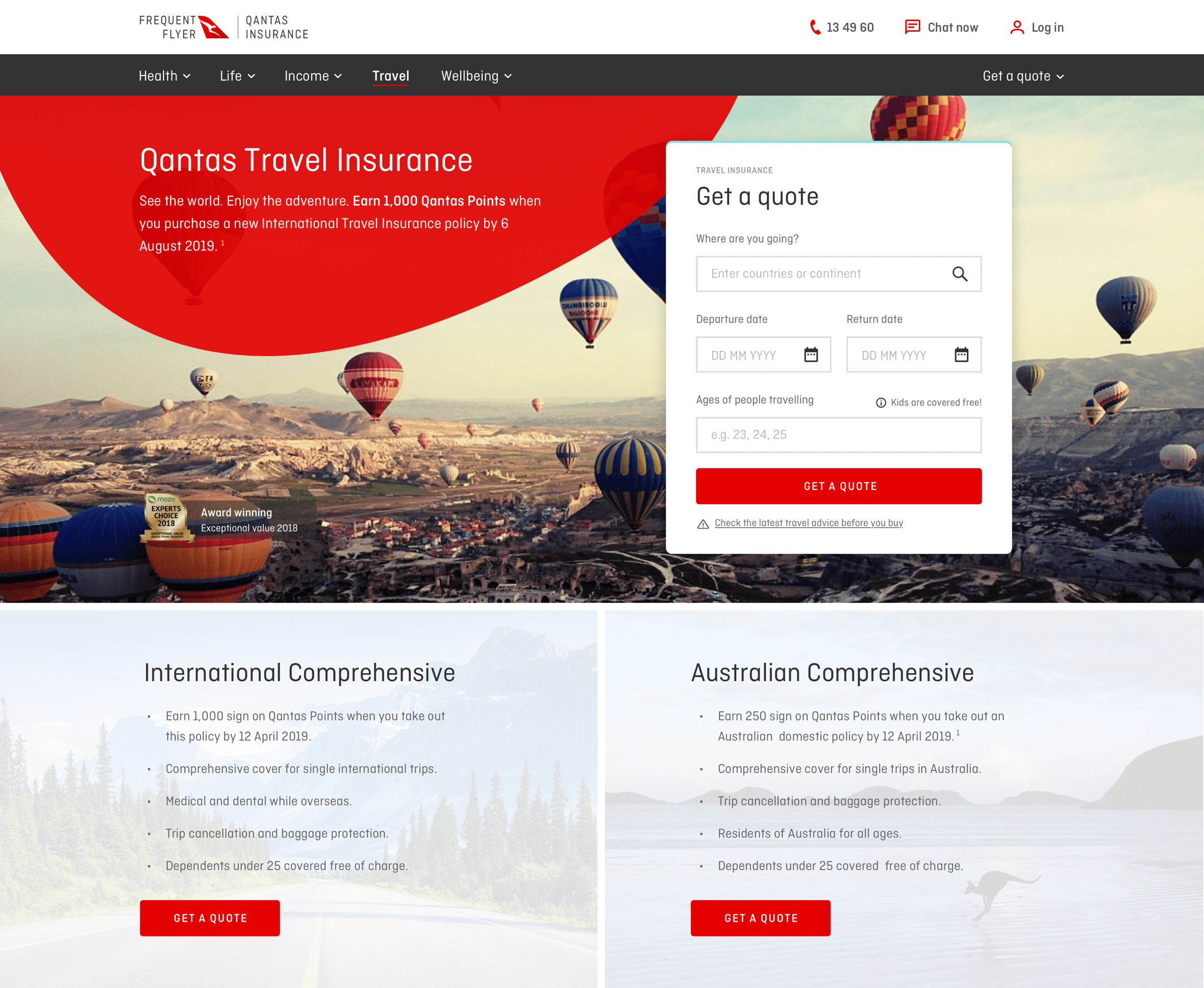
The result for the desktop is what you see below, a scalable Travel widget, we tested this and we got amazing results in return in terms of our early user testing sessions.
09
Ui Design
Mobile App
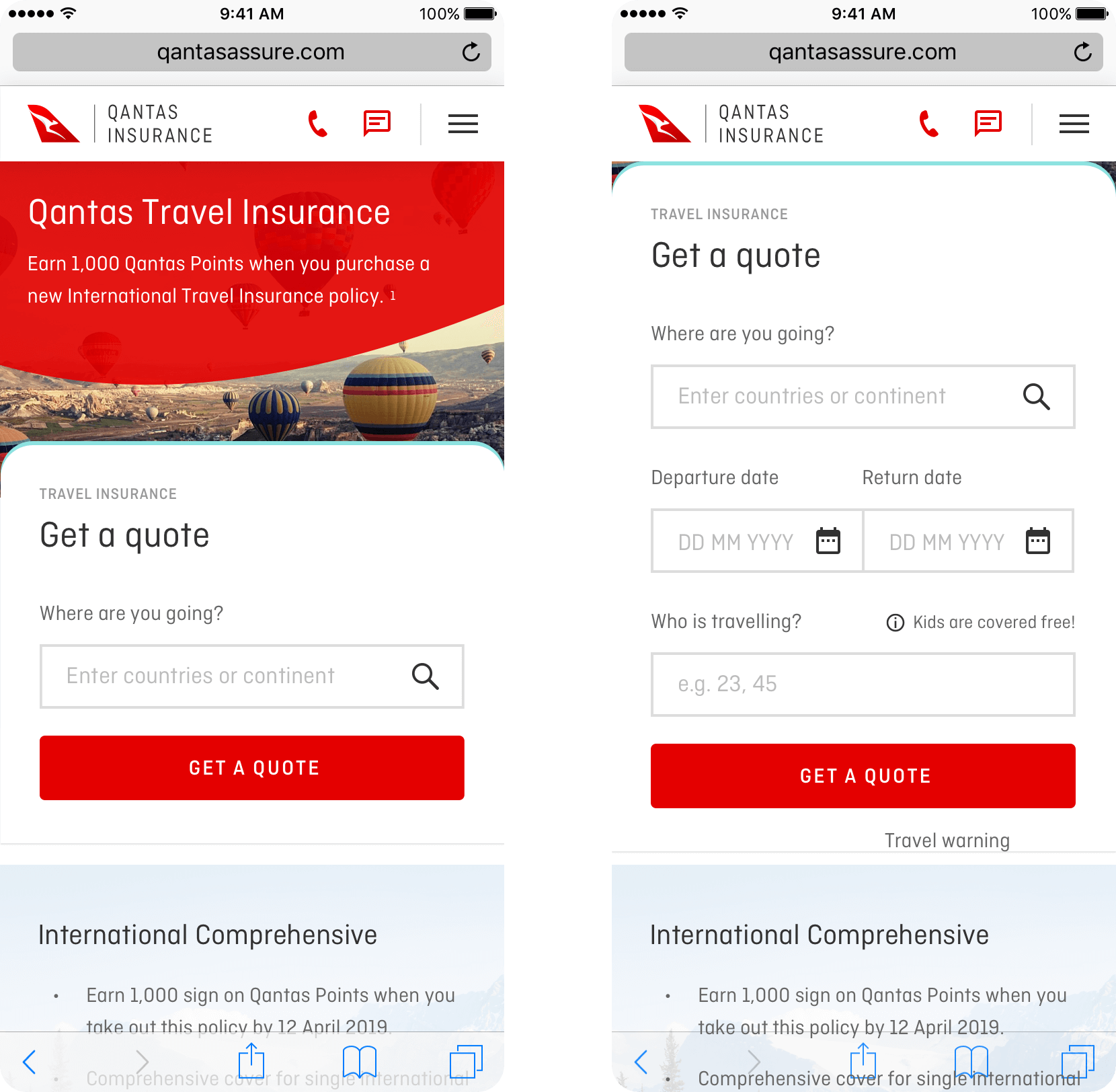
Don’t worry, of course we didn’t forget about Mobile, below is the mobile version of this widget where we did our best to keep the main CTA above the fold for better conversion, but once the user interacts with the widget, it expands itself out.
15
The End
Up Next
Wow! Time really does fly when you’re having fun. I’m afraid this case study is just about over. But I’ve prepared a few more for you so there’s no need to panic (yet).