Music entertainment
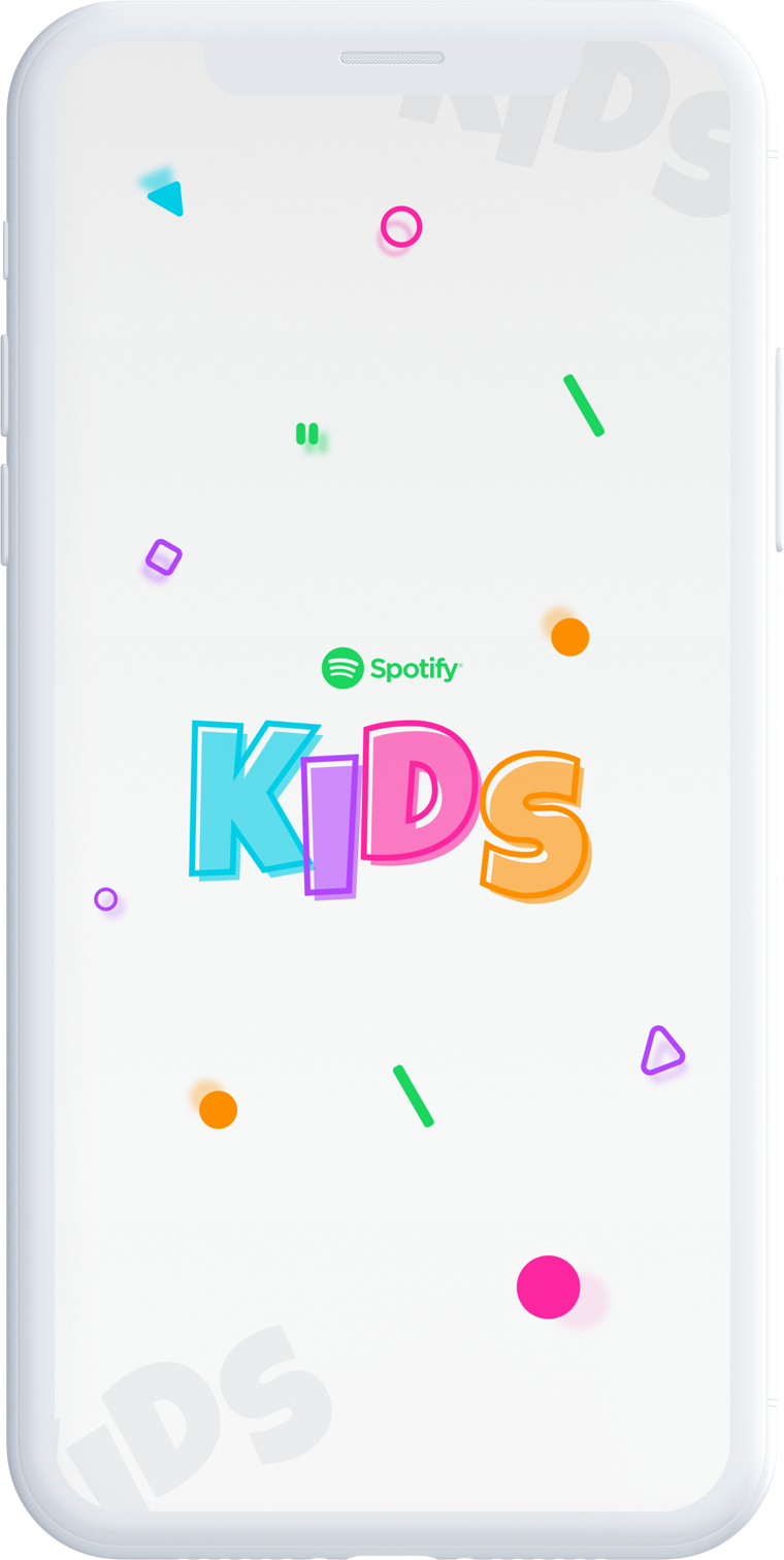
Spotify for Kids App
Spotify has captured a majority of the music streaming market. Their product design is clean, clear, steps back and lets the artists shine. However, Spotify have left one segment out of the mix -- children. This is an iOS App concept to start a conversation around a music experience for kids.
01
Overview
About the Project
The idea of this concept is to create a completely new experience for spotify music player that would enable kids to have fun, dance and goof around. The focus of this initial concept would be around an iPhone X and iOS 12 OS.

02
Objectives
Identifying the Problem
Internal research has shown that kids between the ages of 3 - 6 years old either don’t have any access to Spotify or have to ask their parents to play their favourite music. Artists like The Wiggles , Peppa Pig and Yo Gabba Gabba are all missing out on customer engagement and revenue. It feels like the Spotify experience is aimed at grown-ups chilling out and rocking out; not for kids who like to have fun, dance and goof around.

03
Research
The Challenge
The end goal is to create a beautiful, engaging and easy to use app for kids between 3-6 years old (toddlers), let’s look at a few possible obstacles in the next section to create some user personas to help us shape this product, (of course these are my hypotheses and they need to be tested further with the final product).

04
Research
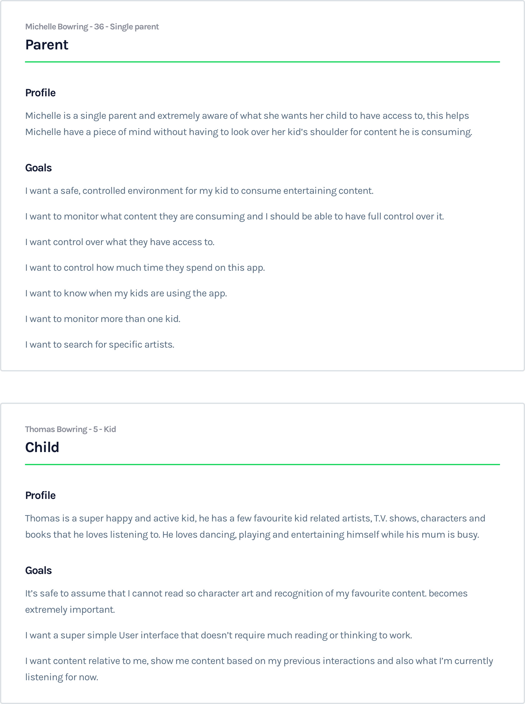
Persona Development
Our main users are parents and kids, parents will be providing the platform for their kid and the kid will be consuming the content.
05
Research
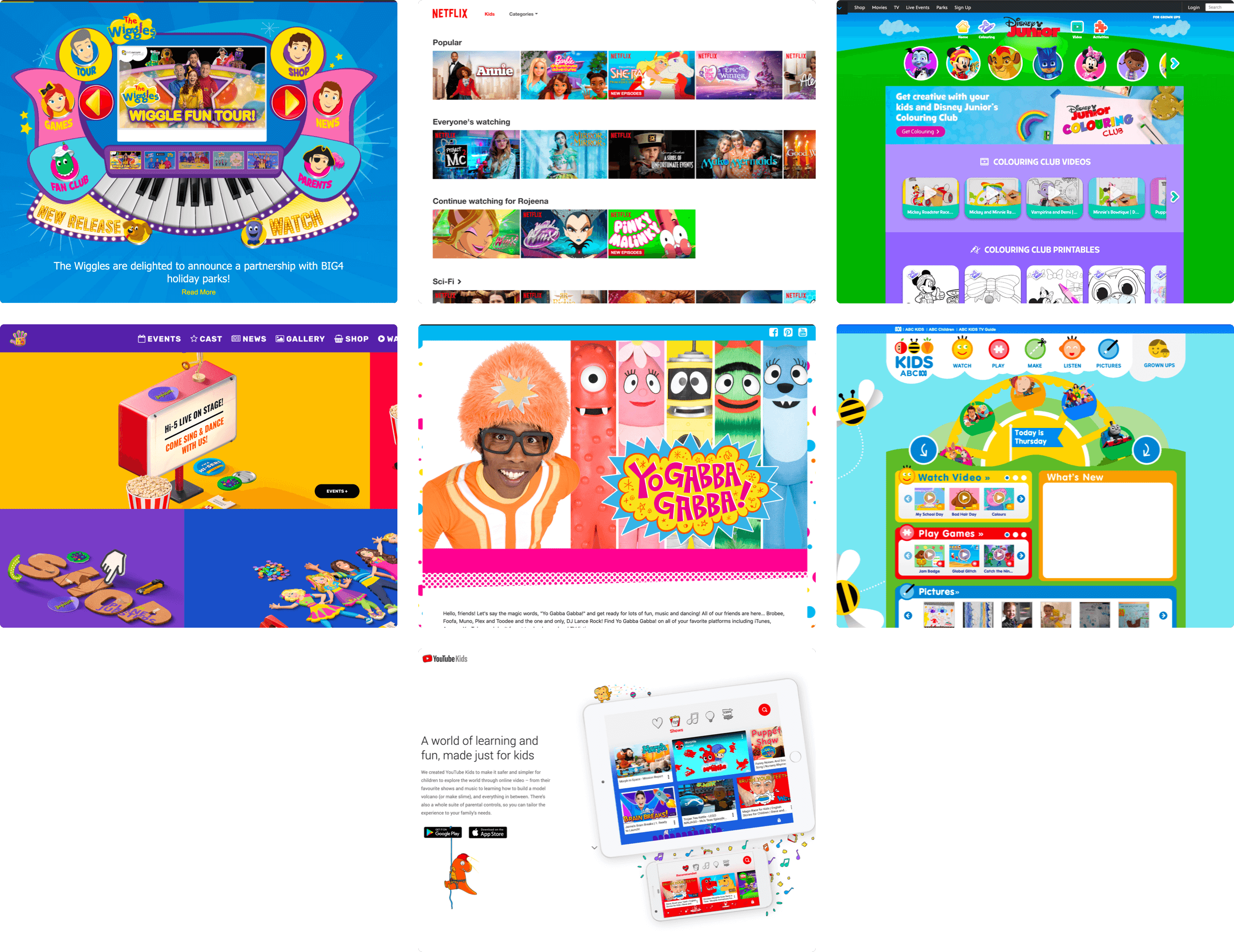
Competitor Analysis
The best thing at this point is to look at the competition. In general, I wanted to understand what is important to parents, what is important to kids, what kids find attractive in products targeted towards them, what is a good User Experience for kids and for parents and also for some branding direction and mood-boarding for the design so I looked at a few direct and indirect competitors and the learnings were the following:

06
Research
Mood Boarding
As I mentioned previously almost every big brand like Netflix, YouTube, Disney and others, if they had a main (adult targeting) product, they had a completely different branding and mood for their kid’s product. If dark mode was a thing, for kids it was changed to light mode, if branding was boring, for kids it was fun and bright, if a lot of text was used, there were more images used for kids, the UX relied less on search by words and concentrated more on content to flow the user and sometimes speech search and a lot more learning. The mood board helped me put together a kid friendly branding for Spotify, it’s important to still stay true with Spotify’s brand as well though.
07
Research
Vision
The research helped me create a vision for the final product, a product that provides a good experience for kids, parents can trust and monitor it and it stays true to Spotify’s name and brand but targeted towards kids.

08
Research
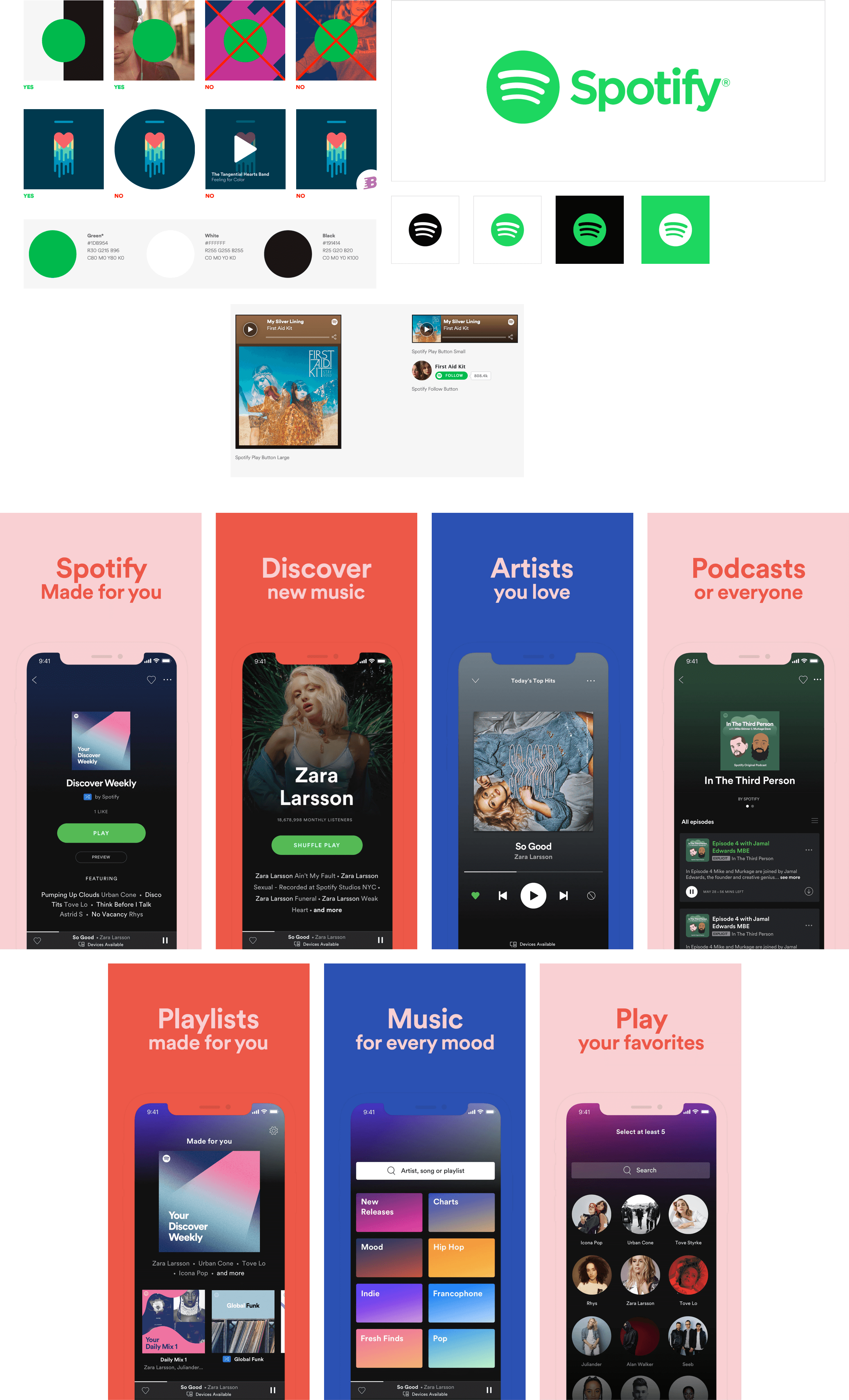
Existing Product
Since there’s already a Spotify app and branding let’s try to consolidate UI patterns already established in the Spotify app and translate them into an enhanced kid’s experience.
09
Product Development
The Product
From the research, I had enough info to start concepting this product. It was time to uncover insights and translate concepts into features that address customer behaviours and motivations. A quick brainstorming session and a quick sketch of the flows that I wanted to design helped shape this product a lot.

10
Product Development
User Flows
User Flows helped me invision the path my users (both parents and kids) would follow through this application. I like to think of these as mini user journeys and do as many of them as possible. They help me think about the product as a user and try to capture possible errors and opportunities.

11
Product Development
Wireflows
These are more refined user flows, almost like a wireframe but at this point I don’t want to restrict myself too much with details and try to quickly sketch out the pages I’m going to design later. They help invision features and flows on the page and in a more visual medium. This is mostly done on paper.
12
Wireframing
Wireframing
Generally nowadays if I have an existing product I skip wireframes all together and use an existing design system to put together a final rough page and refine from there, however with this one since I have no idea what this thing would look like I chose to refine my wireflows into wireframes, these are the screens I will be designing later.

13
Wireframing
Parent’s Flow
With the wireframes I explored both the parent’s sign up and the kid’s usage flow. The idea with this flow is to give peace of mind to the parent that they can safely set up an account for their child, monitor and control what their child interacts with. Used as many existing Spotify elements and patterns as possible.
14
Wireframing
Kid’s Flow
This is the main part of the app, the part that I will be doing UI for later, with this flow I wanted to explore an interface that is as simple as possible for the child to use, again keeping in mind that they can’t read, they can’t identify meanings and abstraction behind icons and we have to keep in mind colourblind kids as well and cannot rely on colours alone to tell a story, therefore really fun, recognisable shapes become very important in this section, I will refine these shapes and colours more when I’m designing the UI. The UX is now less about your traditional iOS app and it is more linear, less about searching and exploring but more around looking and recognising.
15
Design System
Branding
The branding of the platform needs to change to suit the target audience a bit more, colours no longer should be cool and pleasing to a younger audience and adults but more fun and interactive, while we’re keeping elements from Spotify we are adding our touches to it.
16
Design System
Typography
We’re keeping the fonts the same as the current brand, they are legible and fun, also as mentioned before kids between 3 - 6 years old generally don’t/can’t read and their parents would do most of the readings.

17
Design System
Color Palette
Spotify's current colour palette is quite bright and fun and it stands back and allows the content to breath instead, that is my goal with this selection, I’m keeping the iconic spotify green however I’m adding a few fun elements here and there to add that fun touch to it. We are getting rid of the dark background on the app though.

18
Design System
Iconography & UI
Kids around this age cannot form abstract understanding of icons, so we are making some changes here too, we’re making each nav icon completely different to each other, with different colours and shapes. We’re also making them more look clickable and skeuomorphic than Spotify’s flat design and we are adding a feedback animation on every button.
19
UI Design
Initial Design
The initial app was this landscape mode app and it just did not feel right, the navigation did not work, the UX was just bad, so I went back to the whiteboard to try the something else.
20
UI Design
Outcome
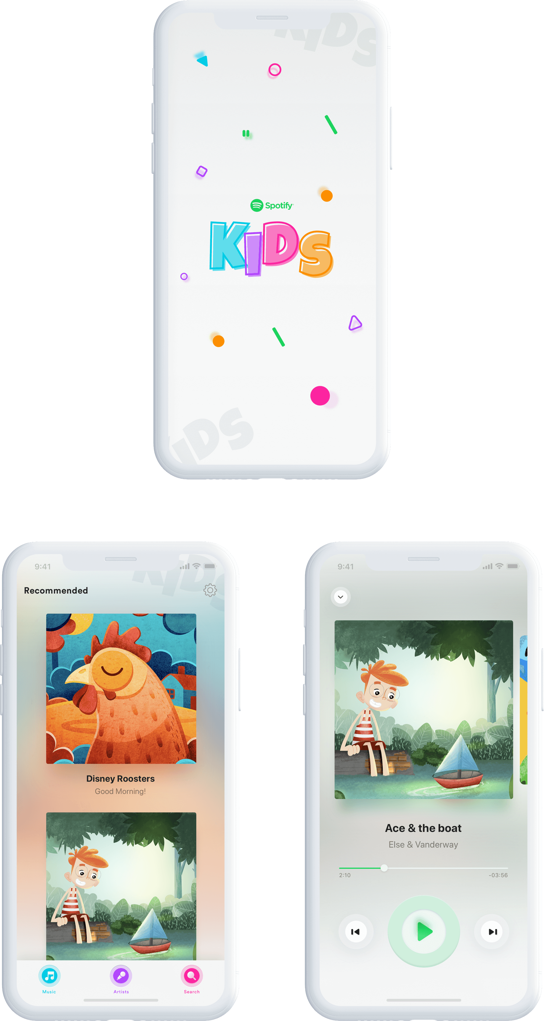
The outcome was a washed down version of Spotify, the final product is super simple with minimum effort to navigate through the app. This is also the same sort of UI I observed on multiple apps targeted towrds kids, like YouTube Kids, some games and more...

21
UI Design
iOS App
The final product is this super simple to use iOS app, it doesn’t have a whole lot of similarities to the Spotify as this was the intention to create a more child friendly environment and also to engage the children in a different more straight forward, super linear UX.
22
The End
Up Next
Wow! Time really does fly when you’re having fun. I’m afraid this case study is just about over. But I’ve prepared a few more for you so there’s no need to panic (yet).