Crowd Sourcing Marketplace
Get Beautiful Designs
DesignCrowd’s mission and vision is to help businesses find the best design in the world, faster, and at a price that fits their budget. They also want to give designers around the world the chance to earn money for their creative skills.
01
Overview
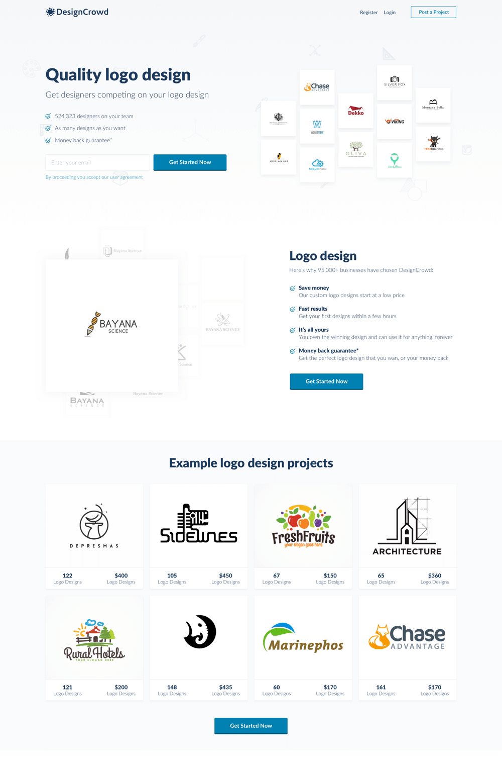
About the Project
When I started at DesignCrowd I was their first official full time designer. The product looked outdated and user experience was terrible, the first thing I wanted to do was to rebrand the site and update it to be more modern and look a bit more appealing. Getting stakeholder buy-in was not an easy task, DesignCrowd was in a growth phase and product was not a focus at all, so the idea was to show the value of design directly affecting sales.

02
Research
Competitor Analysis
The way to stay on top of competition is to keep looking at what the competition does, learn from their good and bad things and improve on them and make your own brand and product standout. I always create a list of direct and indirect competition and check what they’re doing quite often, what features they have, what their customers like and dislike about them and more.

03
Branding
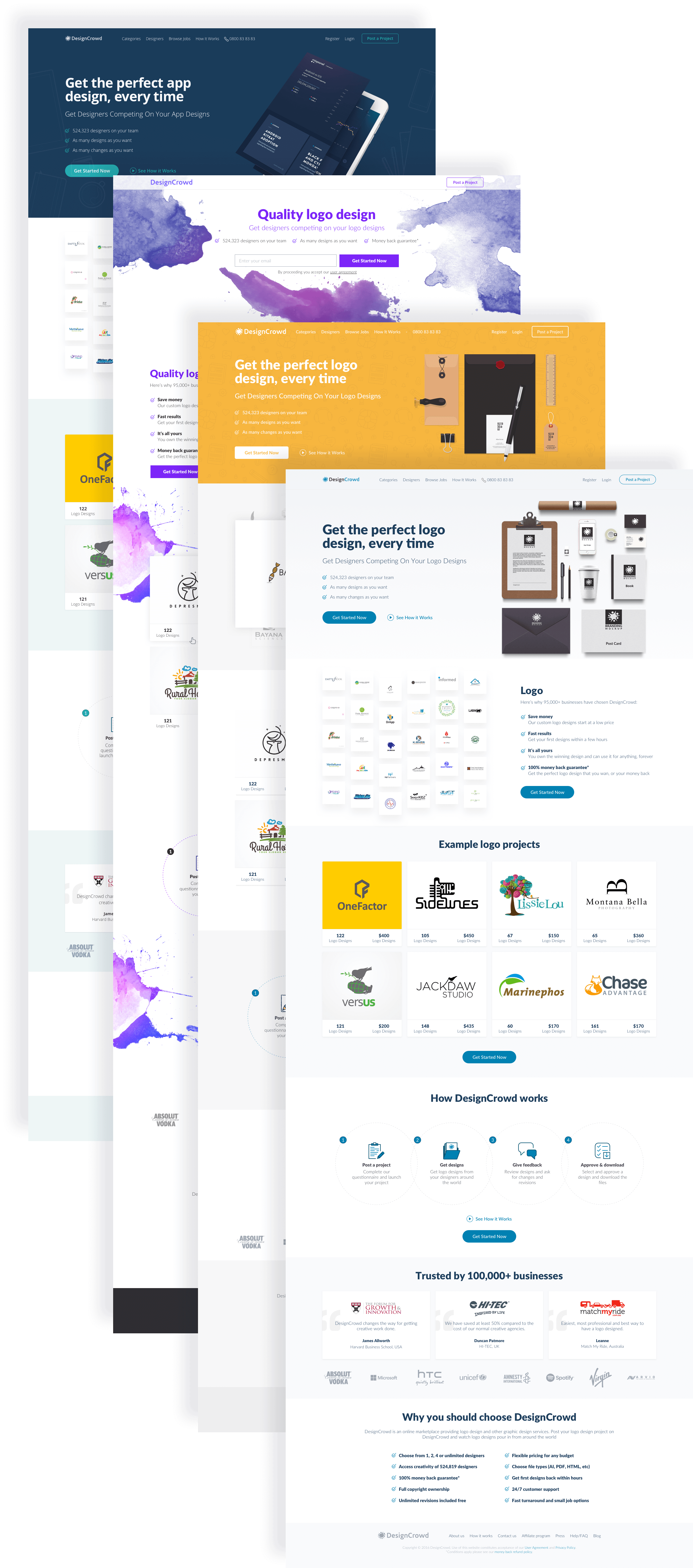
Branding Research
Coming up with a perfect branding wasn’t easy, we first did a few internal workshops to see what we wanted the new DesignCrowd to be, then based on that we interviewed a few of our users to see what they thought of DesignCrowd, then we started concepting out a few different ideas, this is what we came up with.
04
Research
Sales and KPIs
One of DesignCrowd most important flows was their checkout flow, a way to prove that design would have a direct positive impact on sales was to test re-skinning this section in the direction we wanted to take the branding towards.
05
Testing
Testing & Learnings
Then we started testing for a while A/B testing the design we liked to see what get out of it, after weeks of testing the new concept proved to be a better choice we saw a really nice 6% increase in sales just by reskinning our checkout flow. We realised the better and more expensive we made the site the lower our sales went as it gave users the impression that we are an expensive company and DesignCrowd was meant to be the cheaper one of our competitors, so we decided to stick with the cheaper looking design.

06
Design system
Design System
It was time to make this whole thing official, it happened that we were also upgrading front-end technology, we were moving away from Bootstrap 3.0 to the newest version of Foundation and that called for a component based design system.

07
Design system
Typography
The idea was to keep the brand looking friendly and affordable and the typography we picked had to resemble that aspect of the brand.

08
Design system
Color Palette
The color palette needed to keep some of the old DesignCrowd identity and add a modern flair to it, it also need to look affordable.

09
Design system
Consistency
Consistency was key to a good experience design and easy development, you see by having a consistent design you save on design and engineering time. You also end up with a better UX. Customers understand your products better, developers develop faster, designers design better. We got busy by creating patterns.
10
Design system
Mapping out pages and components
Then we started putting together pages and look for anything that we could turn into a component, the result was this massive list of components below.
11
Design system
Modular
We also realised that we do a lot of A/B test to increase sales and improve the product on minor elements, so we decided to take our components and create a modular pattern where you could test and retest blocks.
12
Ui Design
Web App External
We weren’t a massive team and implementing the whole design was not possible. The solution was this incremental change of the old UI to new UI, customers hate change so we made sure to make this as seamless as possible, first we started by adding the branding then we started building the components slowly and implement them to the site slowly. This allowed us to update the site in minimum downtime.
13
Product
NPS
After growth it was time to improve our NPS score, spoiler alert we were on -35 and we managed to pull ourselves up to +10 in 2 months, how?

14
Product
The Challenge
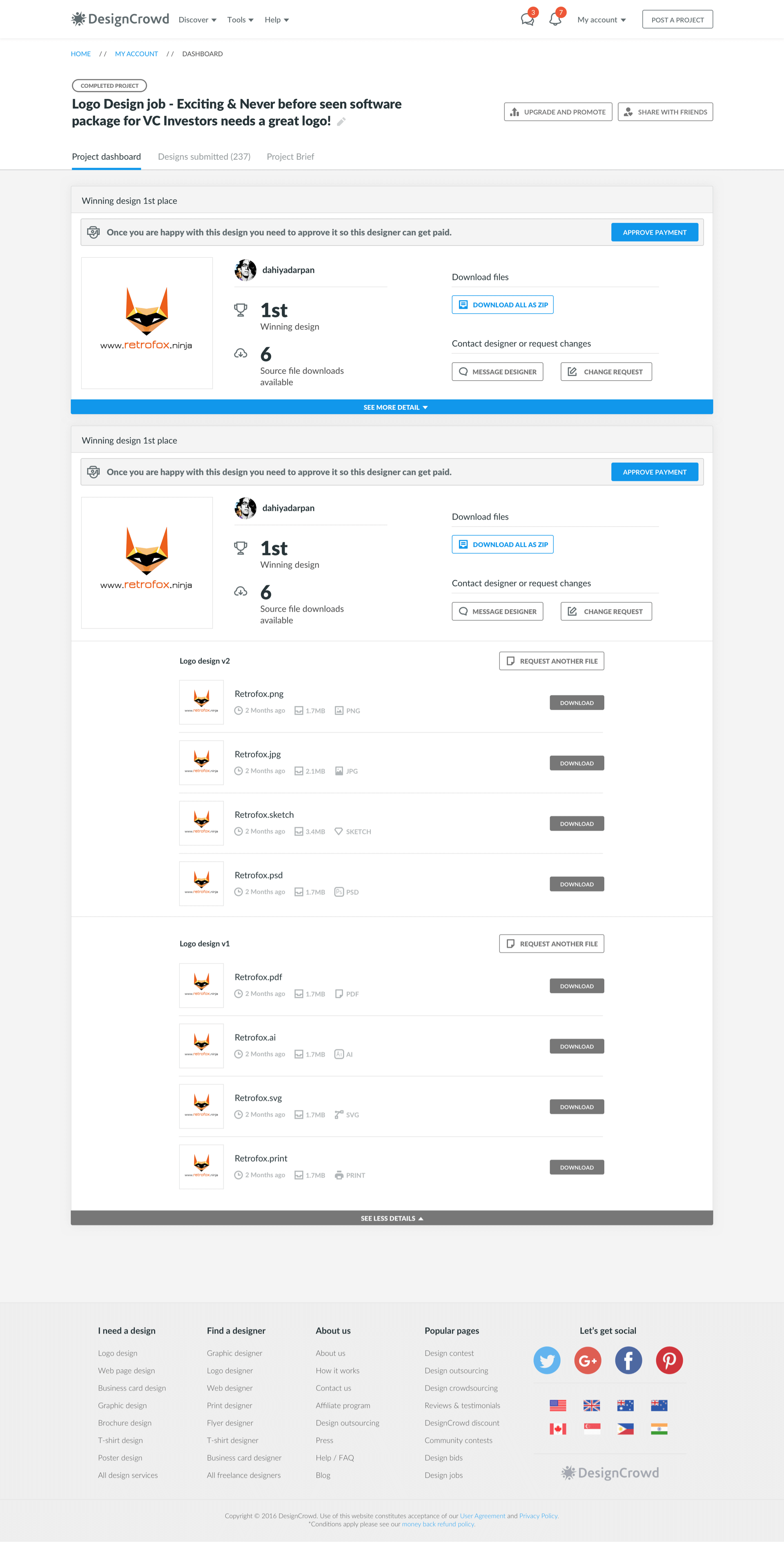
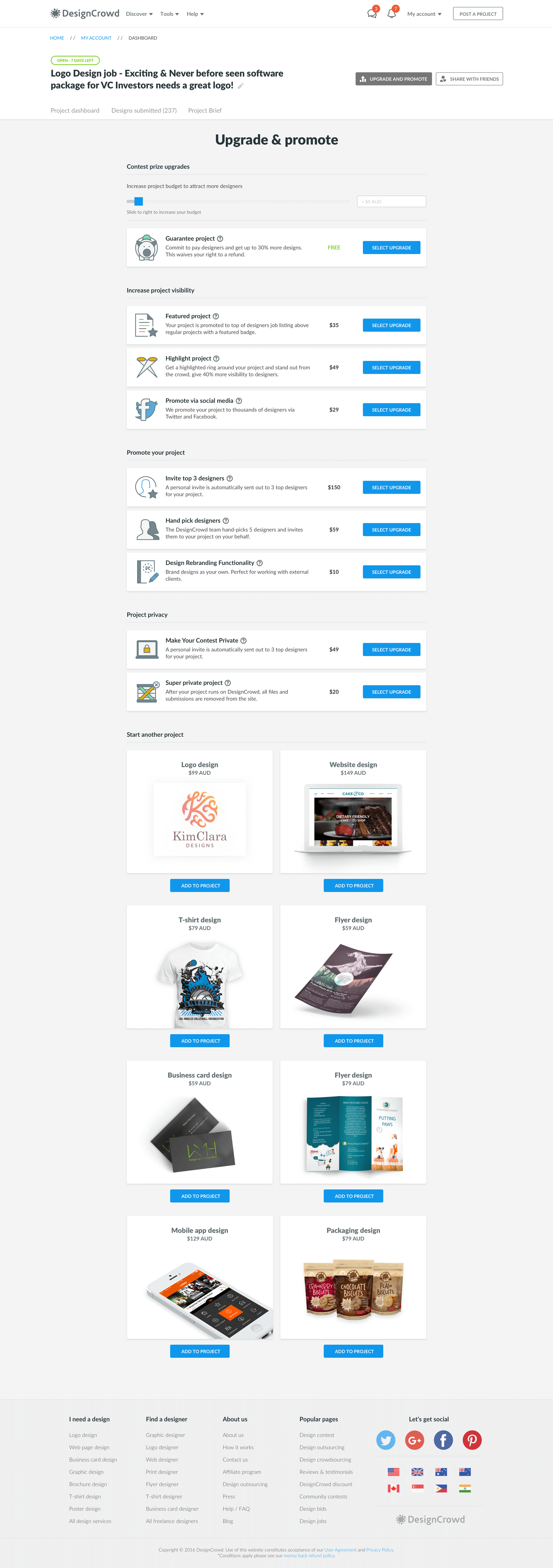
We talked to our designers to understand their pain points, most were not satisfied with the design of the site and a lot did not find the UX useful or easy to use. We also talked to our customers and realised that after posting a project managing their project was a very confusing and difficult task to do. So we got busy running a few workshops to map these pain points. I won’t bore you with the details and get to the point, we realised communication and project management was not easy on our platform and we got busy designing and testing the way designers and customers collaborated on their project. The result was the massive change in our NPS score.

15
UI Design
Web App Internal
The result was this massive change to the UI and UX of our product, this was a huge change and had to handhold both designers and customers, but at the end everyone was generally very happy with the change and our NPS records backed us up.
16
The End
Up Next
Wow! Time really does fly when you’re having fun. I’m afraid this case study is just about over. But I’ve prepared a few more for you so there’s no need to panic (yet).