E-Commerce
Buy & Sell Rare Watches
Selective is a robust online magazine and e-commerce store featuring in-depth reviews, critiques, and reports on watches of a particularly high quality. In the course of eleven years, Selective has established itself as the preeminent resource for modern and vintage wristwatch enthusiasts.
01
Overview
About the Project
For some, collecting, buying and reselling watches is not just about wearing the market’s most fashionable watch. Whether you call it a trend, a bubble or a new form of economy, one thing is certain – the watch enthusiast world needs a place where sellers can liquidate their assets quickly, while buyers enjoy getting a reasonable deal.
When Selective, approached me with his vision to create such a marketplace, I went all in. The challenge ahead was alluring: to launch an eBay for the Snapchat generation.

02
Research
Heuristic Evaluation
I started by performing a heuristic analysis on their site, noted what each page has, what works, what doesn’t. How do we make the overall digital experience better.

03
Research
Content Auditing
This exercise is very helpful for when I try to figure out how many pages I’m designing for, what each page currently has and what extra elements do I need to design for each page. It also helps forming a simple sitemap or service map down the road.

04
Research
Background
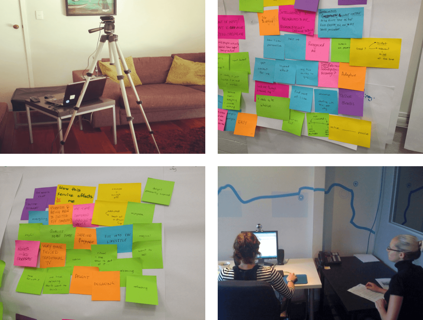
After my interview with the stakeholders and the research with the client it was time for me to validate what Selective wanted was viable by their customers. They had a solid customer base, buyers and sellers but I needed to identify who these people were exactly, gather a bunch of personas out of the data we have already collected, find out about their pain points were and try to make their experiences as smooth as possible.

05
Research
Persona Development
After my interview with the stakeholders and the research with the client it was time for me to validate what Selective wanted was viable by their customers. They had a solid customer base, buyers and sellers but I needed to identify who these people were exactly, gather a bunch of personas out of the data we have already collected, find out about their pain points were and try to make their experiences as smooth as possible.
06
Research
Epics & Design Stories
Epics are stories that provide an overview of the features. They helped us think through the design decisions, to create and provide useful user experiences.
07
Product Development
Sitemap
After auditing the website I put together a sitemap, this helped with two things. One it made it easier to get a quick overview of the entire platform and two it helped me get better understanding of the way a user could flow through the site. We ran a few card sort exercises internally and with users to figure out what structure and flow made the most sense.
08
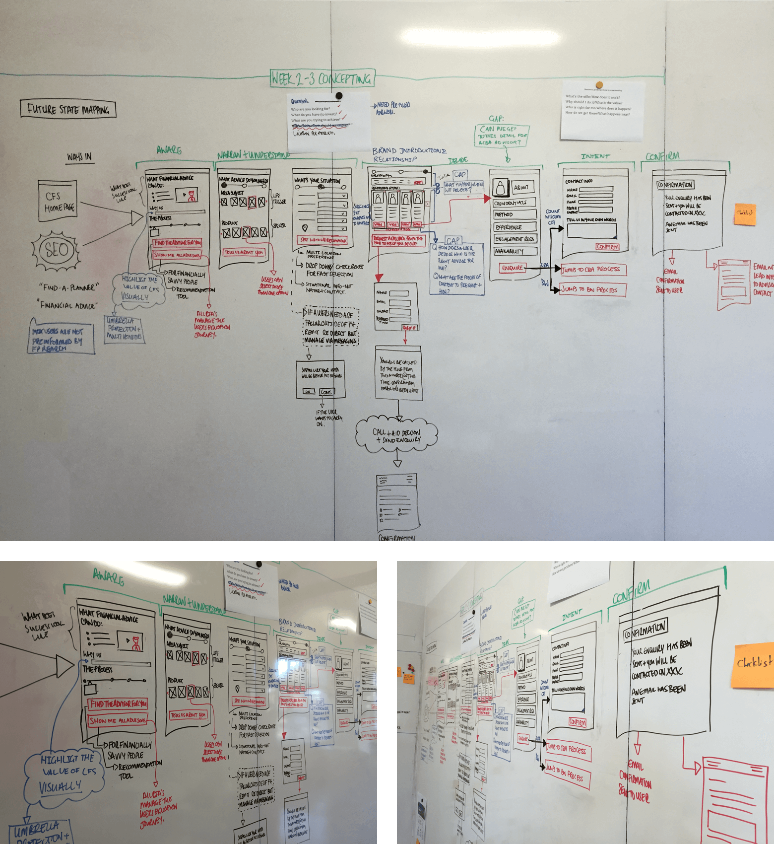
Product Development
Wireflows
Over the years, I have had to create flowcharts to communicate interactions. To give more context, my flowcharts have morphed to include wireframes.
09
Product Development
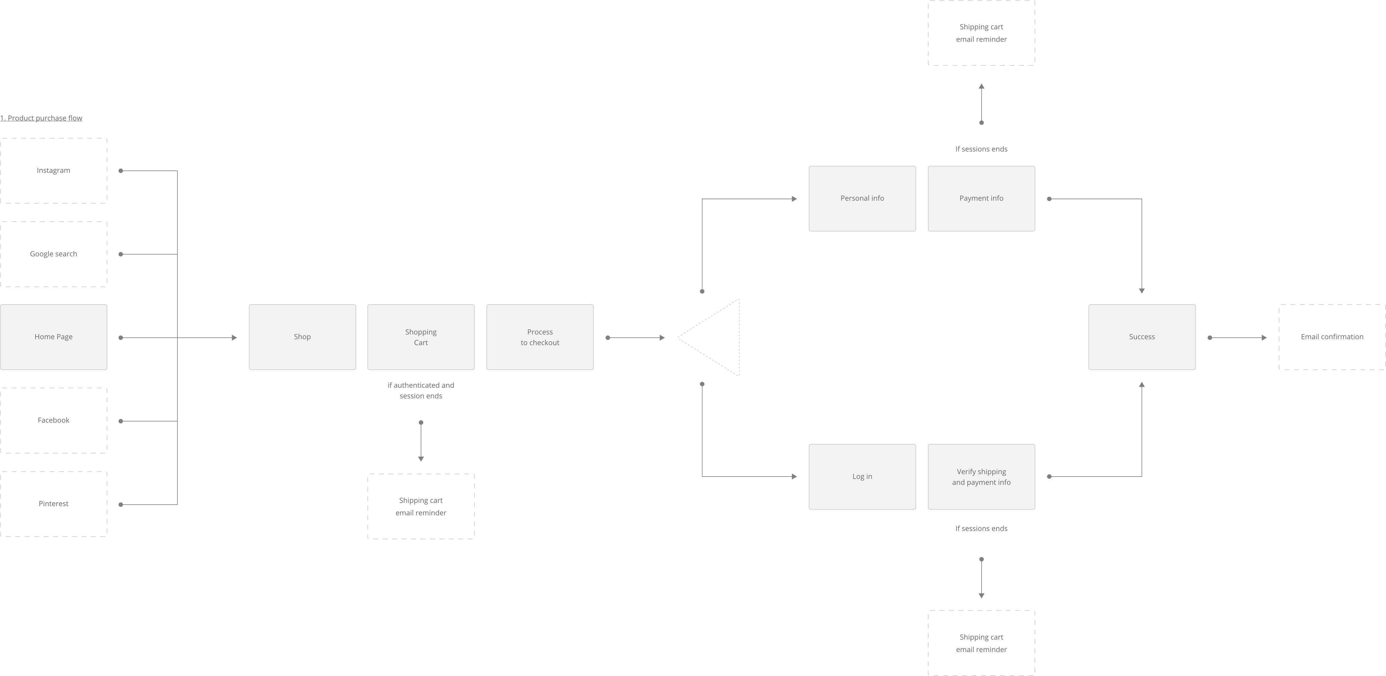
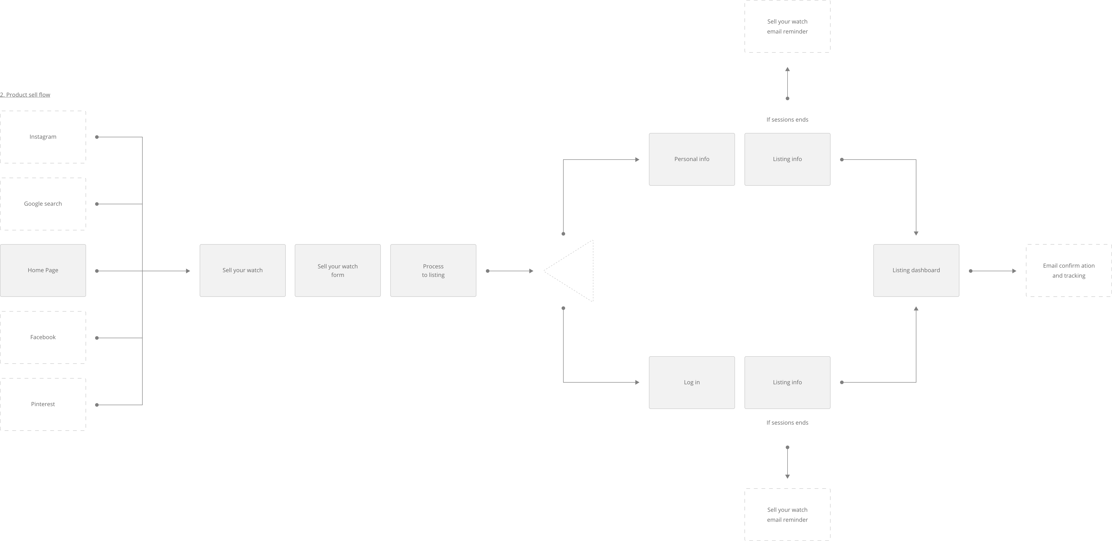
User Flows
User Flow is the path a user follows through an application. I like to think of them as mini user journeys. They help think about the product as user and try capture possible errors and opportunities.
10
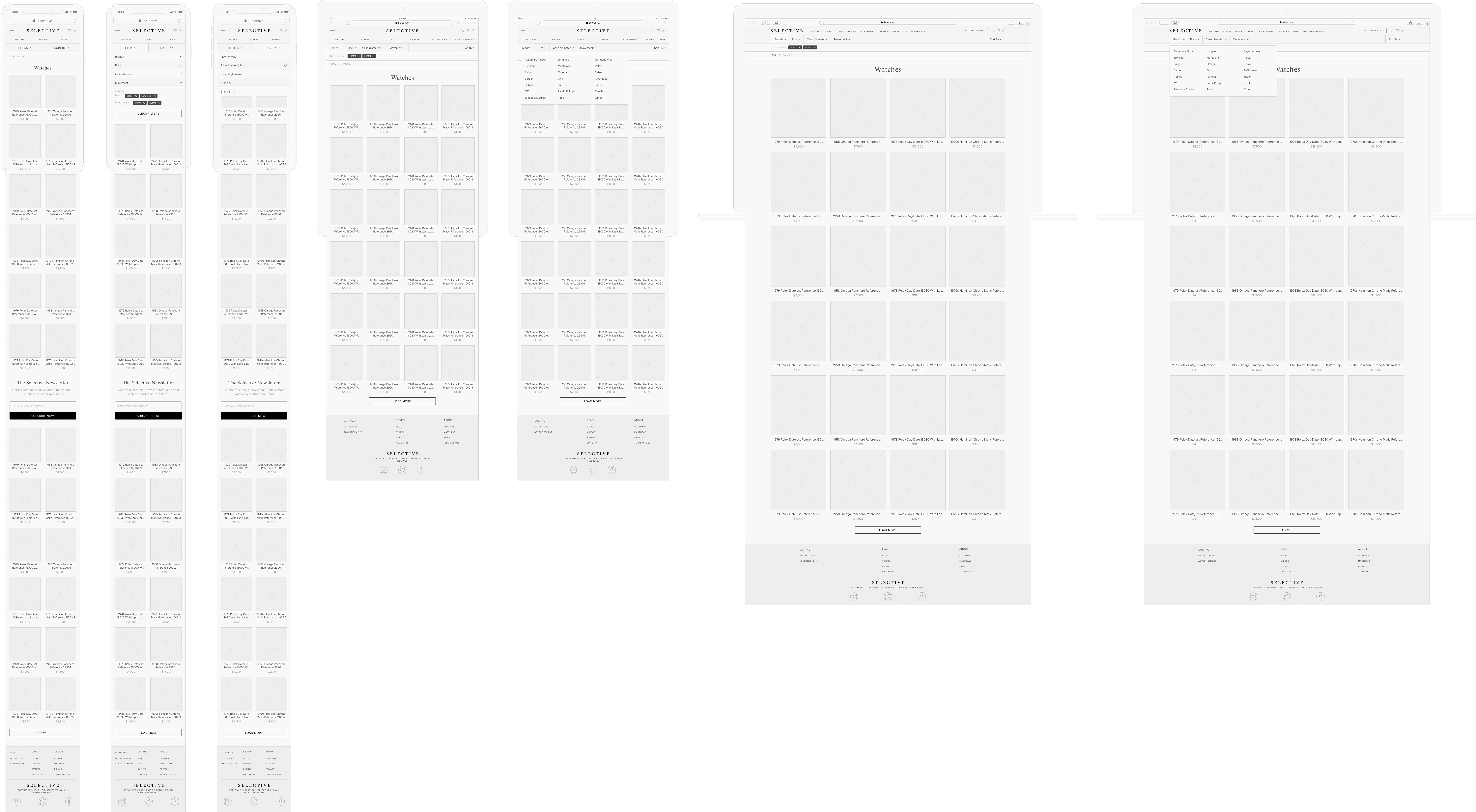
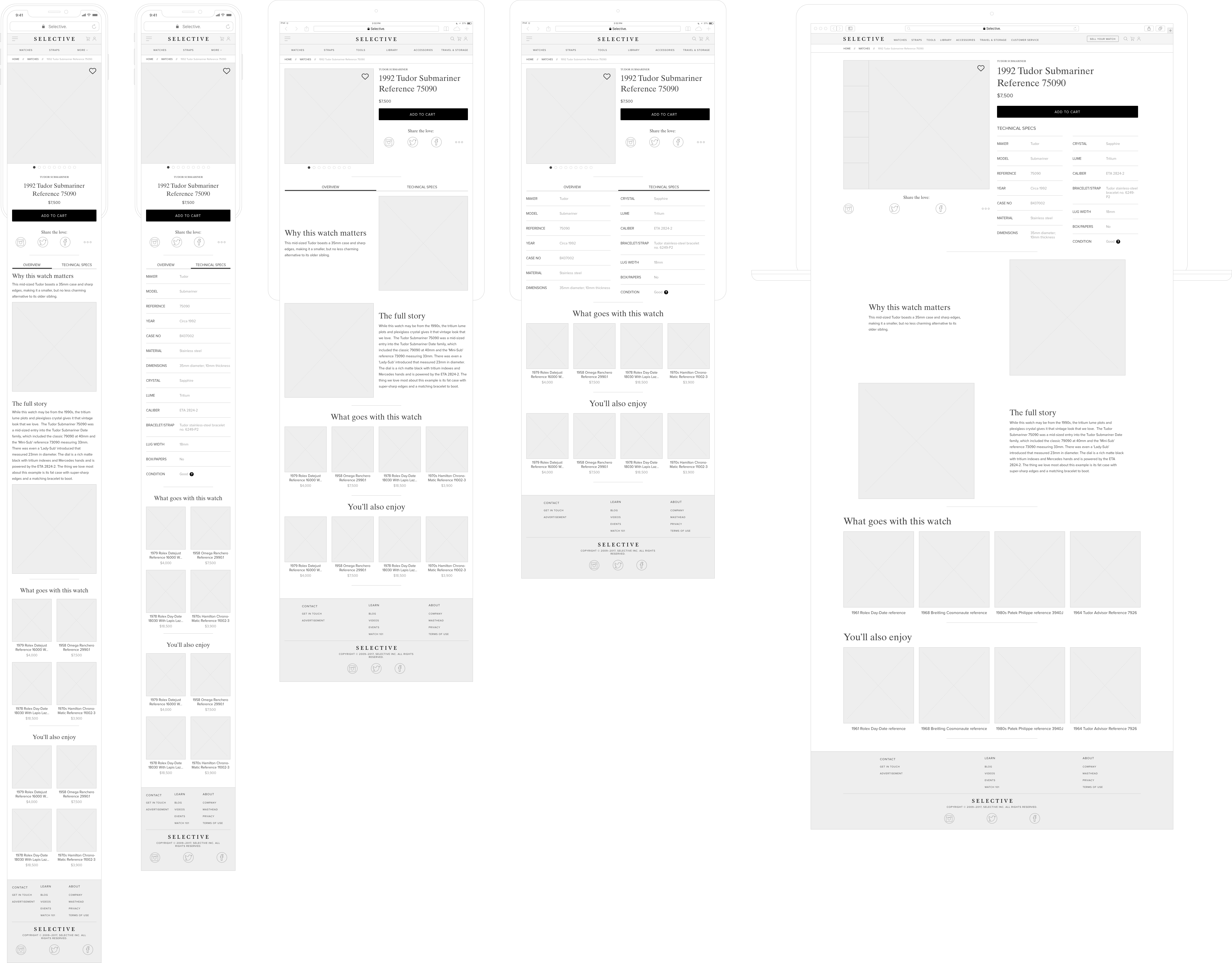
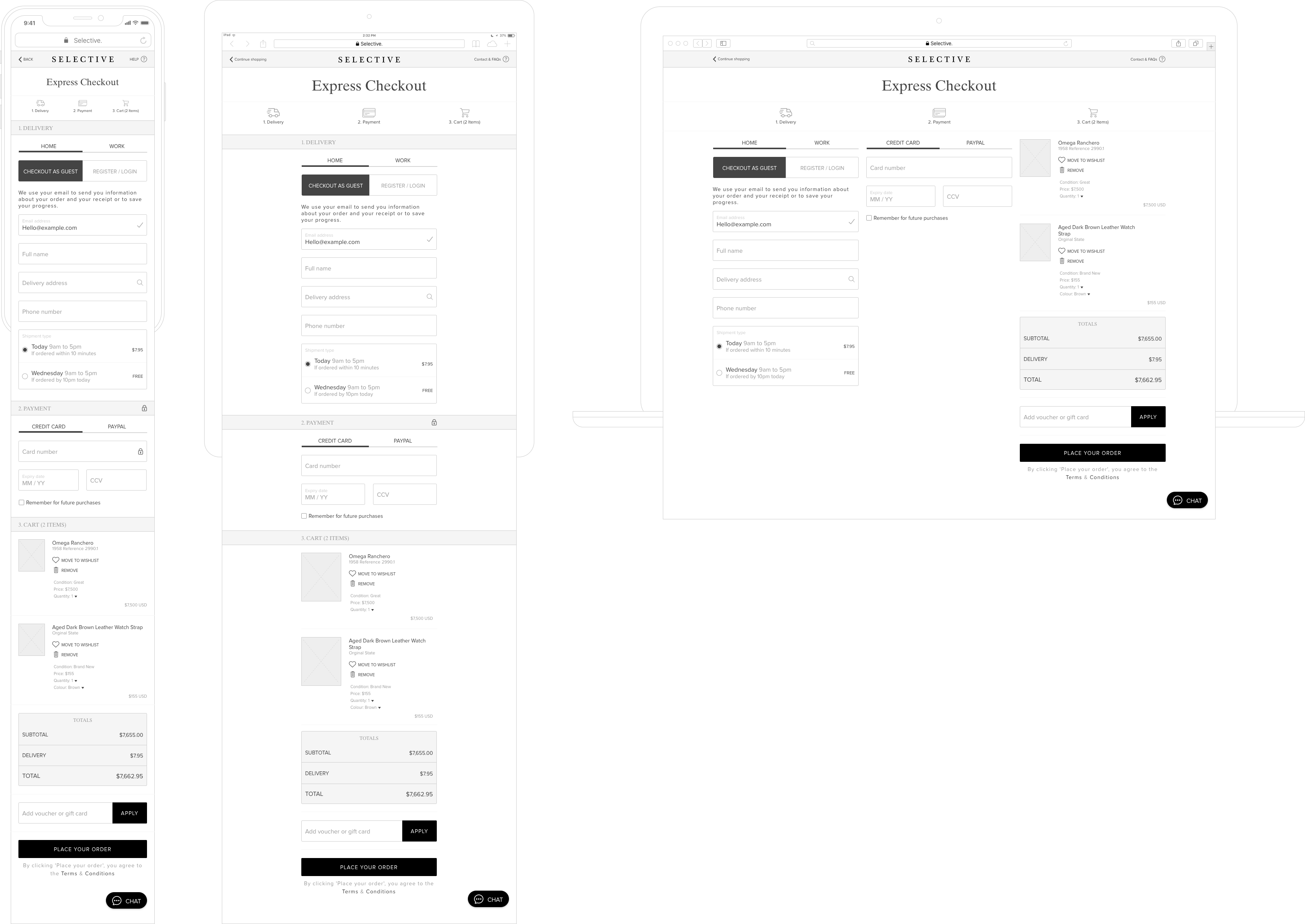
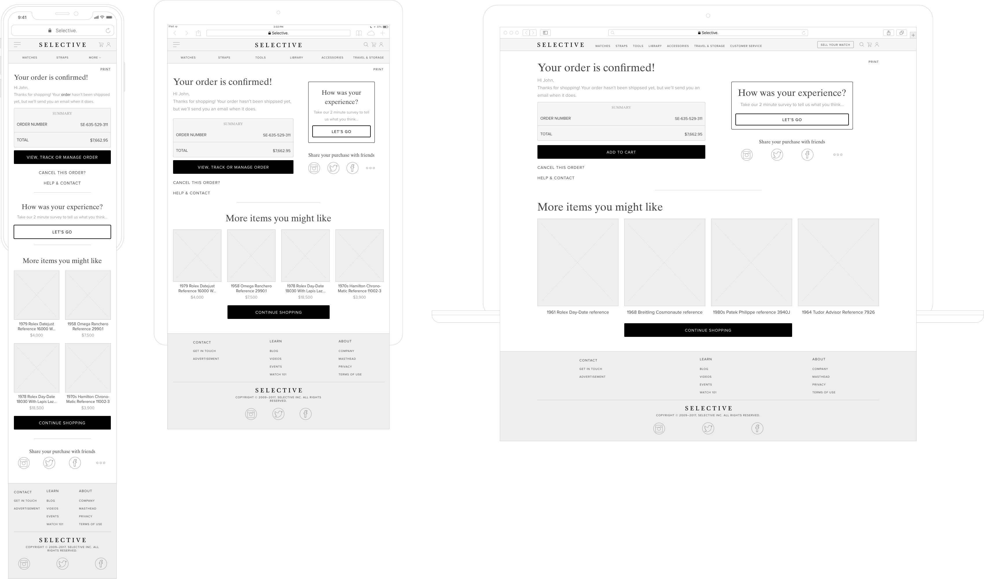
Product Development
Wireframes
The next step was to visualise the user flows and sitemap. I started with some quick sketches and continued with creating high-fidelity wireframes.
11
Testing & Analytics
User Testing
Once the wireframes were approved by the stakeholder we went into rapid prototyping and user testing. We recruited 3 x 5 user groups to test our prototype with (it was a mixture of people based on our personas). The first group proved that most of our UX assumptions were correct but there were some fine tunings left to do. Second group gave us the confidence that we fixed most issues that the first group had but pointed to some other smaller issues and the third group really gave us the confidence to go into design / build mode.
12
Design System
Branding & Style Guides
Selective had a pretty solid branding, we wanted use their branding elements and apply them into a meaningful and scalable UI design language.

13
Design System
Typography
Selective had a pretty solid branding, we wanted use their branding elements and apply them into a meaningful and scalable UI design language.

14
Design System
Color Palette
As mentioned before Selective’s branding was pretty on point, however we had to change some of their colors slightly to make them more accessible friendly.

15
UI Design
Outcome
This project was long and hard journey and we worked really hard to get the desired outcome, after going through all the research, testing, wireframing, component building and design system it was time to put the UI together.

16
UI Design
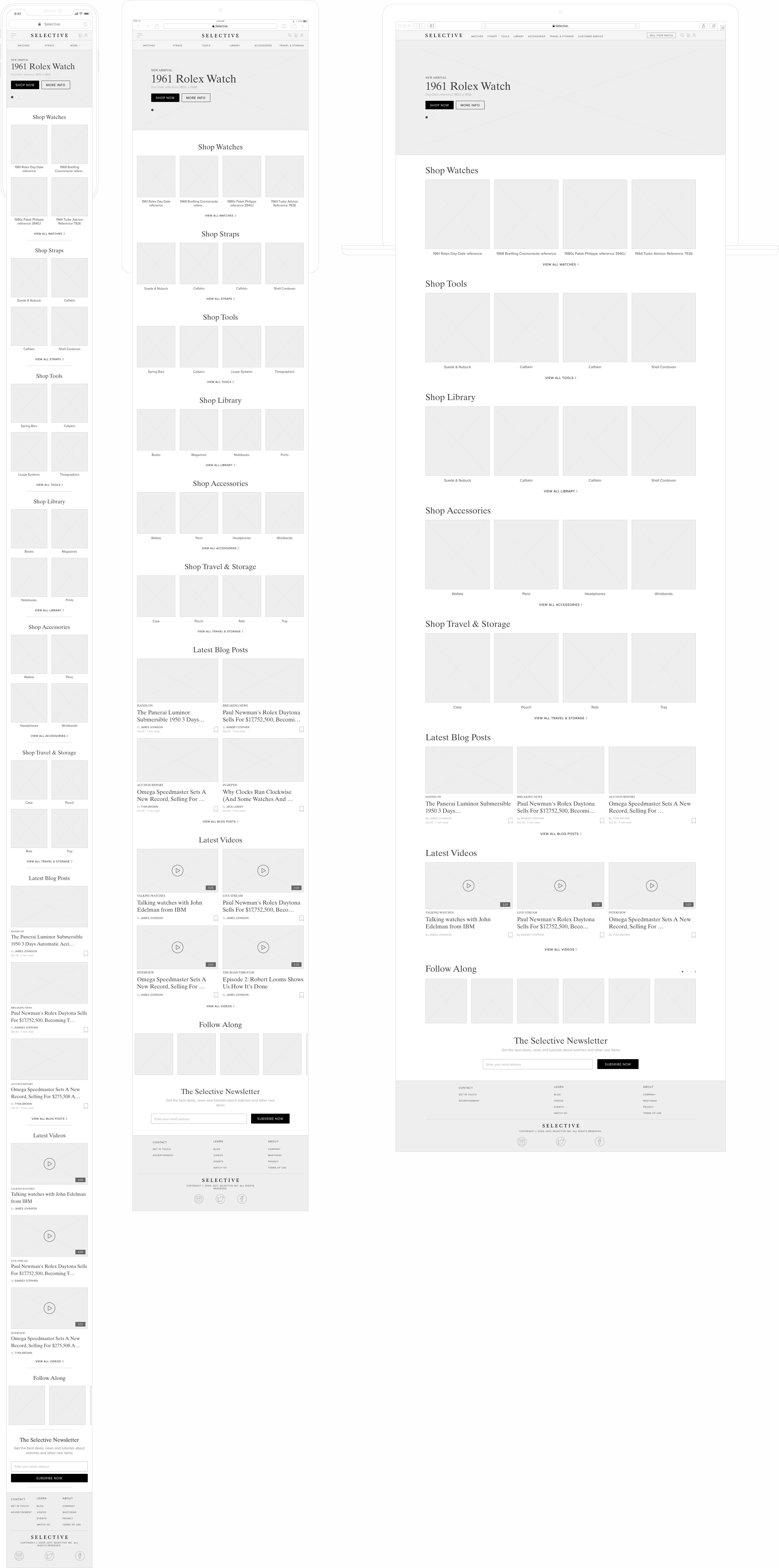
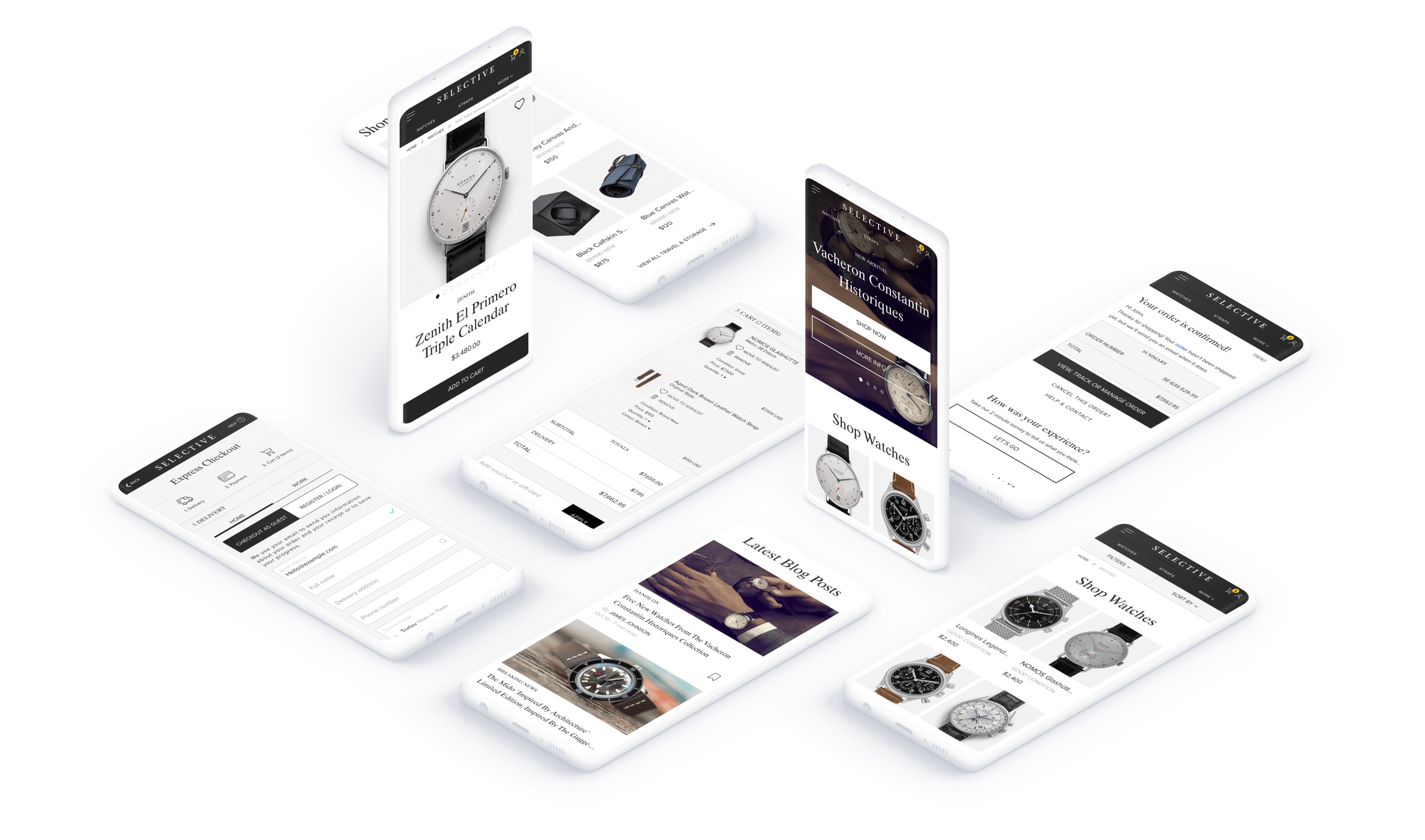
Mobile First
Our testing proved to us that our users really wanted to be able to access content on their phones and tablets so we designed a complete responsive web application using the mobile first methodology.
17
UI Design
Tablet View
Mobile first doesn’t mean no tablet view, it’s gotta look on them tablets too…
18
UI Design
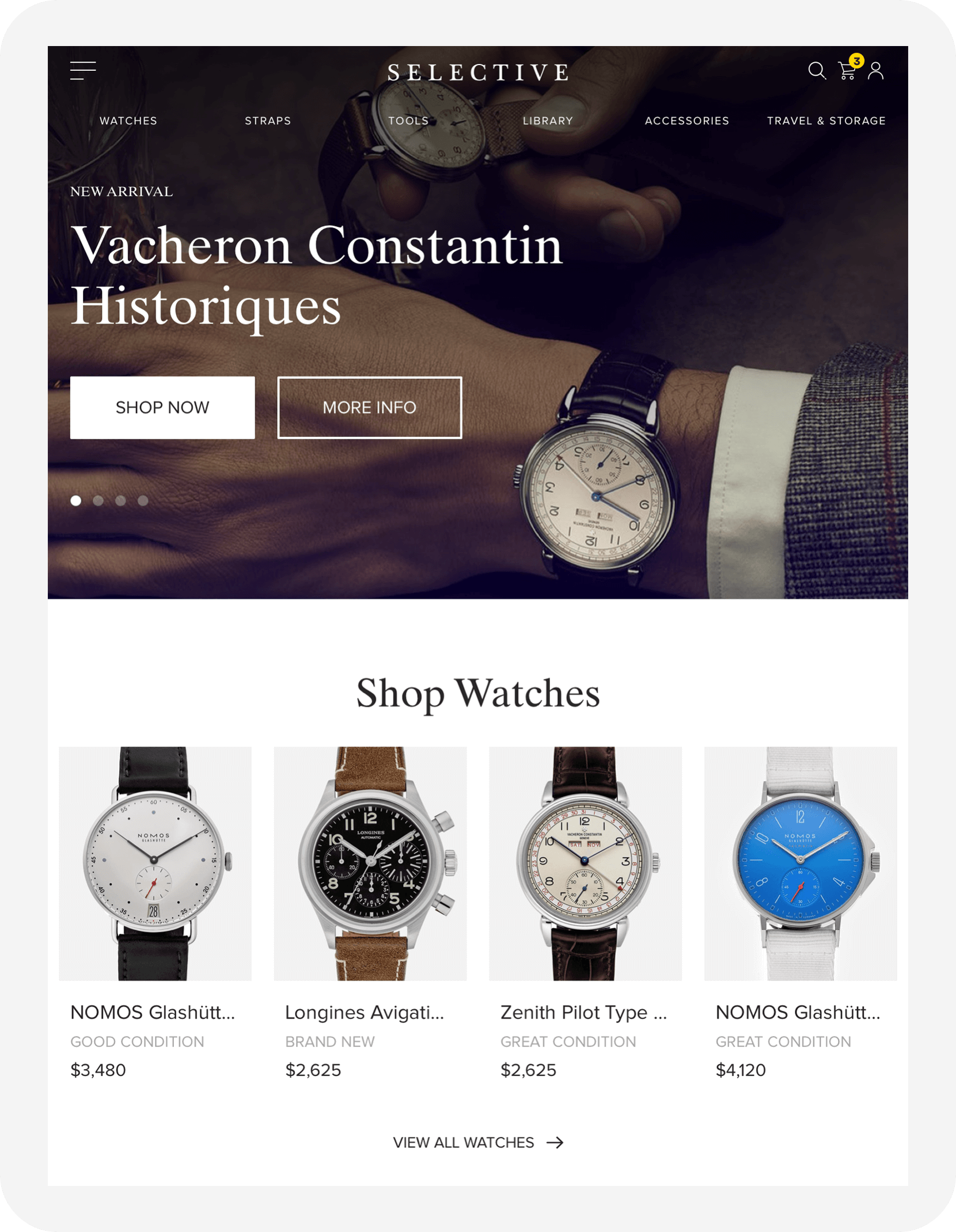
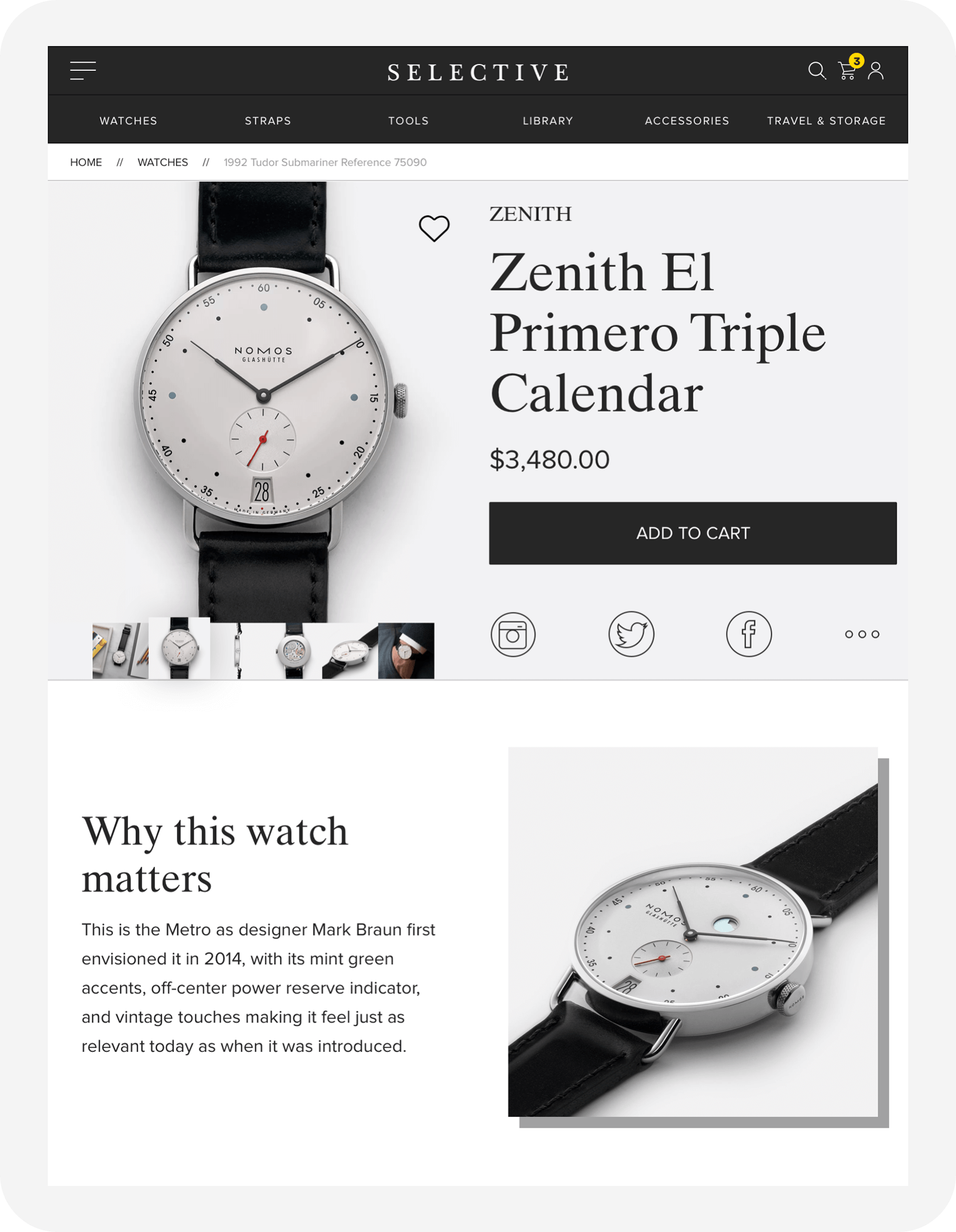
Desktop View
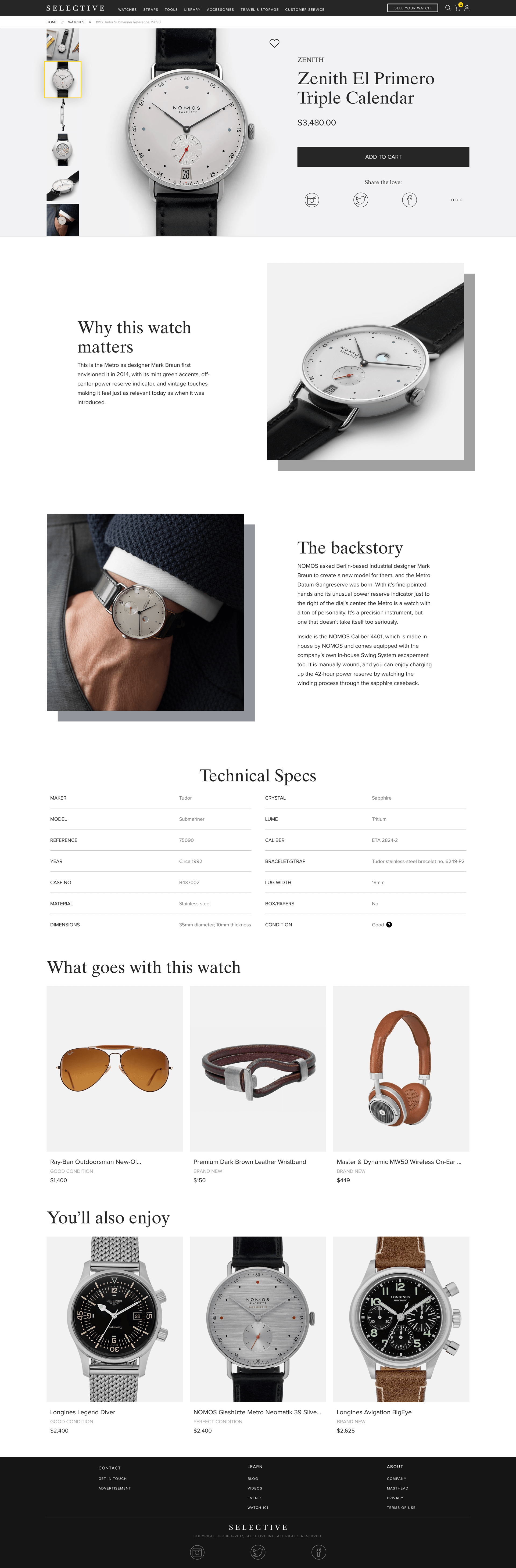
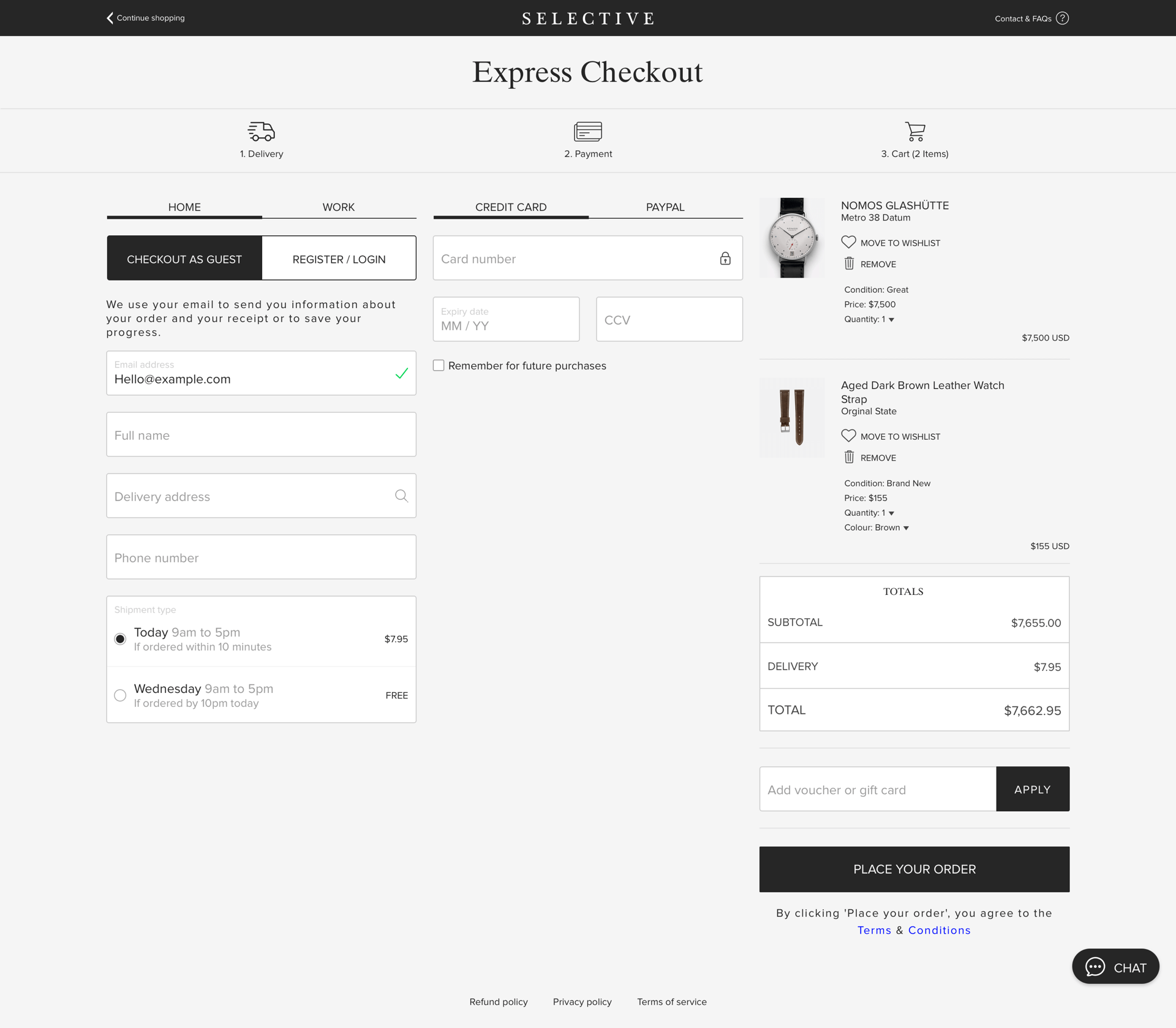
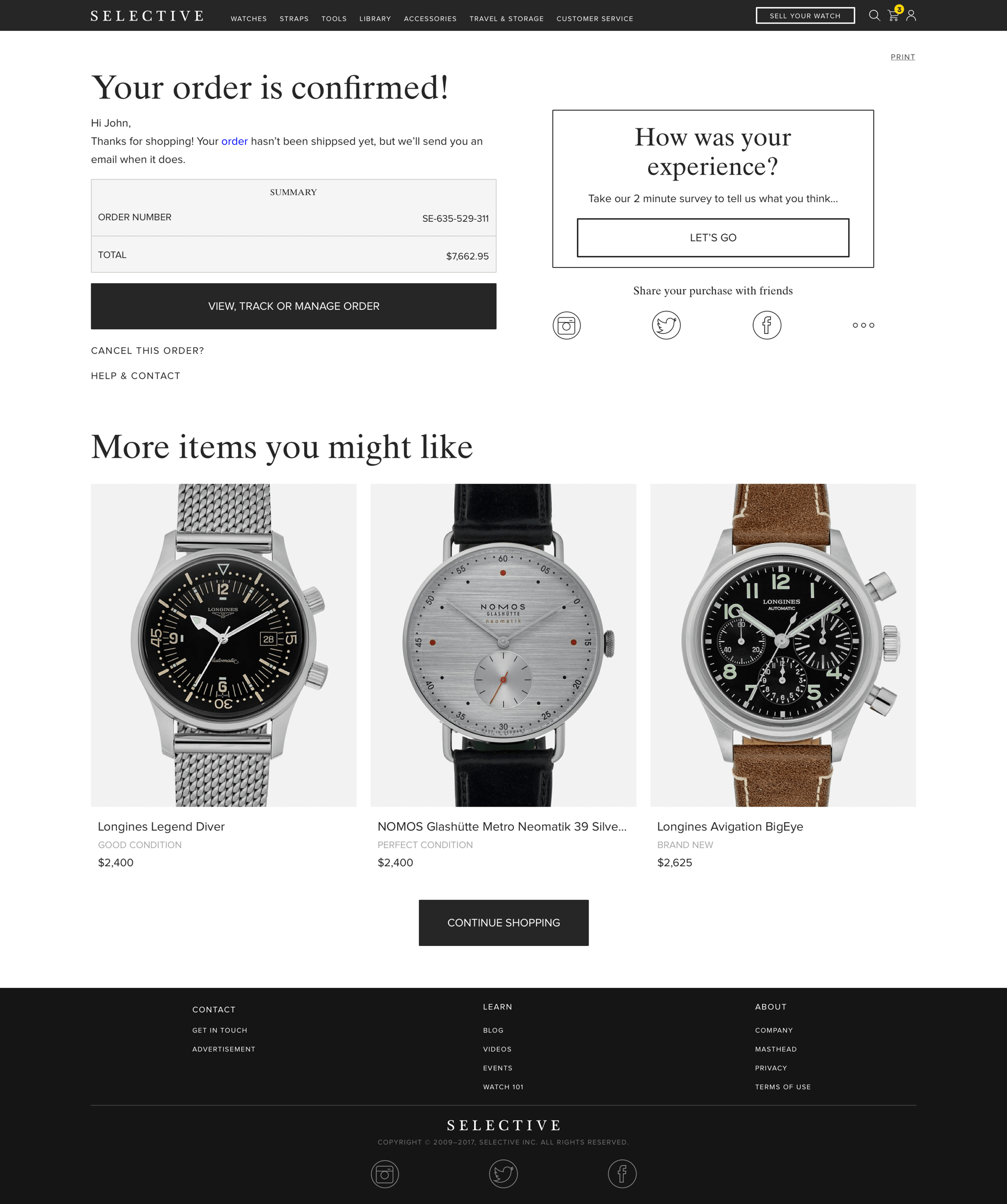
This was the result of the v1.0 of their eCommerce platform. This includes the full purchase flow.
19
Interactions
Interaction Design
The point of animations was to add to the experience without distracting the user from their main task. Below are a few examples of what we did interactions.
20
The End
Up Next
Wow! Time really does fly when you’re having fun. I’m afraid this case study is just about over. But I’ve prepared a few more for you so there’s no need to panic (yet).