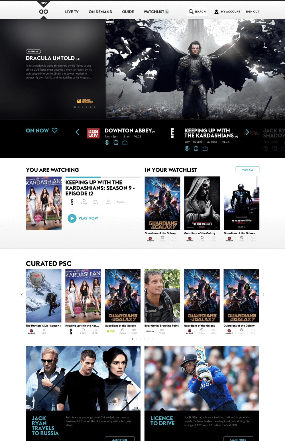
VOD Entertainment
VOD Digital Experience
Now you can take the thrill and excitement of live sports, epic movies and hit shows with you, wherever you go in New Zealand. Depending on your subscription, SKY GO lets you live stream all the action from a range of our most popular channels direct to select smartphones, tablets, Mac or PC.
01
Overview
About the Project
SKY New Zealand had apps designed and developed for their SKY GO product and wanted to consolidate the same UI patterns established for the apps to translate smoothly into a web app experience.
We relocated to New Zealand for 6 weeks to work closely with the SKY team to make this product come to life.
SKY GO enables all SKY customers to find and view a selection of linear SKY channels and VOD content on smartphones, tablets and on the website.

02
Objectives
What were the Objectives?
Competitor matching and product alignment: SKYs competitors in this area already offer VOD content across multiple device types. SKY’s SVOD Product Navajo will deliver the ability for non-SKY subscribers to watch On Demand content on tablets and mobiles.
Subscriber Retention through VOD offering to tablet and mobile devices: Extending our content offering to multiple devices gives us the opportunity to extend the perceived value of our proposition.
Utilisation of Content Rights through increased viewing opportunities: The ability for customers to view the same content in multiple ways can make SKYs programming more relevant and extend its reach.

03
Objectives
KPIs
36% of SKY customers using the SKY GO App every month by the end of FY. (Approx 300k)
Incremental viewership of 4.3 hours/month amongst SKY GO users by the end of FY.
SKY Sport and SKY Movies penetration amongst SKY GO users are 3.5% and 2.7% higher than non-users by the end of FY.
SKY GO has a positive effect on NPS Score.

04
Research
Background
We started with interviewing customers and getting surveys out to gather some quantitative data from our current pool, we wanted to gather data on:
- Awareness and understanding of SKY GO as a product
- Understanding of usage among current users: where, when, how, who, devices
- Current satisfaction and issues encountered with existing features
- Appeal and usage intention of SKY GO among non-users
- Interest of customers in VOD
- Impact on retention and NPS

05
Research
Survey Roadmap
We planned our survey roadmap and the way we were going to measure different areas and we marked all the areas that interested our research.

06
Research
Survey Demographics
We gathered data on our customer demographics, this helped us list out features for specific groups of people.

07
Research
Persona Development
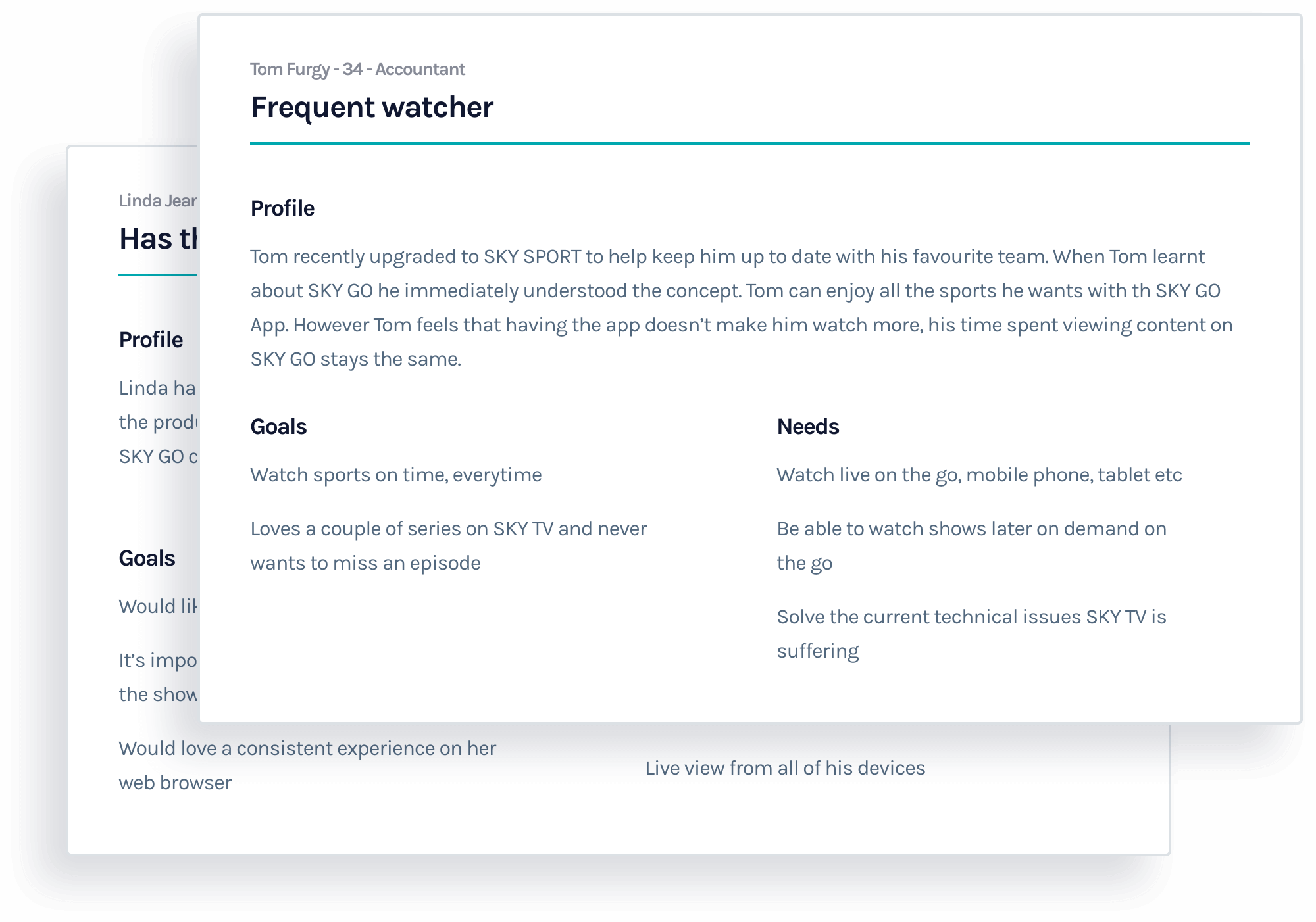
In order for us to have specific users to build for, out of the research we did we created two types of users so we can refer to during the design and development process.
08
Research
Competitor Analysis
We carried a detailed competitive analysis with other companies that had similar products to gain an understanding of what they’re doing, what is working for them and what isn’t.

09
Research
Epics & Design Stories
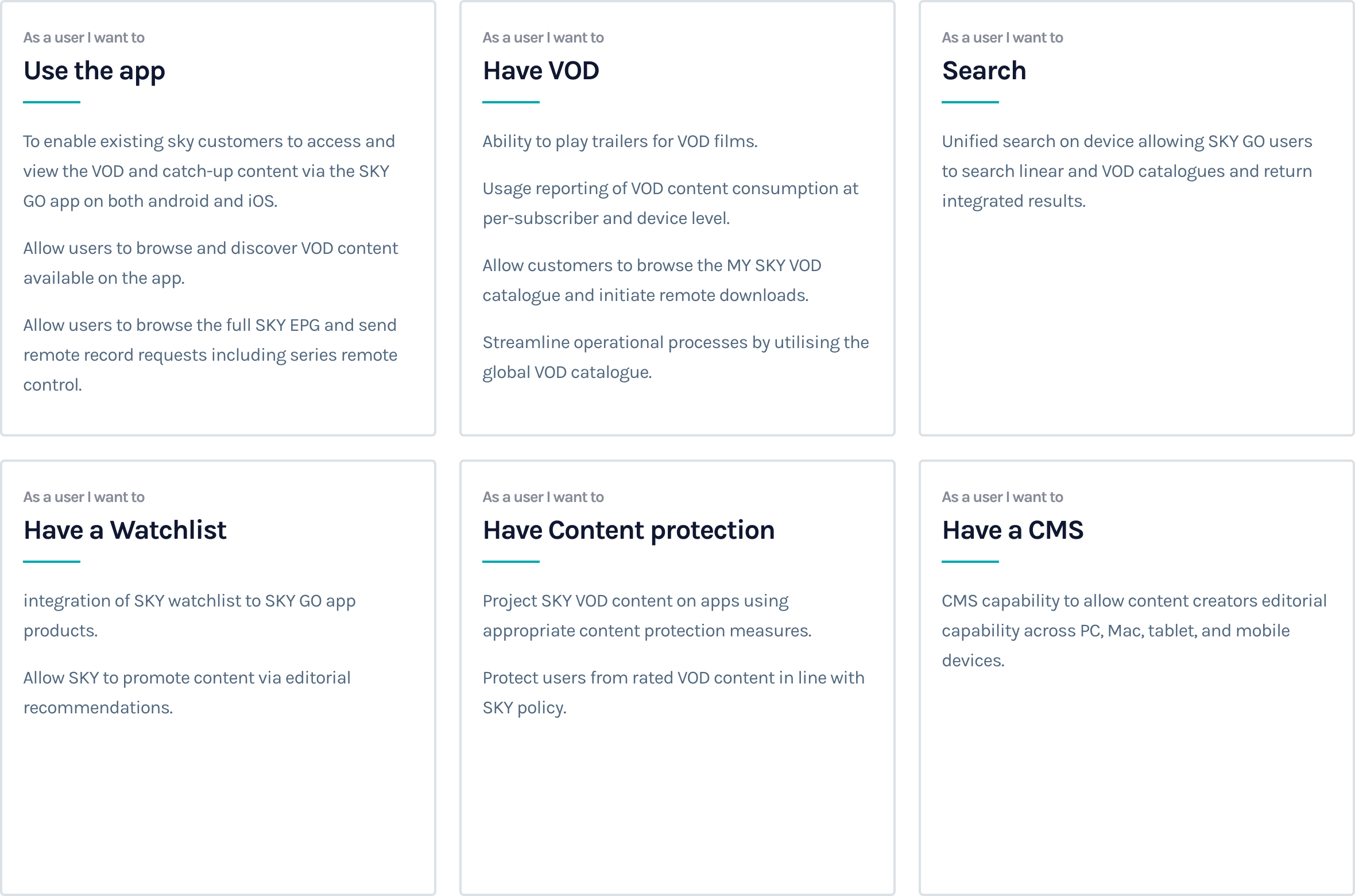
Epics are stories provide an overview of the features. They helped us think through the design decisions, to create and provide a useful user experience.
10
Research
Business Requirements
Based on the research we carried and some user surveys and interviews that we had we were able create some solid business requirements to reach our user and business needs.

11
Product Development
The Product
After the research phase we moved in house with the SKY team to work closely with the stakeholders to ensure the outcome would be as great as it can be. We carried out daily standups and weekly presentations to make sure everyone was on the same page.

12
Product Development
Existing Product
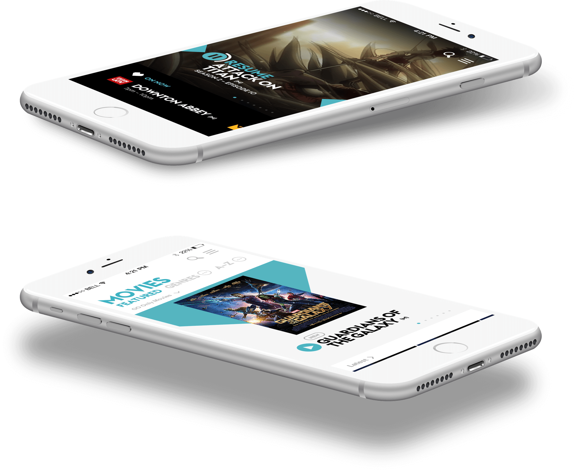
SKY GO apps were built by a different agency and our job was to help consolidate UI patterns already established in the SKY Go apps and translate them into an enhanced website experience. We started looking at what we already have on hand.
13
Product Development
Existing Patterns
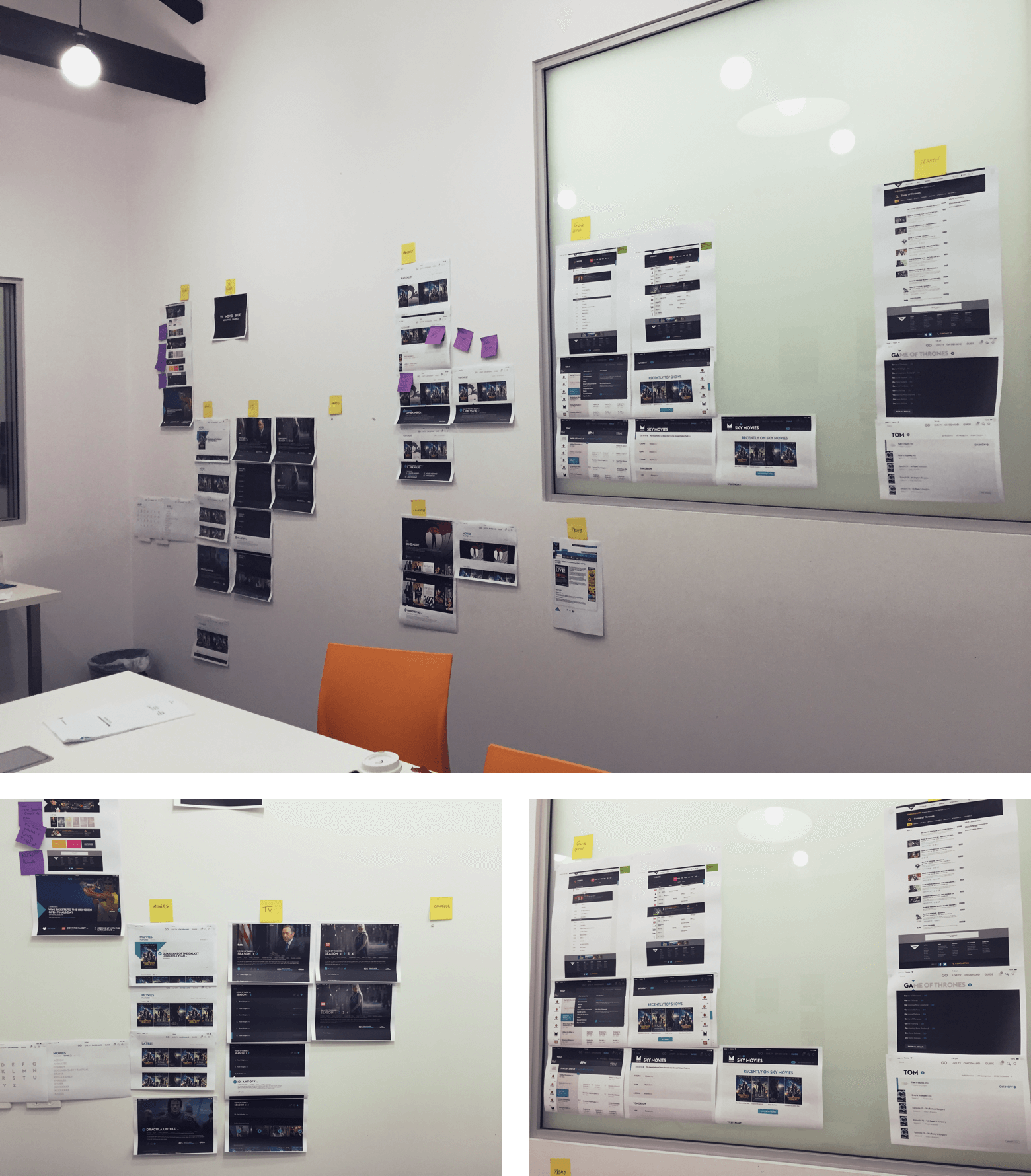
We wanted to make sure that the UI and UX from the apps to the website were not too far apart and only make changes when necessary, we started by looking at and studying every app screen we had access to in the right flow and took notes.
14
Product Development
Service Concepting
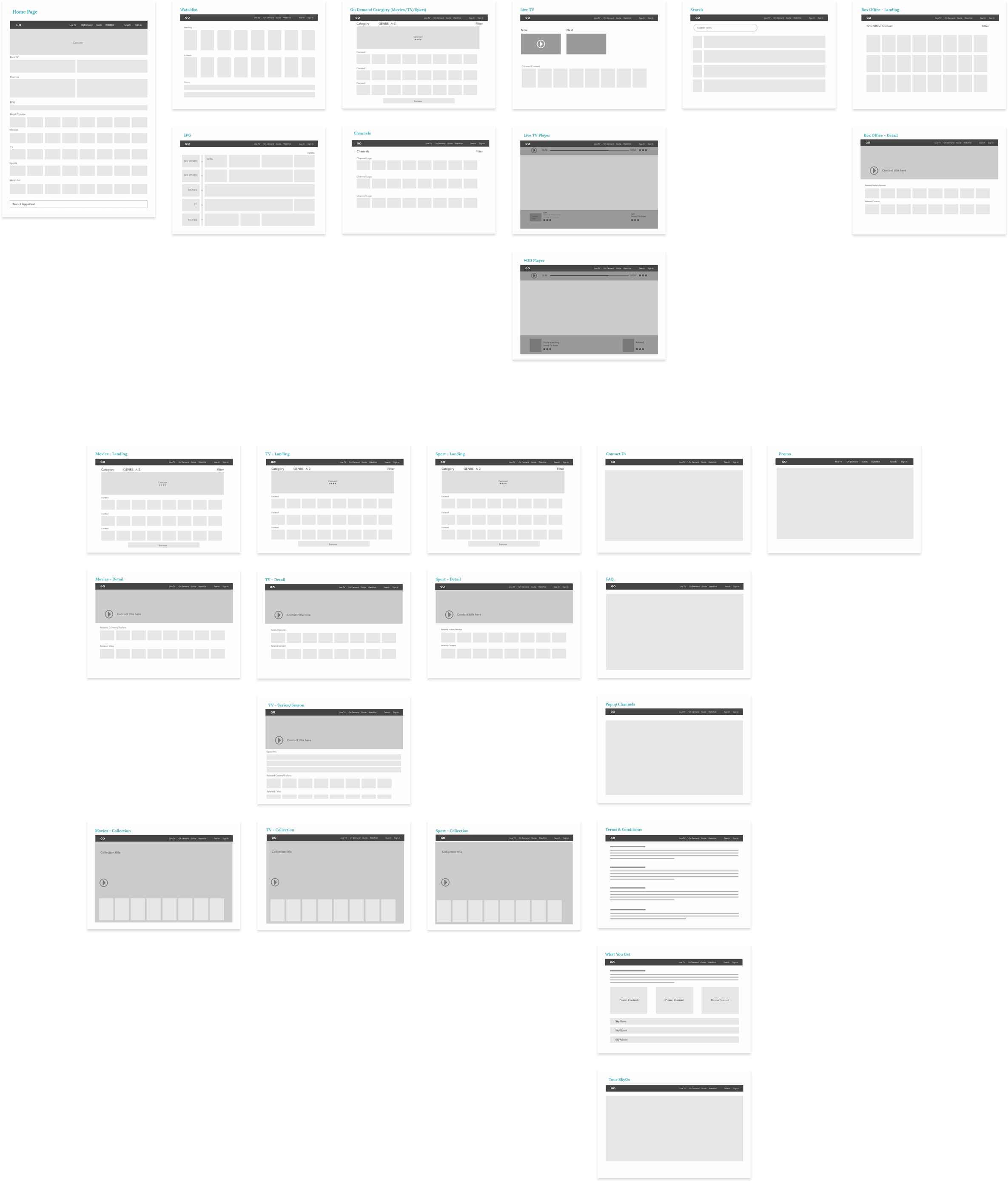
After we figured most of the flows and UX patterns, we went back to the business requirements and user requirements and we started planning out the different sections and modules each page required.
15
Product Development
Service Mapping
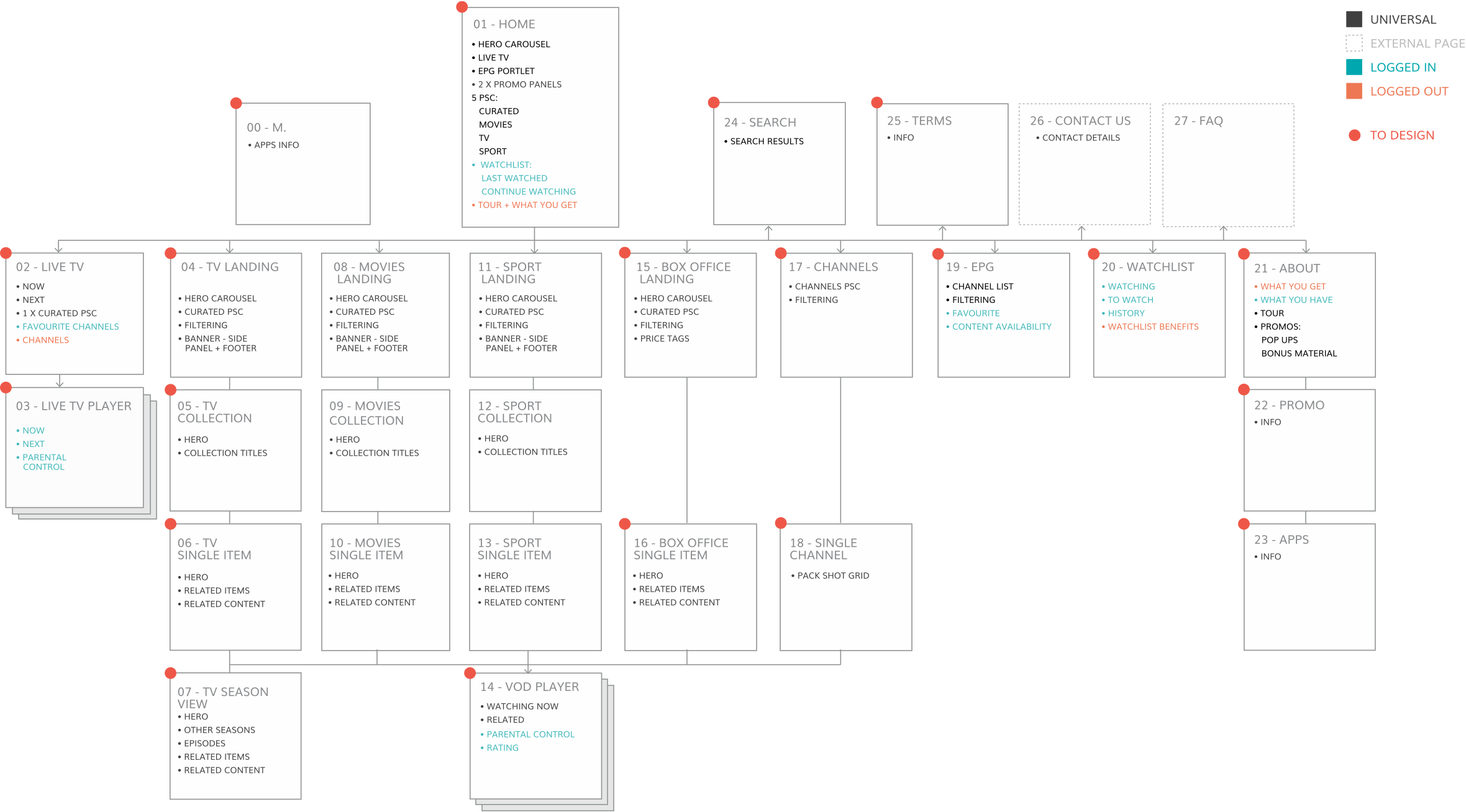
We wanted a point of reference and user flows to design from and this required us to do a quick service map of the entire system and get it approved by the stakeholders.
16
Design System
Style Guides
SKY worked closely with a branding agency to develop their new identity and we were given specific brand guidelines to follow.

17
Design System
Typography
We used the typography provided by the SKY branding palette to keep a consistent experience across all of their apps.

18
Design System
Color Palette
As mentioned before Sky’s branding was pretty on point, however we had to change some of their colors slightly to make them more accessible friendly.

19
Design System
Iconography
We worked closely with the branding company and SKY to develop a nice and consistent iconography across all apps and websites. The icons resembled the SKY brand and identity.
20
UI Design
Outcome
Working closely with the SKY team we created their web application as modular and flexible as possible, we documented everything thoroughly for the development team and the SKY team.

21
UI Design
Grid
Working closely with the development team we decided on a 12-column grid system, they were building their framework from scratch and we designed the following grid system.

22
UI Design
UI Components
We started working on patterns and UI components using the service map that we designed earlier.

23
UI Design
States
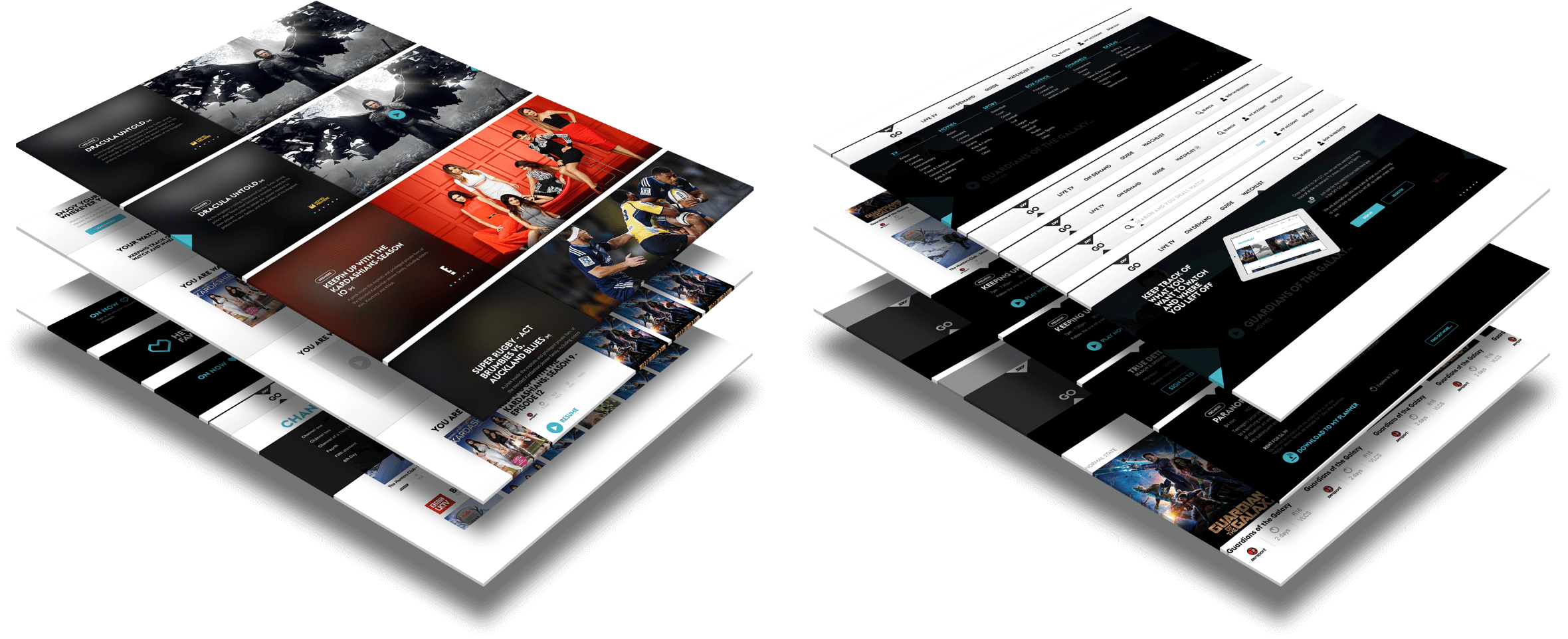
Throughout the design we had to think of the different states every user might experience and design all screens accordingly.
24
UI Design
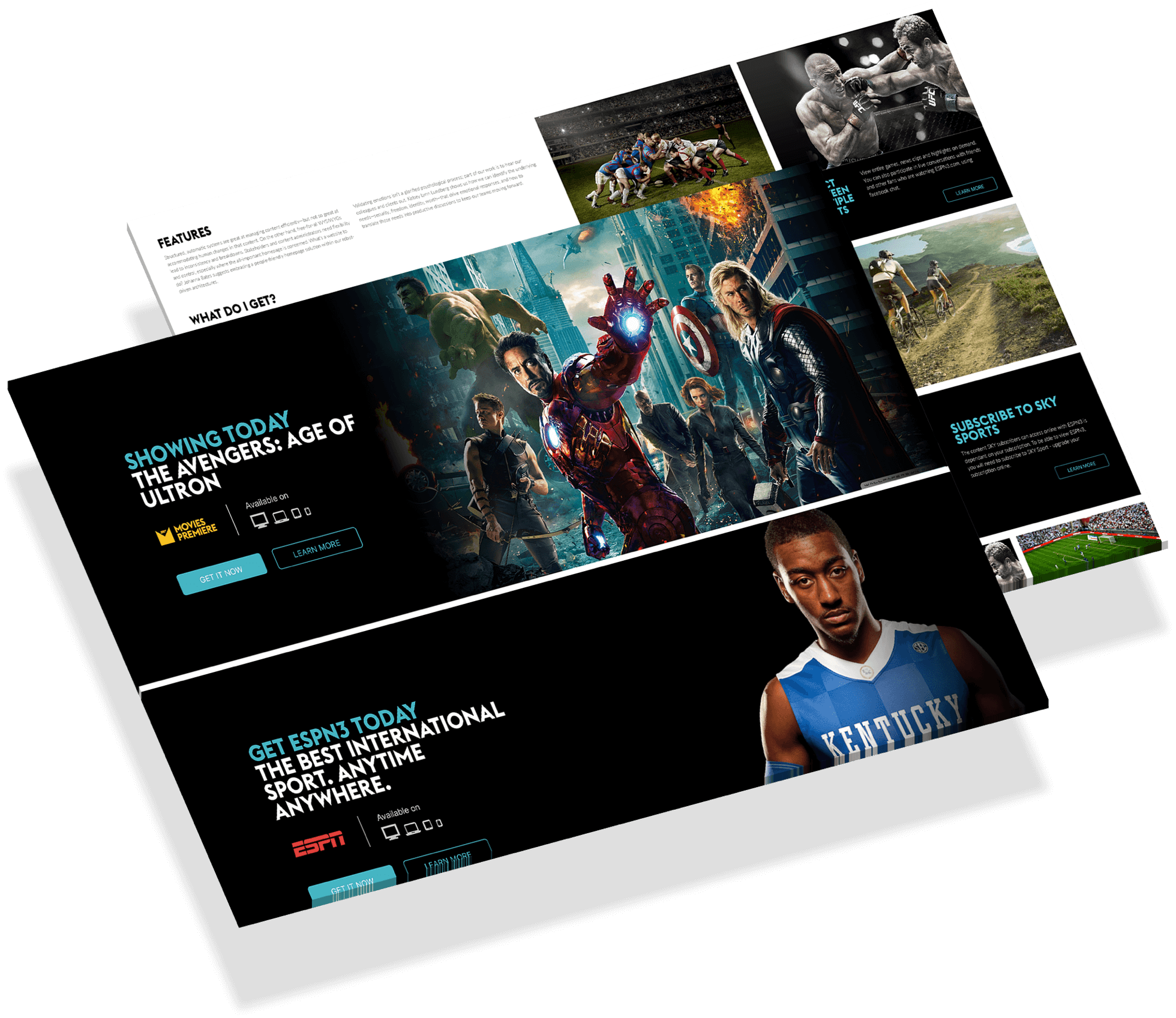
Modular CMS
SKY content creators also required to be able to create their own content and custom pages using their custom CMS system and this required us to create modules they could use throughout the site.
25
UI Design
Web App
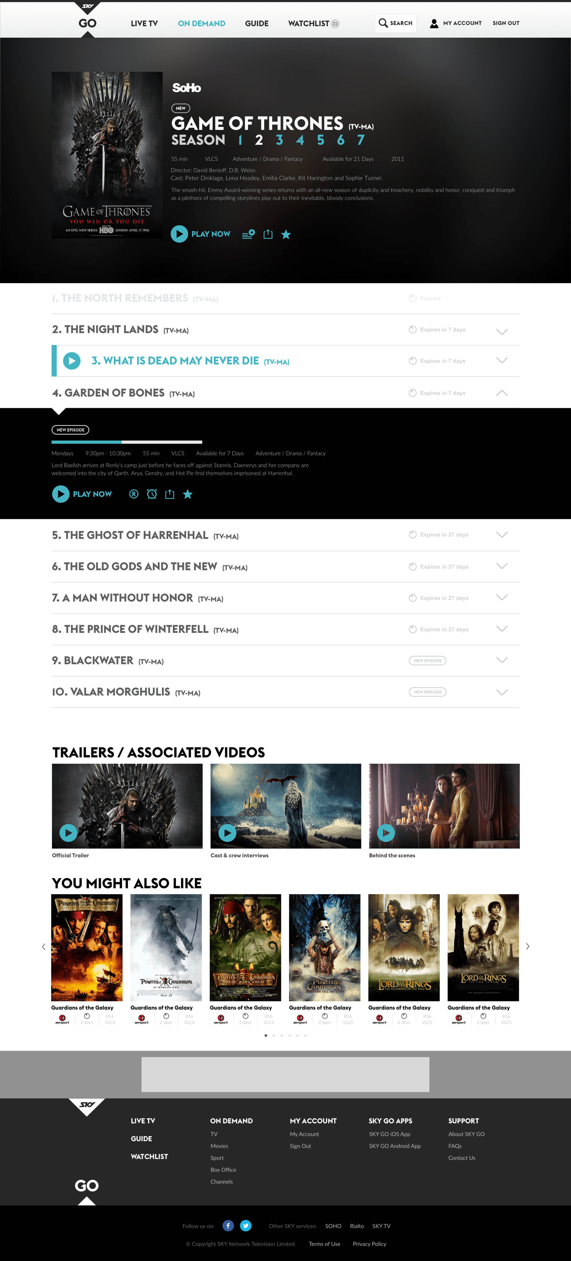
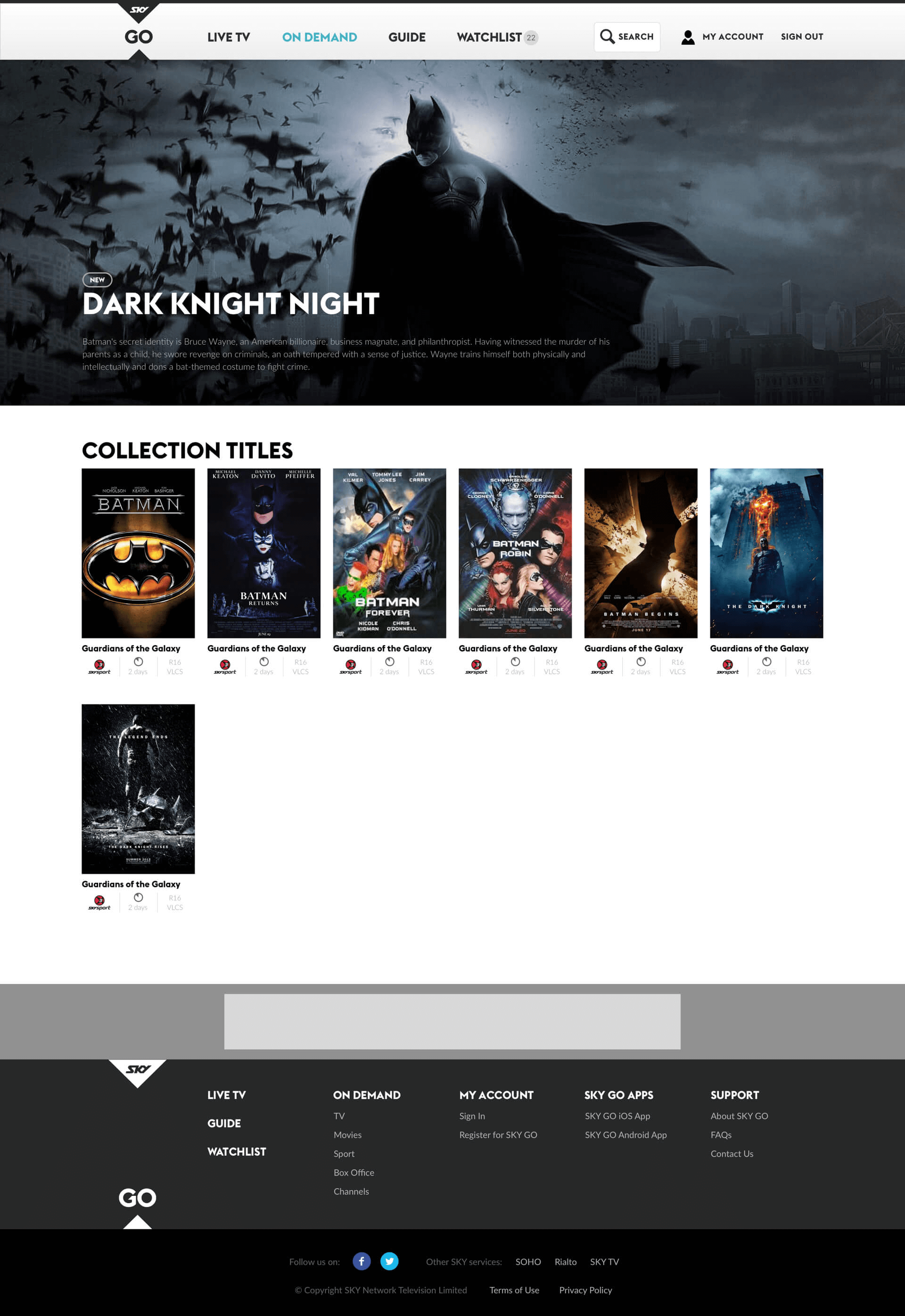
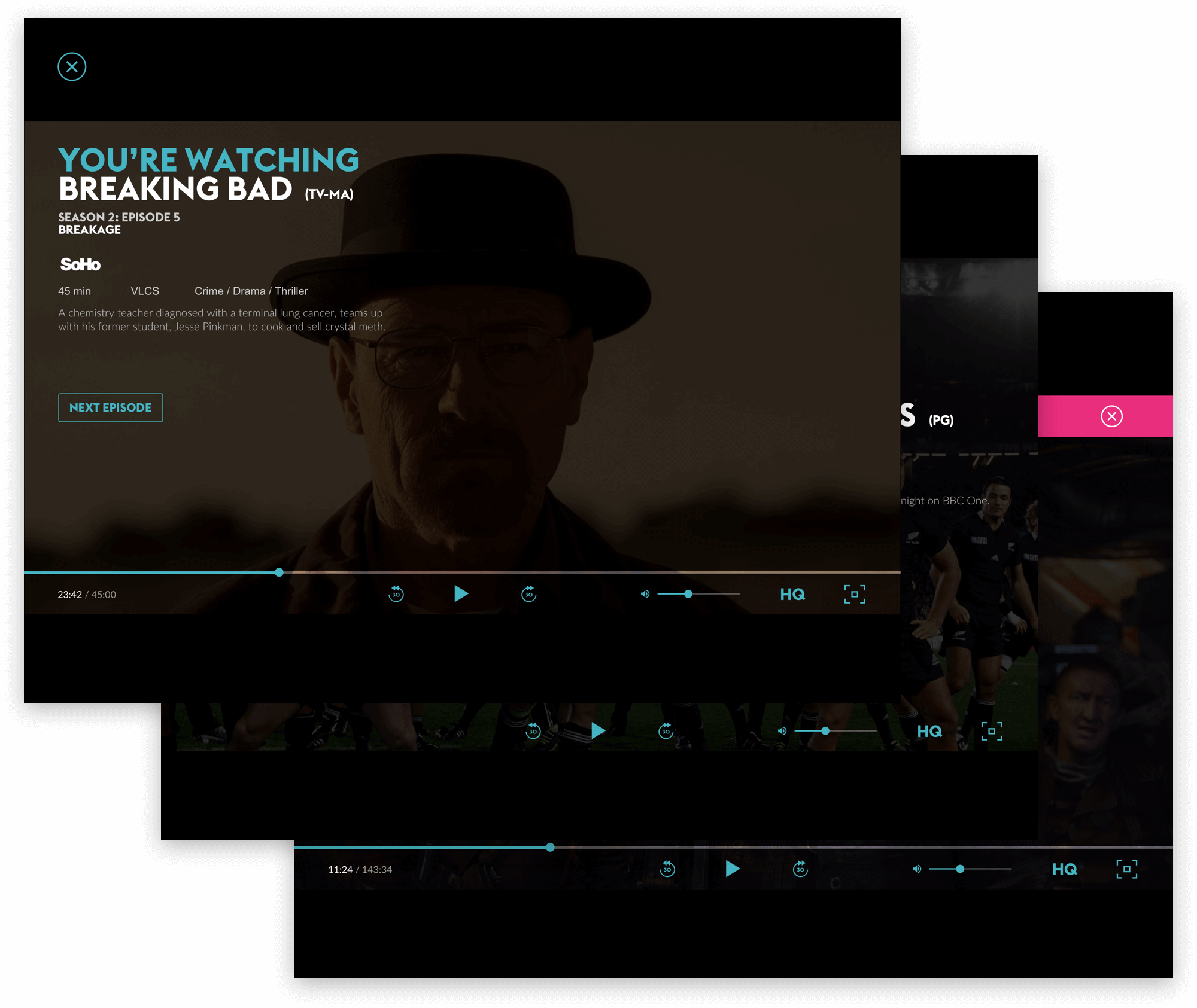
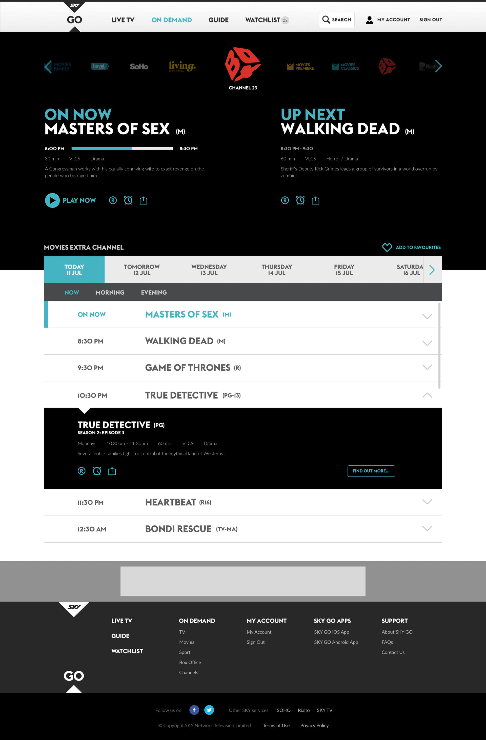
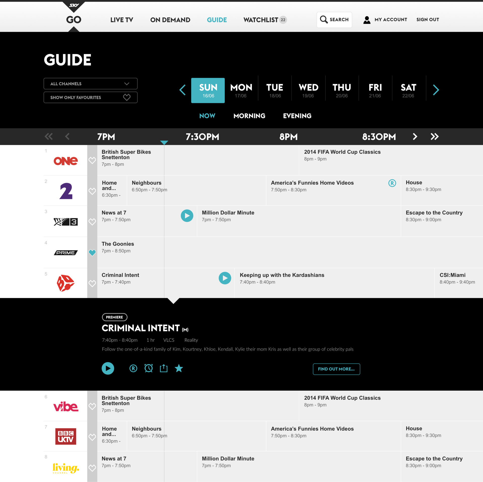
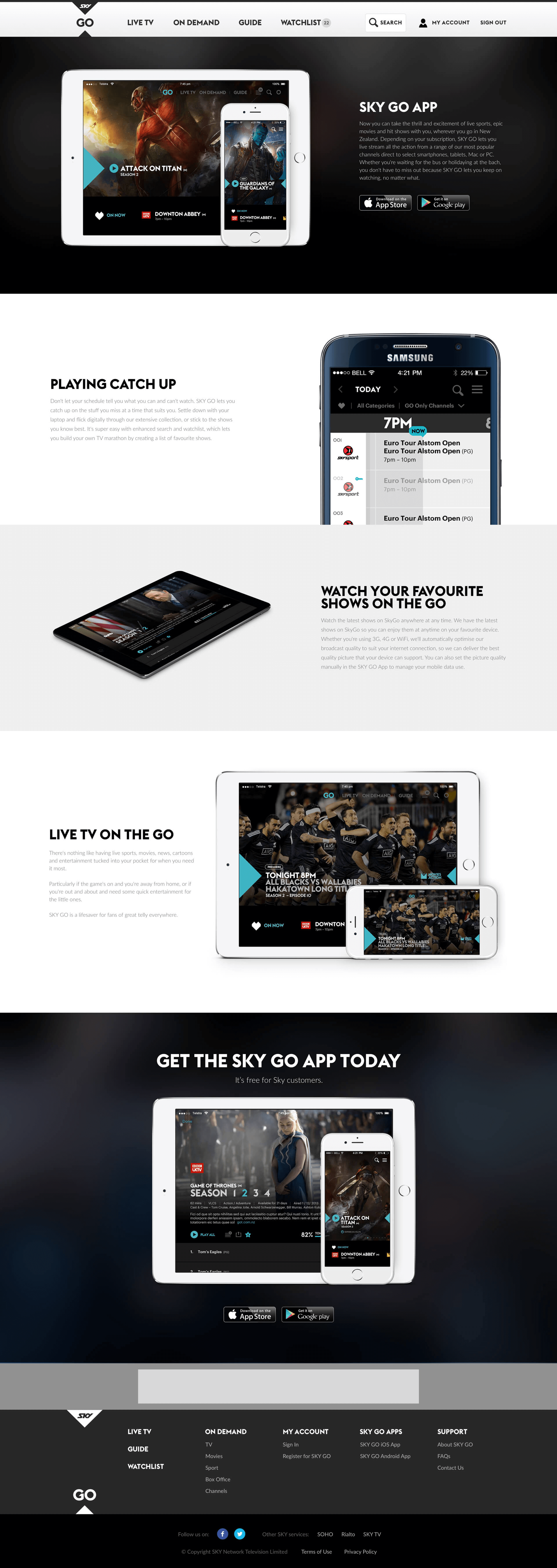
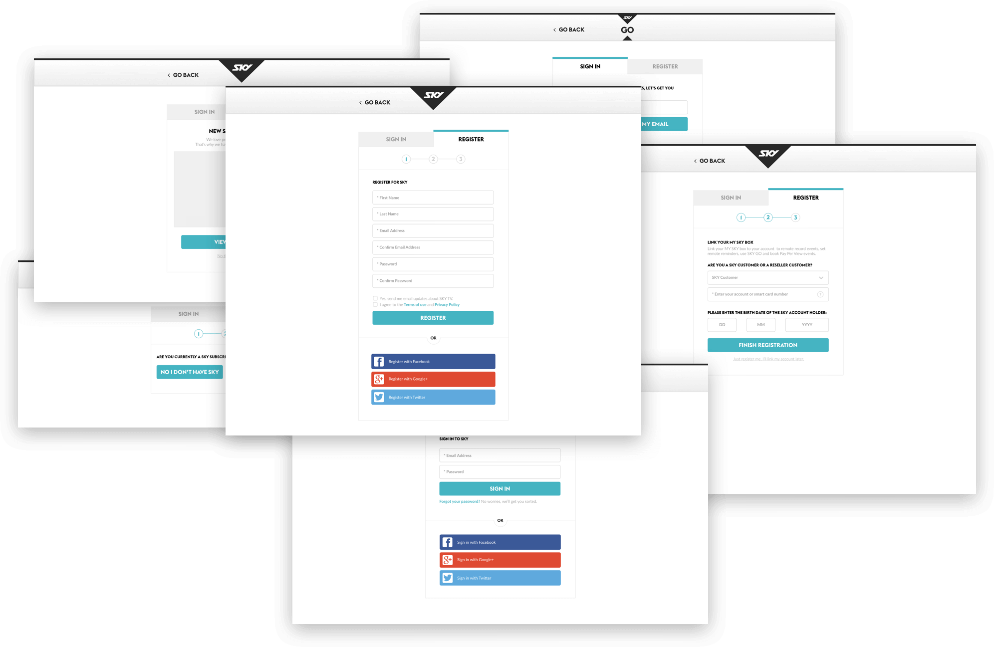
Putting everything together, the following is the collection of some of the screens that we designed for SKY.

26
The End
Up Next
Wow! Time really does fly when you’re having fun. I’m afraid this case study is just about over. But I’ve prepared a few more for you so there’s no need to panic (yet).