Booking & Ordering
Digital Order Experience
Foundry is a beautiful small cafe located in Sydney known for their amazing coffee and food experience and customers can enjoy wait-less food and coffee. They let customers pre-order and pay for food and coffee? so it’s ready when they arrive.
01
Overview
About the Project
Foundry project is a beautiful digital service for the Foundry Cafe. Time management is important and this app helps customers to get what they want when they want it without wasting any unnecessary time, it also allows for quick payments, automatic rewards program and much more.
I led the design of Foundry digital experience, iOS, Android, Watch OS and Web since the outset of the project in 2016. Up until 2017, I led efforts to evolve the service and address customer pain‐points related to the browse and discovery experience. Below is a diagram to show the process that we took through this project.

02
Objectives
Identifying the Problem
Foundry is a small cafe with large volume of daily customers, they find it hard to manage all of their orders with the number of staff that they have onboard, the kitchen is super small and they can’t relocated as they have the perfect location with almost no competition around, however they can’t keep up with the volume of the orders and they can’t hire any more staff because of the size of their cafe.

03
Objectives
The Challenge
The owner wanted to Improve customer experience by allowing customers to easily be able to place orders, pay and book without hiring more staff. Creating deeper relationships with customers via digital channels may help overcome some of the barriers.

04
Research
Background
After identifying what we needed to do and figured out how to measure success, I tried to stay focused through the research, by making it short and effective. I gathered as much data as possible from user feedbacks, technical reports, etc. I also created a detailed competitor analysis that gave us insight from current similar apps which helped us to meet the priorities and to serve the best possible solution for the business and their customers.

05
Research
Vision
The research allowed us to create a vision and a unit of measurement for success throughout the project.

06
Research
Persona Development
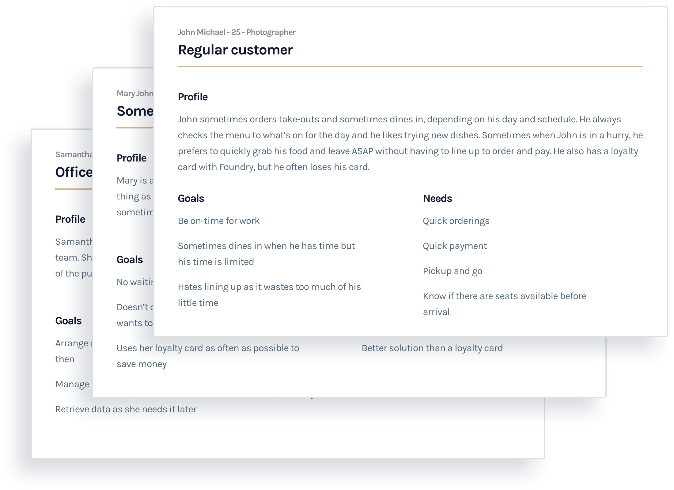
In order to test our ideas and hypotheses, we interviewed people and created some fictional characters, to understand possible scenarios and problems we were trying to solve.
07
Research
Epics & Design Stories
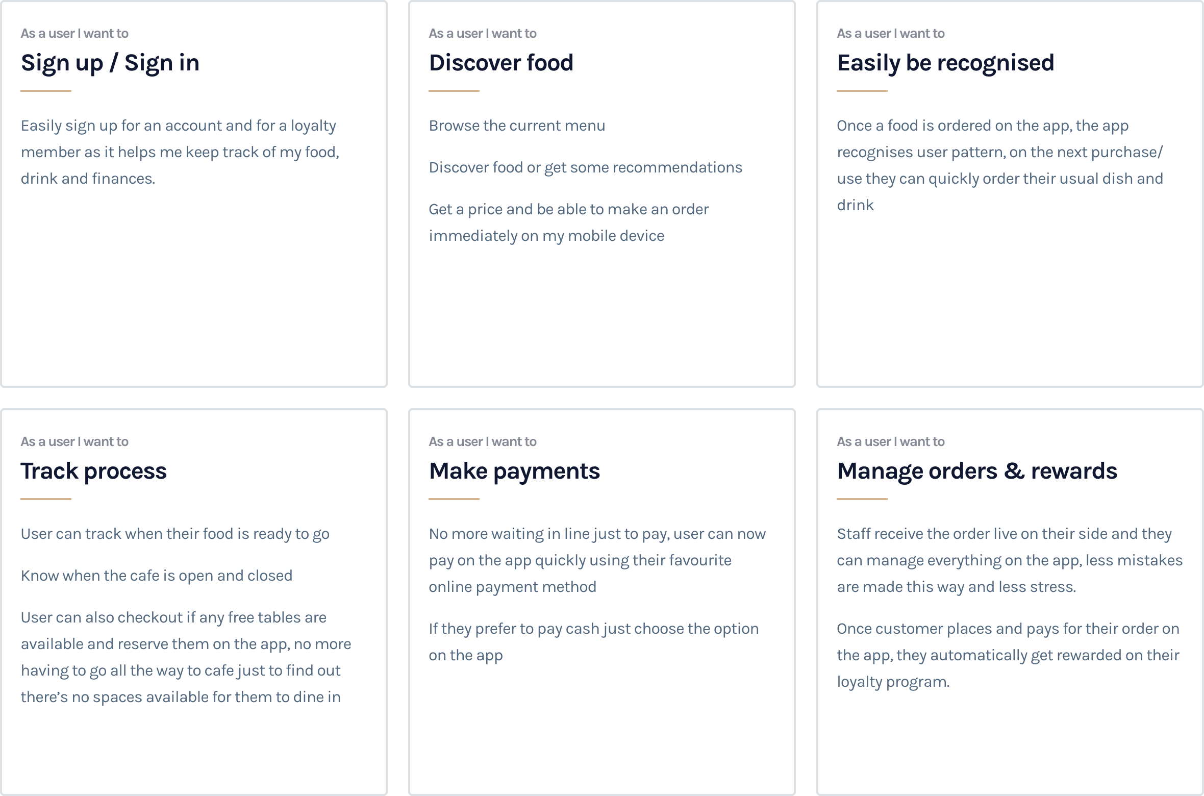
These helped us gather an understanding of the feature-set we needed to come up with in order to satisfy the use cases.
08
Product Development
The Product
I partnered with the project manager to uncover insights and translate concepts into features that address customer behaviours and motivations. I created frameworks and prototypes to share the vision, design principles and content strategy. This helped to evangelise ideas, gain alignment and drive decision making. I evangelised customer goals and balanced business goals. I prioritised and negotiated features for launch and beyond. I designed down on Android, iOS mobile, Watch OS and the Web. I executed journeys, wireframes, prototypes and design specs.

09
Product Development
Information Architecture
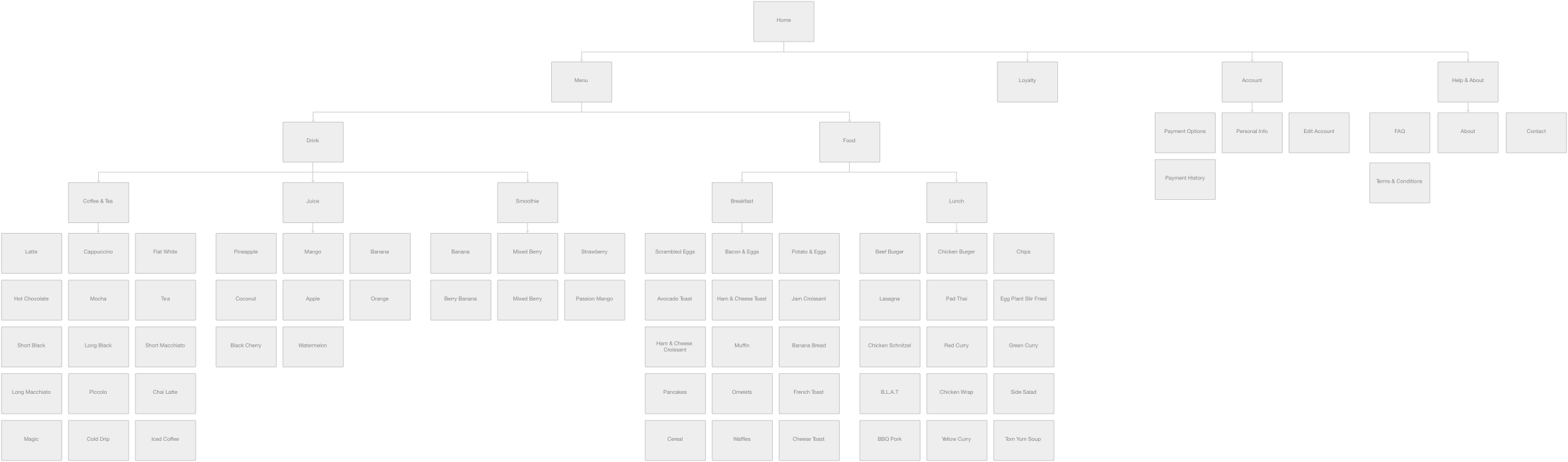
We started out with mapping out the architecture of the product, this helped us come up with our initial mapping and menu system.
10
Product Development
User Task Flow
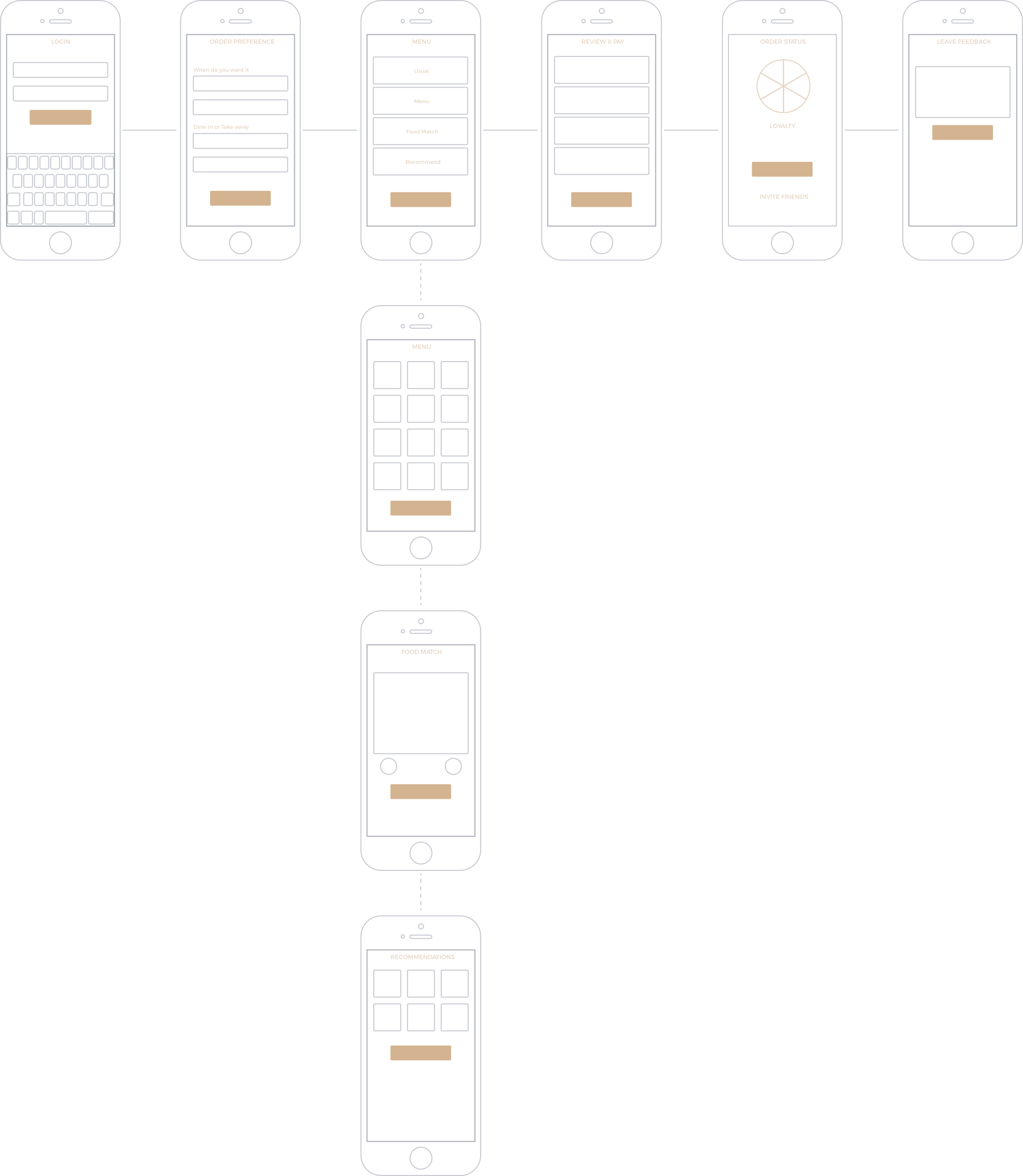
The user task flows helped us to think through the design, before a feature is actually developed. It helped us to interject the user into the flow of the application, and determine if the conceptual model agrees with the user model.
11
Wireframing
Wireframing
The next step was to visualise the user task flow. I started with some quick sketches and continued with creating high-fidelity mockups.

12
Wireframing
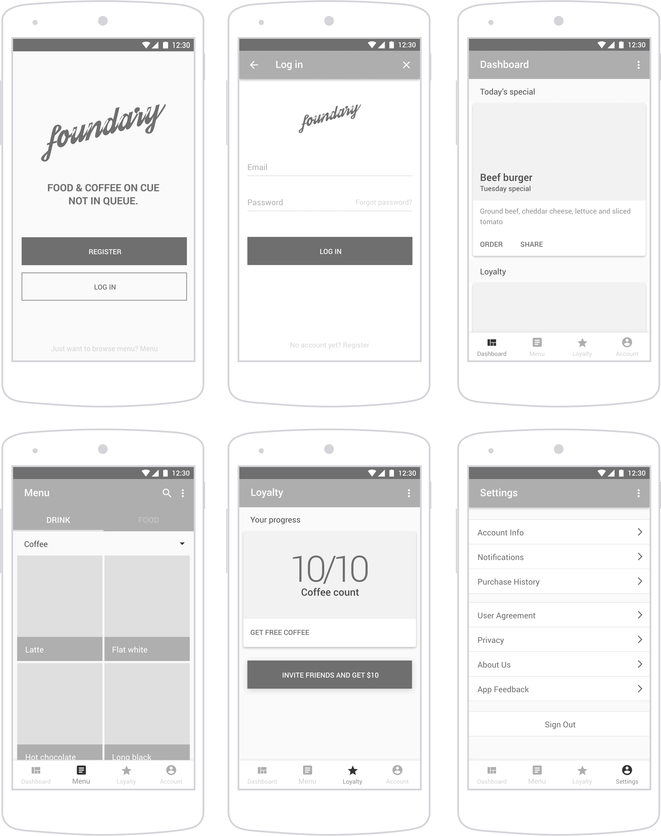
Android Mobile
Starting out with the main app, using the information we gathered and flows that we had, from previous research, I was looking at the different user experiences that each platform follows, using Google Material design for Android I started designing the interactions and flows.
13
Wireframing
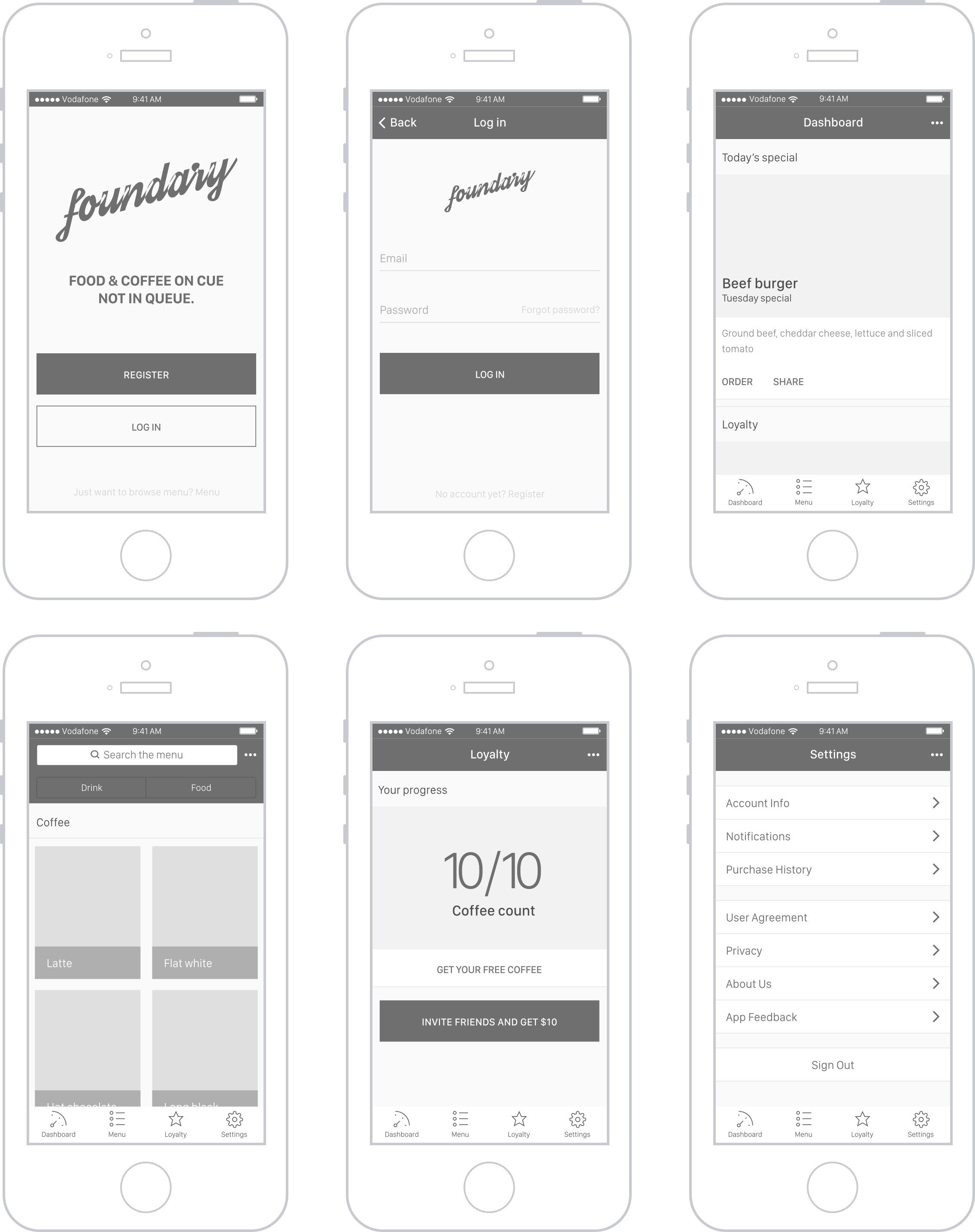
iOS Mobile
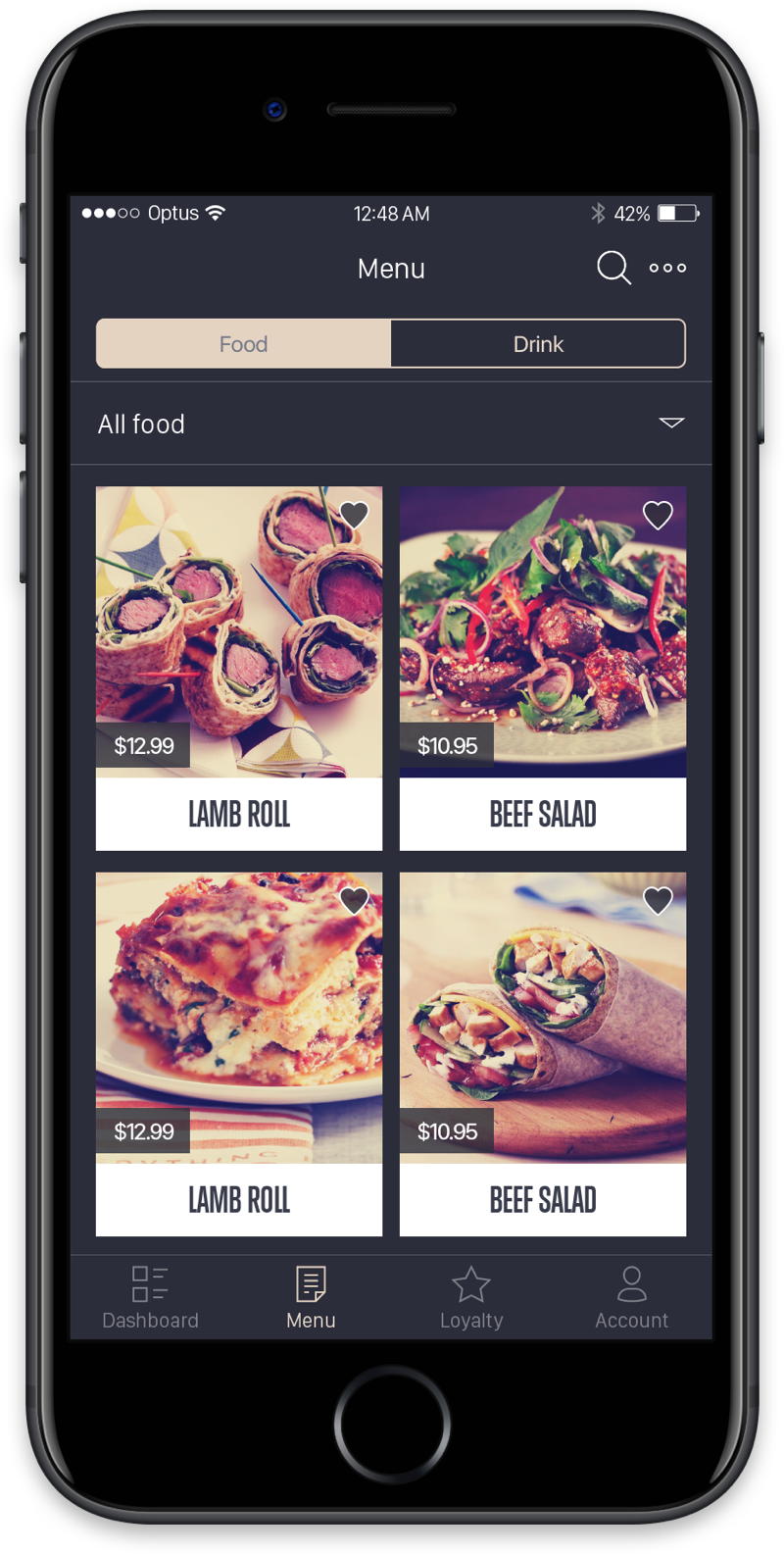
Starting out with the main app, using the information we gathered and flows that we had, from previous research, I was looking at the different user experiences that each platform follows, using iOS Human Interface Guidelines for iOS I started designing the interactions and flows.
14
Wireframing
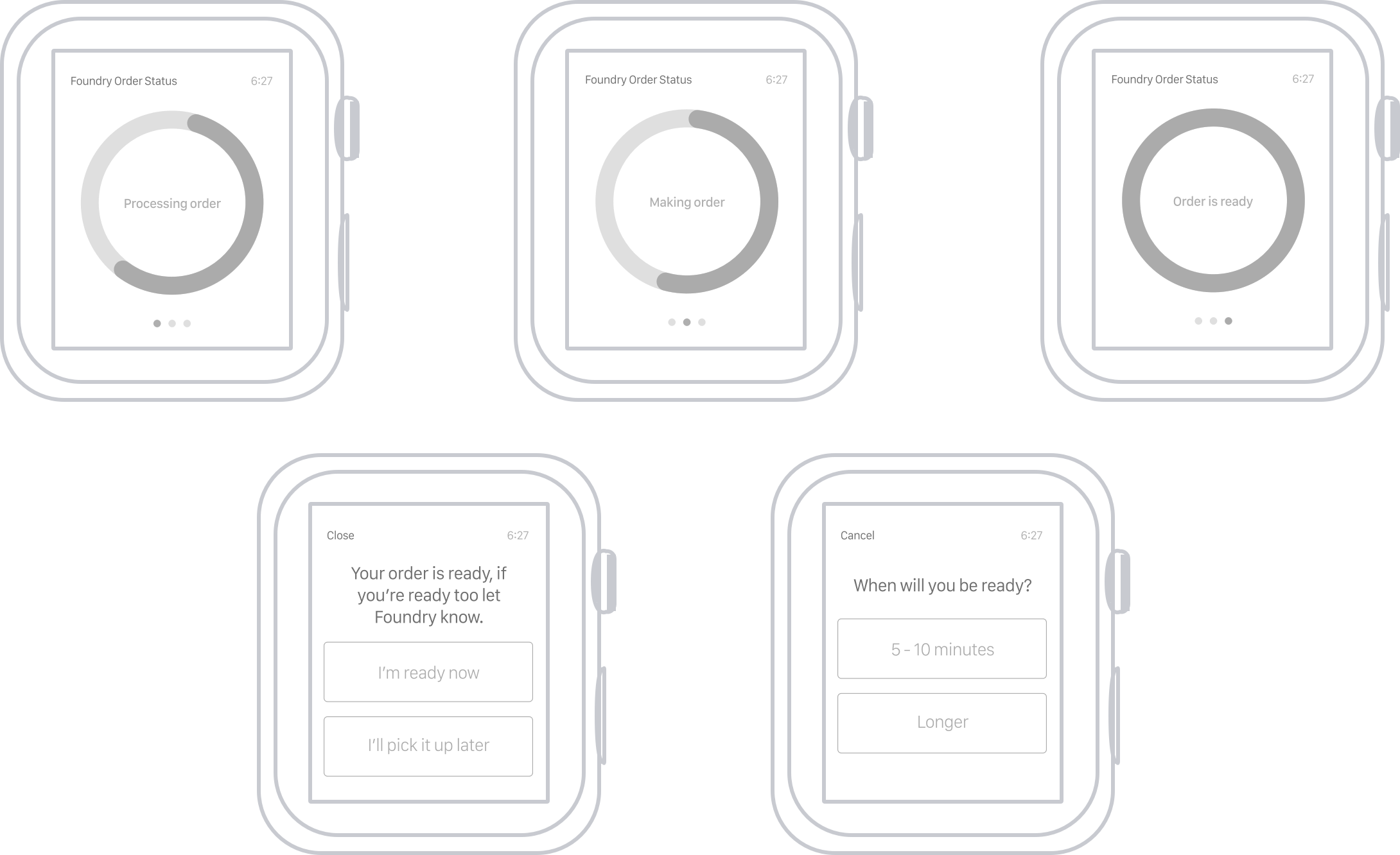
Watch OS
The Watch OS app was meant to be a quick notification tool for users with the device, understanding that not everyone would have an Apple Watch, the interaction doesn’t take away from the main experience but it compliments it.
15
Wireframing
Website
We decided the website is going to be place to advertise the apps and also to provide very basic contact information as we realised through user research that not many people use the website to place orders.
16
analytics
Test & Validation
We went through multiple A/B tests and user testing session during the entire process to validate our hypothesis and ideas, when the budget wasn’t there for testing we tried to validate our ideas via Gorilla testing and a lot of analytics and A/B tests.

17
Design System
Style Guides
The style guide was the primary visual DNA of Foundry cafe, I wanted to mimic from the characteristics of the cafe itself as much as possible and since they had a very unique vibe, this wasn’t too hard.

18
Design System
Typography
The style guide was the primary visual DNA of Foundry cafe, I wanted to mimic from the characteristics of the cafe itself as much as possible and since they had a very unique vibe, this wasn’t too hard.

19
Design System
Color Palette
The style guide was the primary visual DNA of Foundry cafe, I wanted to mimic from the characteristics of the cafe itself as much as possible and since they had a very unique vibe, this wasn’t too hard.

20
Design System
Iconography
With the iconography we wanted to use subtle and consistent designs across all apps and the website, We also wanted icons to look simple and be as informative as possible in trying to communicate with the user and support their text.

21
UI Design
Outcome
The outcome was a set of successful apps for a few different eco-systems like iOS and Android.

22
UI Design
Android App
In order to put the android app UI together we referenced the Google Material Design for UI elements and interactions as much as possible, we used Foundry style guides, fonts and colors to keep thing consistent across the products.
23
UI Design
iOS App
In order to put the iOS app UI together we referenced the iOS Human Interface Guidelines for UI elements and interactions as much as possible, we used Foundry style guides, fonts and colors to keep thing consistent across the products.
24
UI Design
Watch OS
In order to put the Watch OS UI together we referenced the Watch OS Human Interface Guidelines for UI elements and interactions as much as possible, we used Foundry style guides, fonts and colors to keep thing consistent across the products. The purpose of this app was to add to the experience without taking anything important away, users still get notifications on their phone but integrated with the watch was a more convenient experience for the users.
25
UI Design
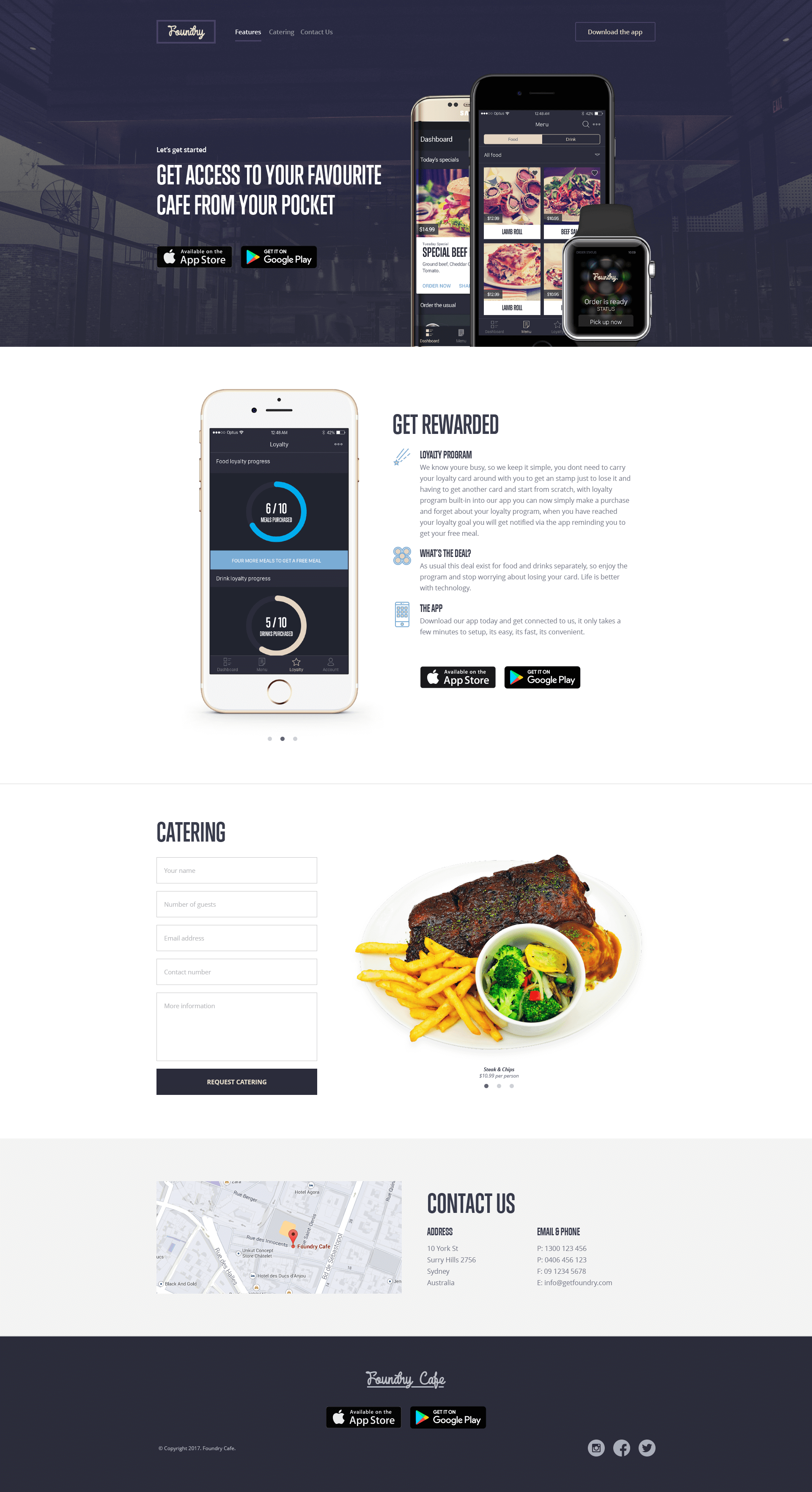
Website
The web landing page was a tool for us to allow users discover the app, find simple information about The Foundry and to book catering as required.
26
The End
Up Next
Wow! Time really does fly when you’re having fun. I’m afraid this case study is just about over. But I’ve prepared a few more for you so there’s no need to panic (yet).