
Construction & SaaS
AI Property Insights
Archistar is the world-first artificial intelligence that helps property professionals find profitable development sites, assess for feasibility and generate dozens of architectural design strategies – all within a few minutes.
01
Overview
About the Project
The stickiness of the app. When a new customer logs into Archistar Property for the first time our primary objective is to provide them with great experience within the product - it’s critical we make a great first impression. We want to ensure our customers understand the value of the product and they have success in using it and return within the next 48 hours to use the product again and we see ongoing usage. (Daily Active Users is a key metric we track). Today, the first time experience for a user within Archistar Property on login is no different to the second, third or even the 100th time they login. User’s today can schedule a training session, where one of our training team will conduct a product demonstration via a phone call and screen sharing One on One with the customer. However, there are two main problems we have identified with this approach: One on One training demonstrations won’t scale as Archistar’s user growth does. The product is reasonably complex and has deep functionality, and although the demonstration does help, the first time a customer uses the product they may not retain all the knowledge from the demonstration. We know this, as we often get follow up emails and phone calls to our support team how to complete tasks.

02
Objectives
Identifying the Problem
After having a look at the platform and being empathetic towards the user (non-tech-savvy in their mid-30s to 40s) the platform is too jarring on the first visit, the colour choices are also a bit off, there’s no focus, things are complex for no good reason and there’s no support when I need it as a user and there’s no sense of direction, so let’s try to fix these.

03
Research
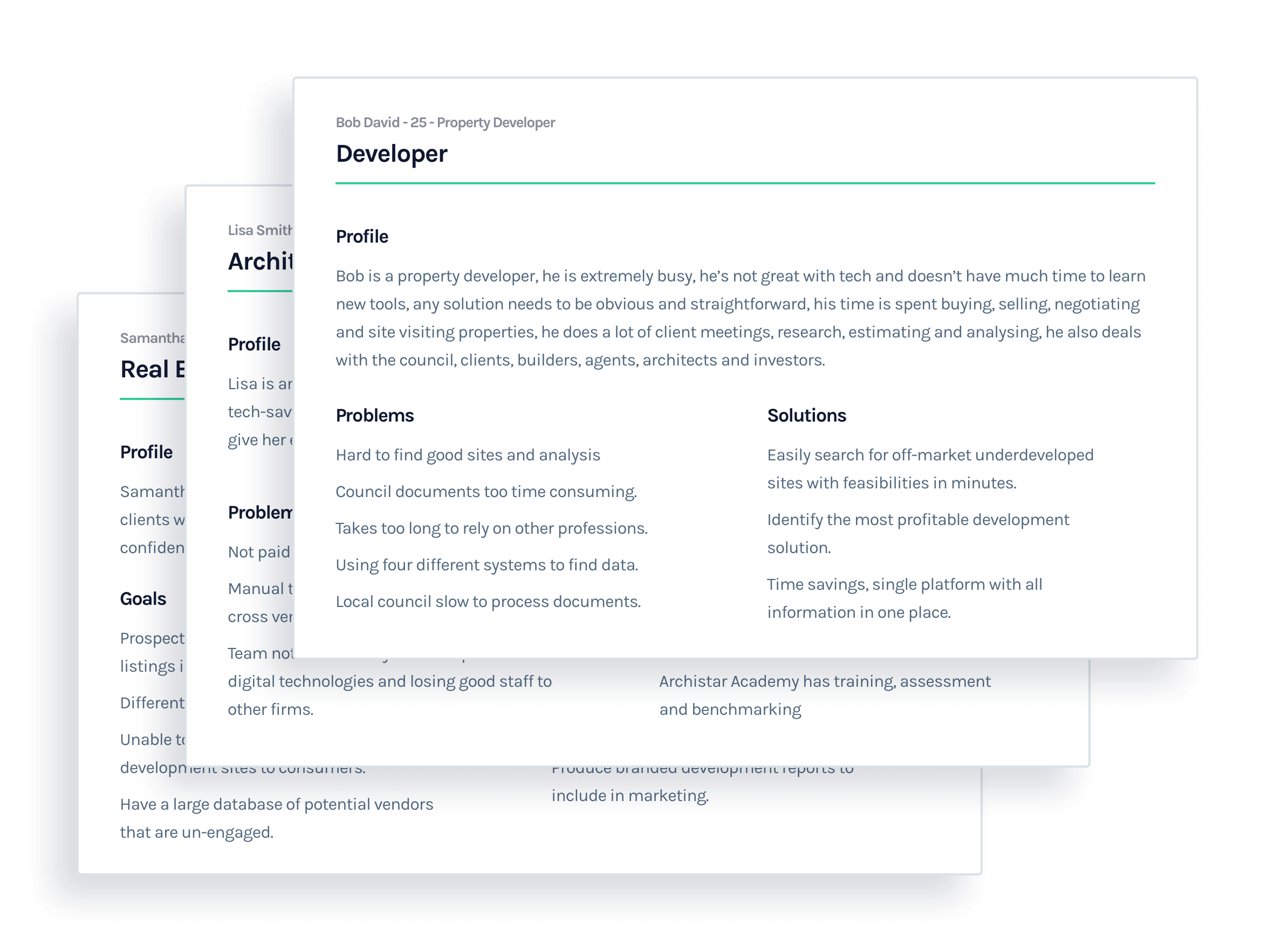
Customer Segment
The Archistar customer base is made up of many types of property professionals, the primary users today are Property Developers and Real Estate Agents. Importantly though there are also users within Architecture, Government and Property Management (property rentals).
In this design because of the lack of time we are going to focus on the two more primary users, Property Developers and Architects as they are the 70% and 20% segments of our users. Since I don’t know much about either of these two fields let’s do some research.

04
Research
Fixing Existing Personas
There are two problems here, the current personas provided are too focused on the problem and solution and not the user themselves. In order to design the perfect solution for a specific customer we need to understand the customer, things like their age, sex, needs, everyday activities and the time of the day they are more likely to use this product to solve specific problems. The reason is to be able to tailor the experience closer to the user needs and approach a more user-centric design.
05
Research
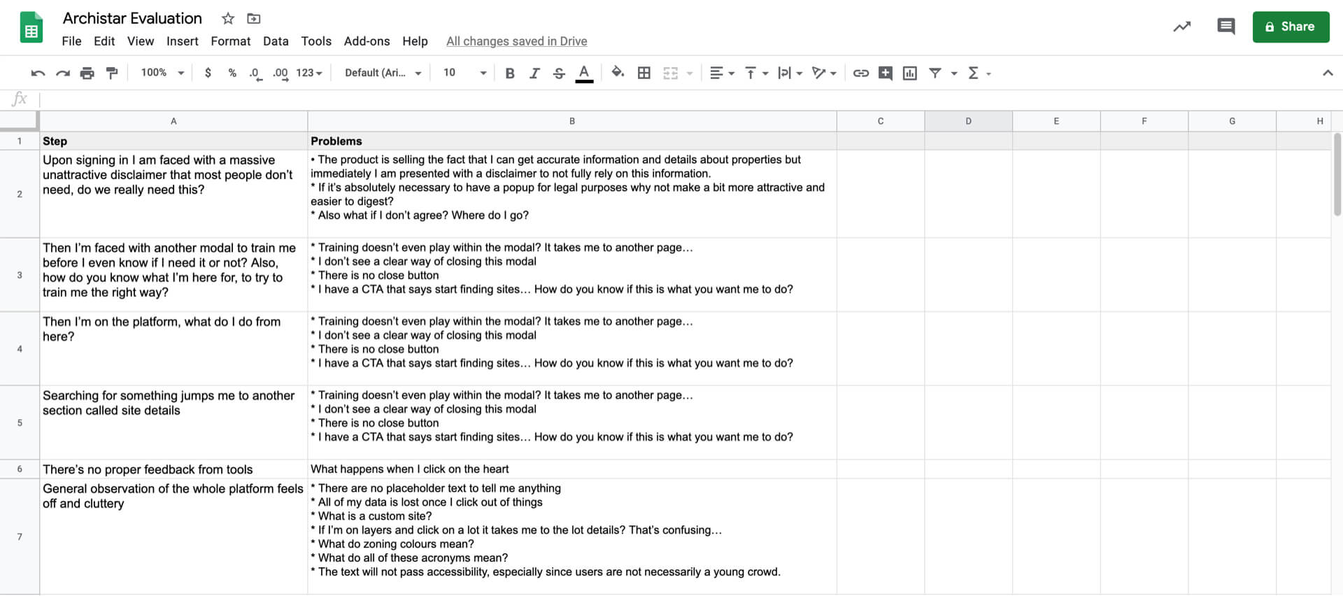
Heuristic Evaluation
I wanted to get an understanding of a user’s first impression of the app and I found the following issues. The common theme here was that there is no focus, the app feels confusing and unwelcoming, the fact that the app is really trying to push users to a tutorial video is a bad sign also the tutorials are 30minute long videos with no focus, our users seem to be busy professionals, there’s a no easing of the user, the architecture of the app feels cluttered and everything is fighting for attention, a lot of industry jargon that not everyone might understand, UI choices of colouring feels off and arbitrary and there’s no obvious help is available.
06
Research
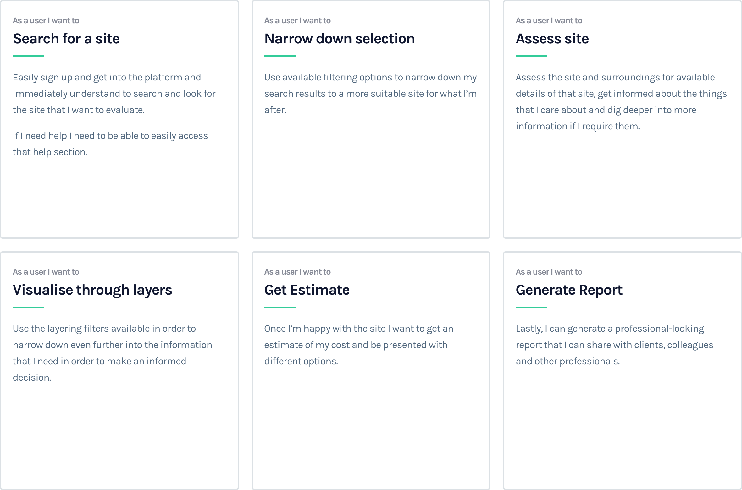
Epics & Design Stories
I also wanted to explore all possible touchpoints of a customer’s experience in order to recommend some more holistic form of experience.
07
Product Development
The Product
After running through the above exercise I wanted to have a few key focus area, I wanted to focus on a few different key interactions, upon arrival as a first time user what do I see, what are the key focus areas, where do you want me to go next, where do I go if I need help or tutorials.

08
Product Development
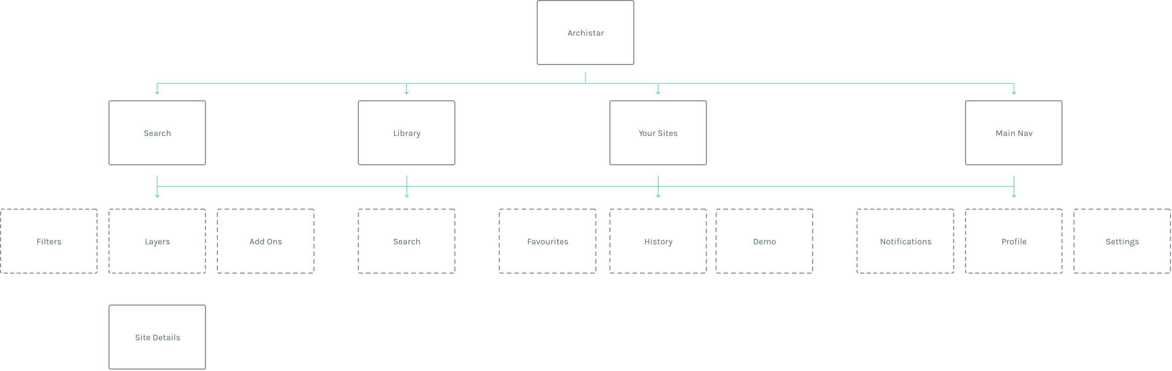
Better Architecture
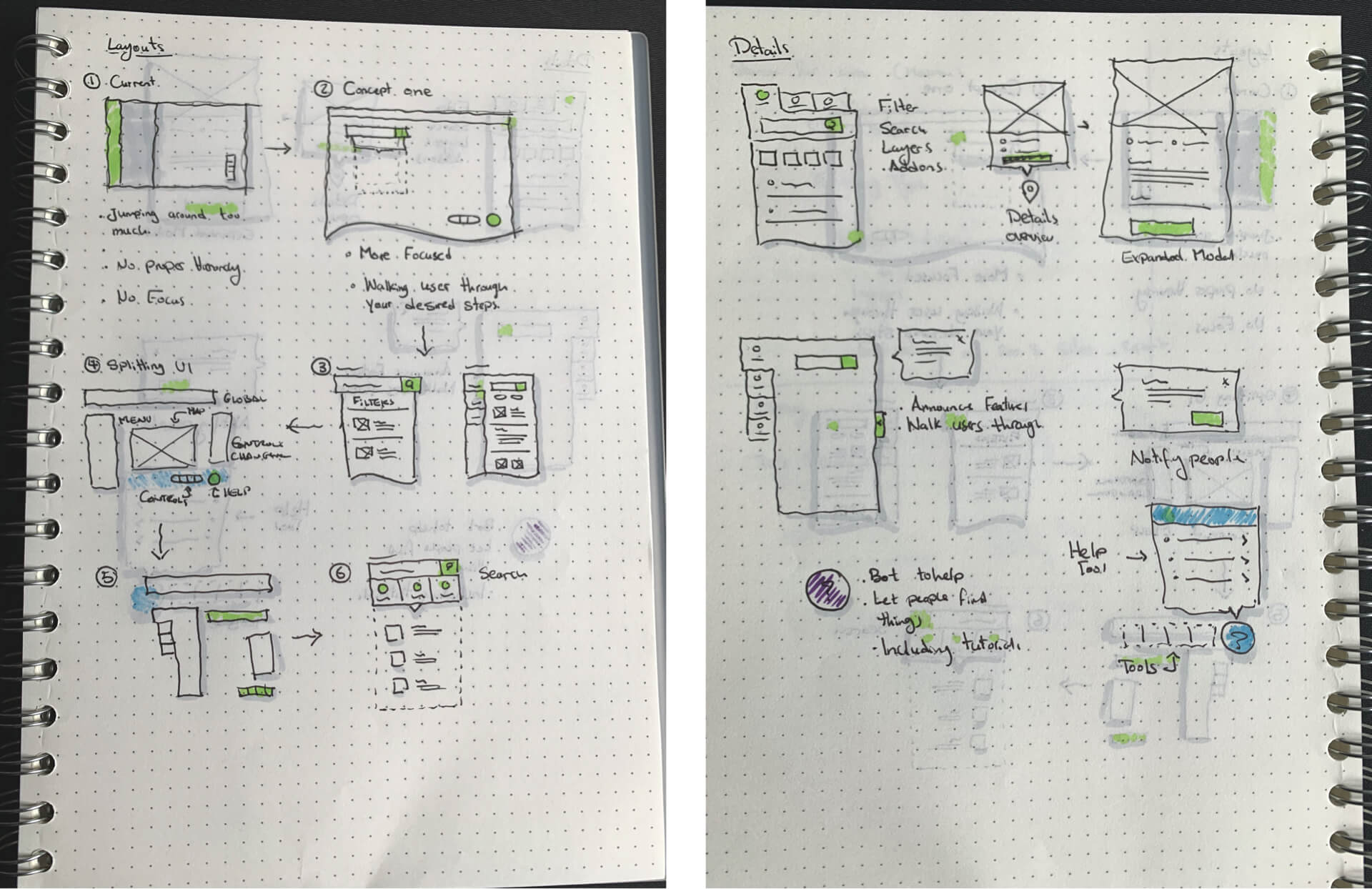
By mapping out the current IA I realised that this experience isn’t suitable for every customer segment, we can easily shuffle the IA per user to help them reach their goals faster, let’s go back to the needs of every customer.
The hypothesis here is that most users want to search, let’s bring that front and centre, let’s also spread things out a bit better, instead of giving everything the same hierarchy let’s bring out the more important things and group them relatively.
09
Product Development
Brainstorming Concepts
In order to come up with the best solution possible, I started brainstorming ideas in order to explore multiple concepts.
10
Design system
Style Guides
There were style guides provided so let’s remake these as components so that we can use them within the design as much as possible.

11
Design system
Typography
With the Typography, I went pretty much with the same specs as what was provided to me within the style guides. Font sizes were a bit all over the place and no good rules around fonts for labels, buttons etc, but nevertheless sticking with them for now.

12
Design system
Color Palette
Same with the colors, again going with what is provided by the company and sticking with their rules here. Again though these were a bit all over the place, not sure of the purpose and rules around all of these colours.

13
Design System
Components
Archistar has semi-established components and I used what I could from here and I created what I needed, I had to fix a few things as they didn’t fully make sense, like the math on the grid system doesn’t make sense, button height being inconsistent with input heights, no solid rules around components that require rules. Also, the floating label is a bad idea for user experience as you cannot indicate optional vs non-optional fields, you cannot provide examples etc, again let’s stick with what we currently have.

14
Design System
Iconography
Although Archistar has its own icon set, I wanted to create a more consistent look throughout the app, so I created my own set of icons.
15
UI Design
Outcome
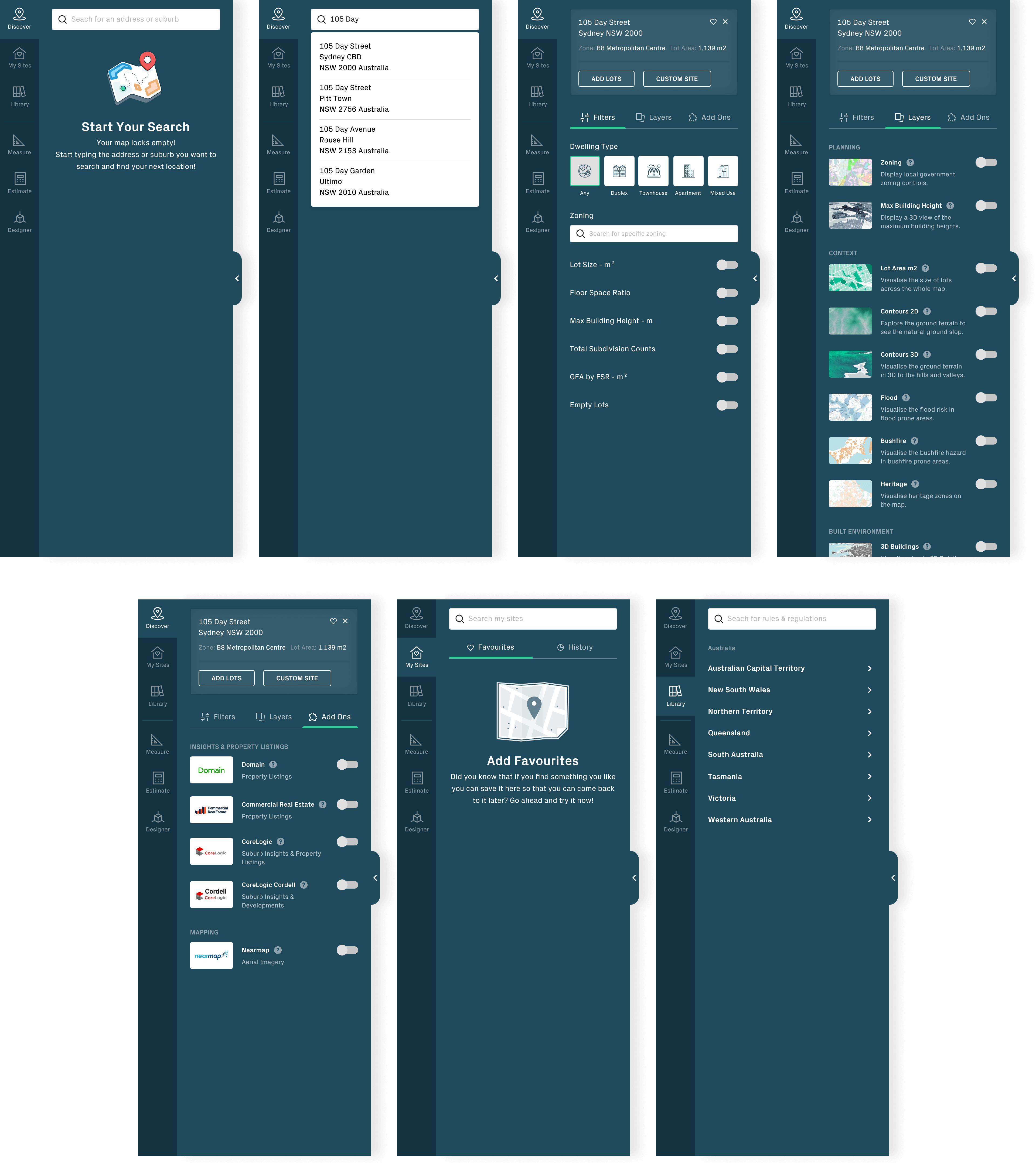
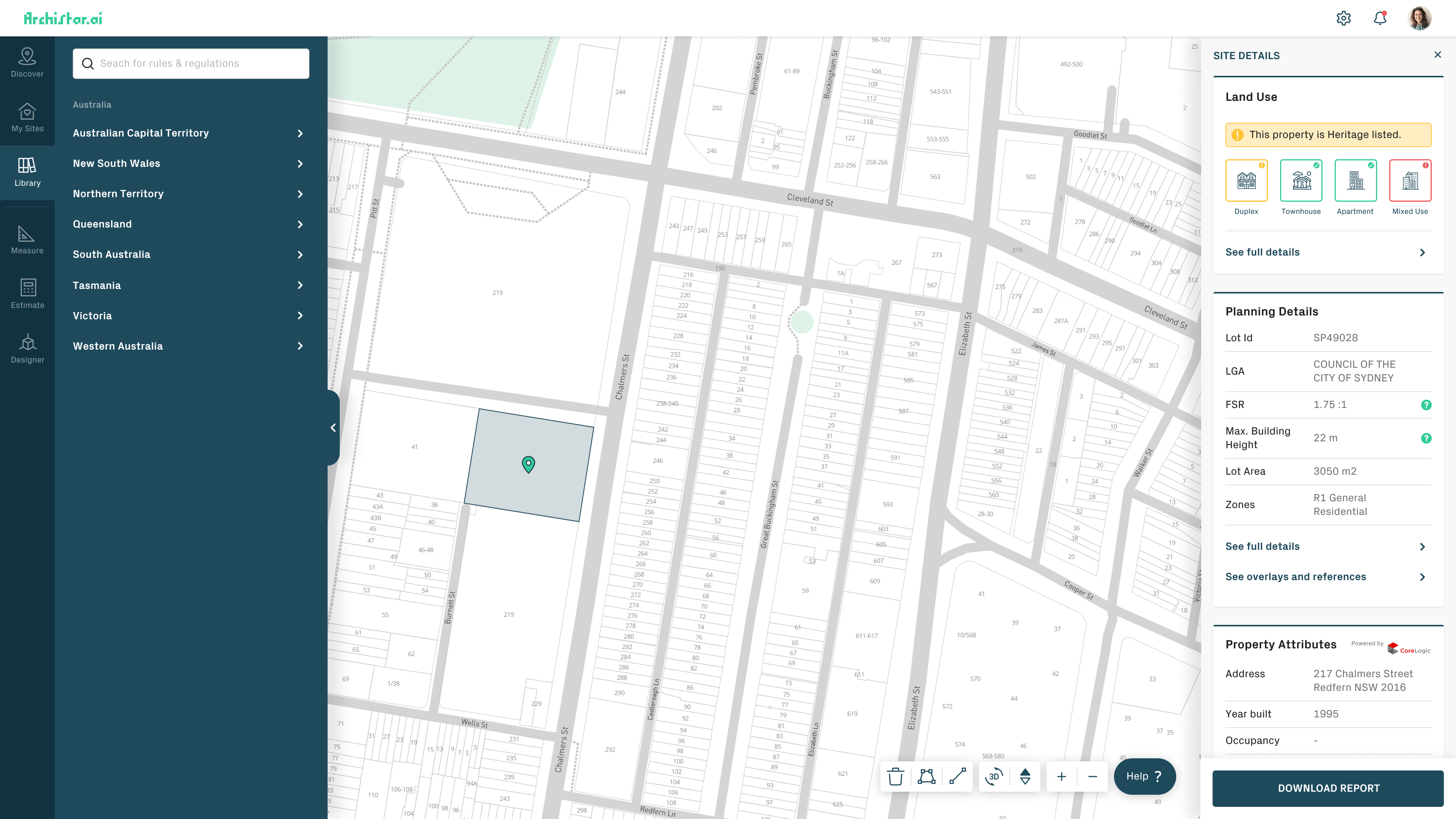
The Outcome was a combination of a few things, I simplified a whole bunch of the architecture based on the above research and brainstorming and implemented a few best practice UX methods around the UI, combined that with a centralised help widget, grouping Search and Filter with all its related elements and grouping tools together and handholding the user through their first experience of each use-case through pop-up tutorials, I believe this would be a more satisfying experience for the end-user.

16
UI Design
Top Navigation
I separated this to the top as this widget should exist on every state of this application as it is a global component, its purpose is to carry:
Logo: Its purpose is mostly branding and possible link back to the homepage.
Settings: Its purpose is to allow users to access most vital settings, like their information, security, payment and more.
Notifications: its purpose is to communicate with the user via notifications about features, system notifications, help tools, reminders, messages and more.
Profile: Its purpose is to allow users to access things like settings, refer a friend, share or logout of the system.

17
UI Design
Side Navigation
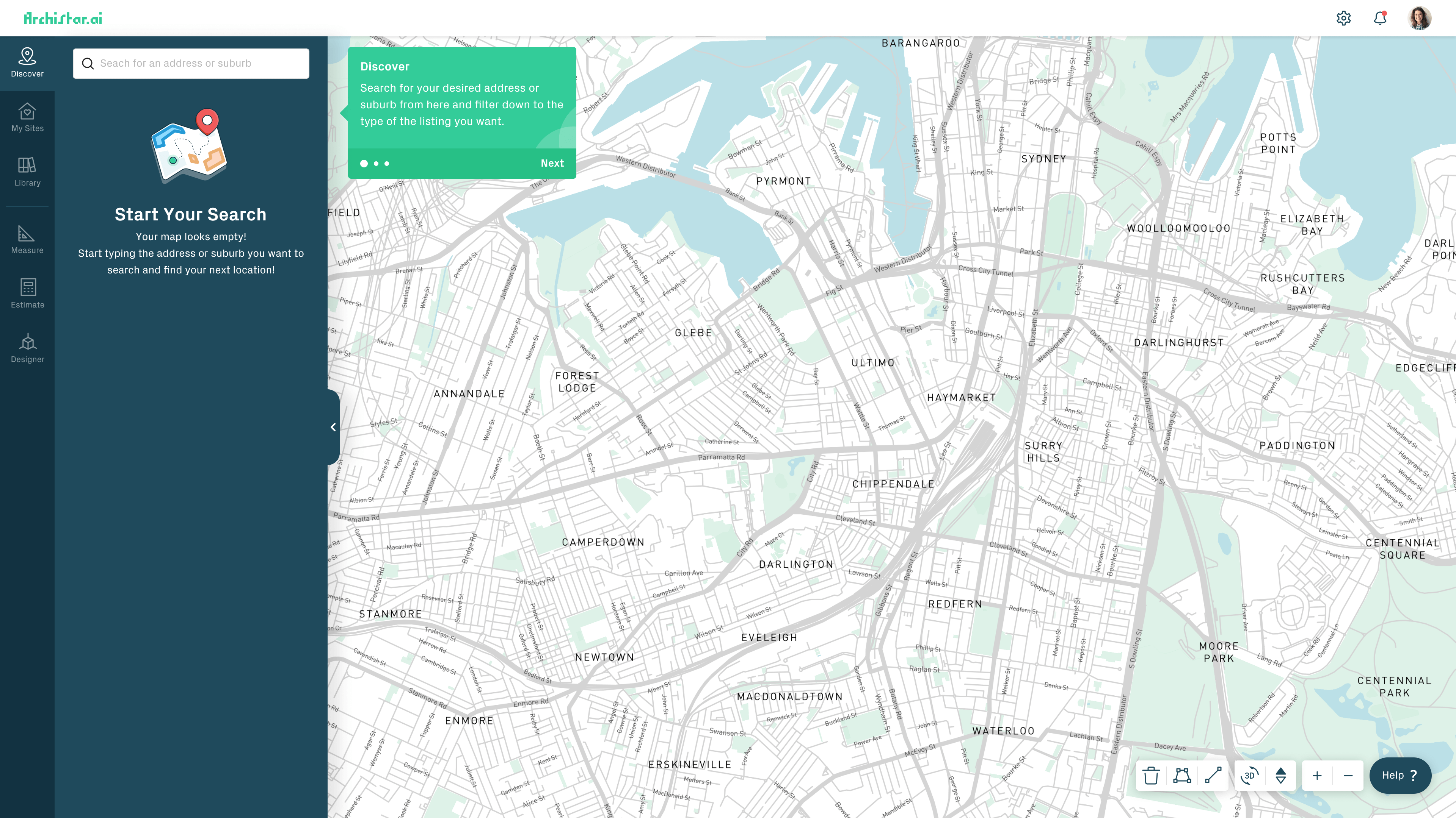
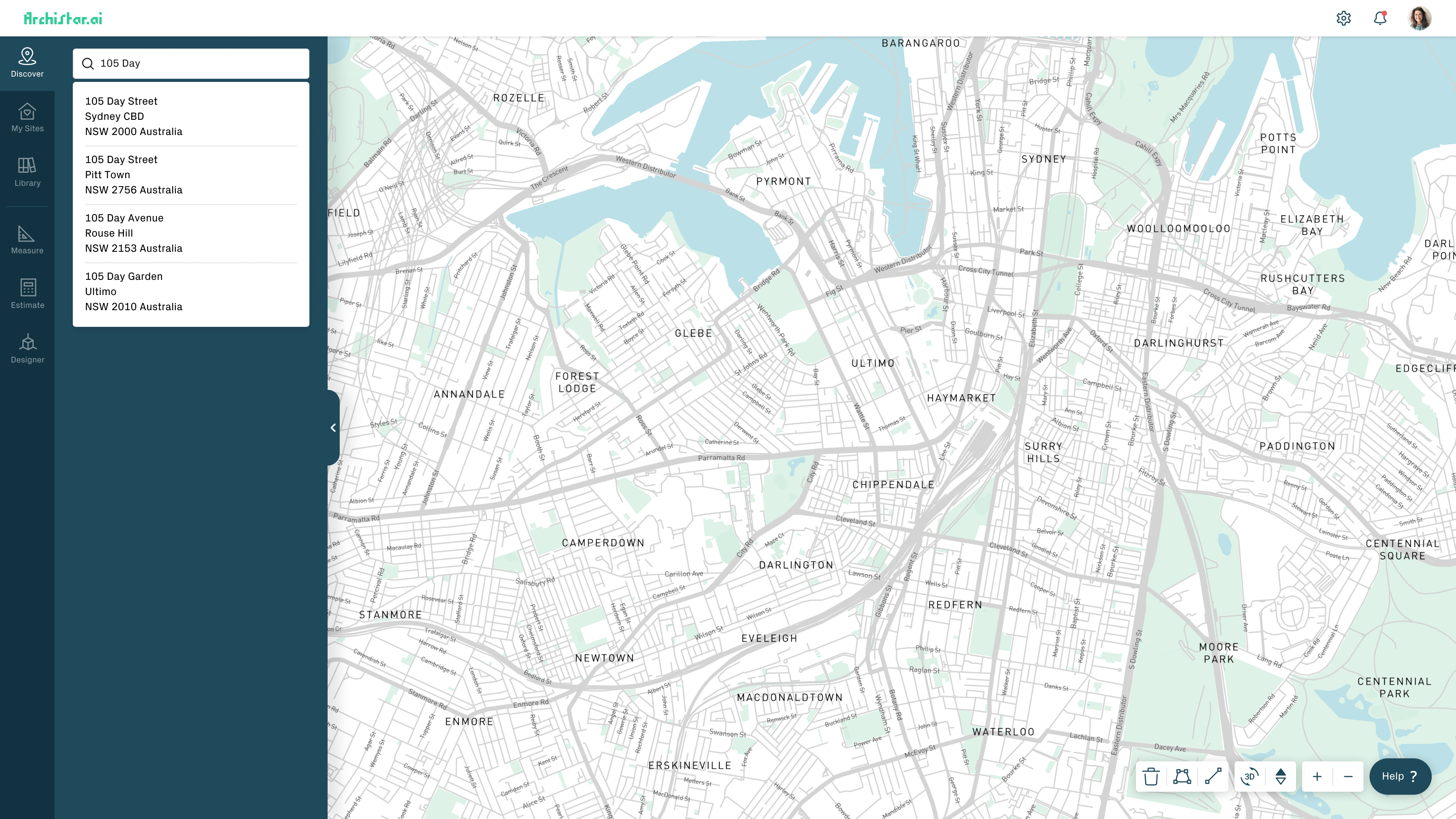
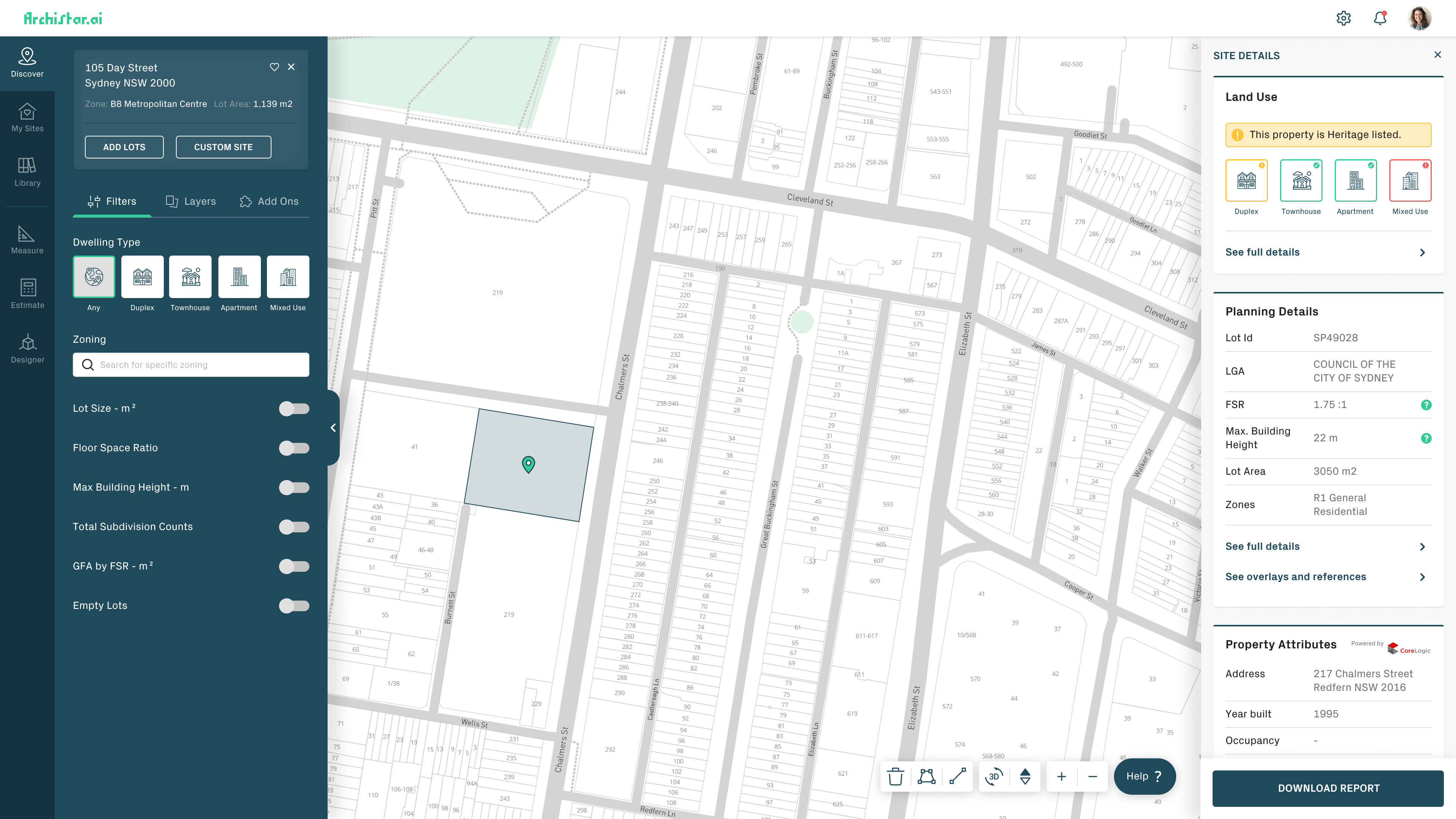
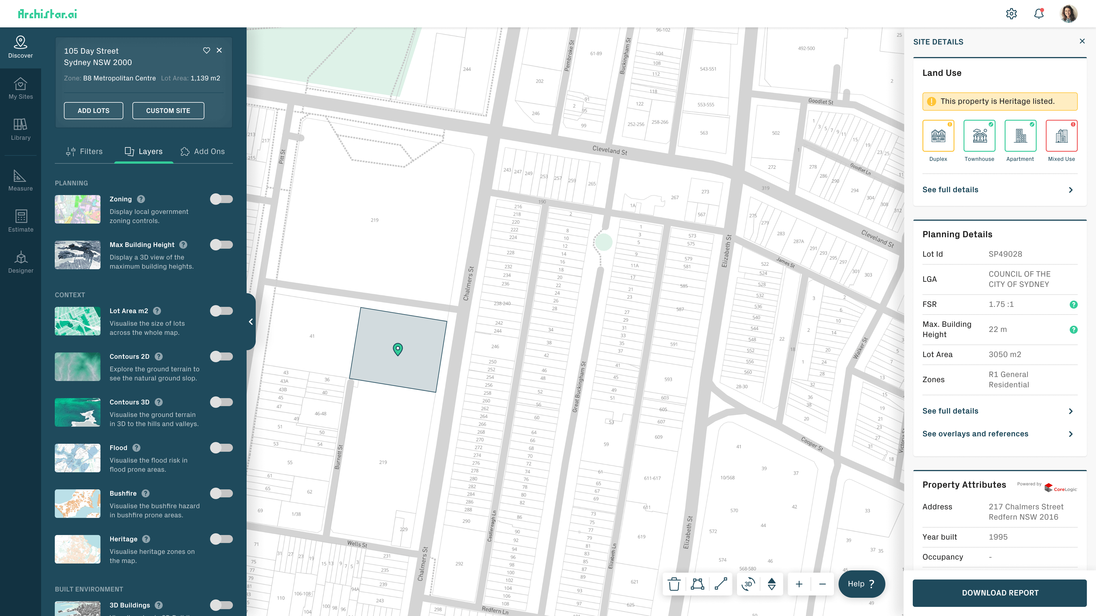
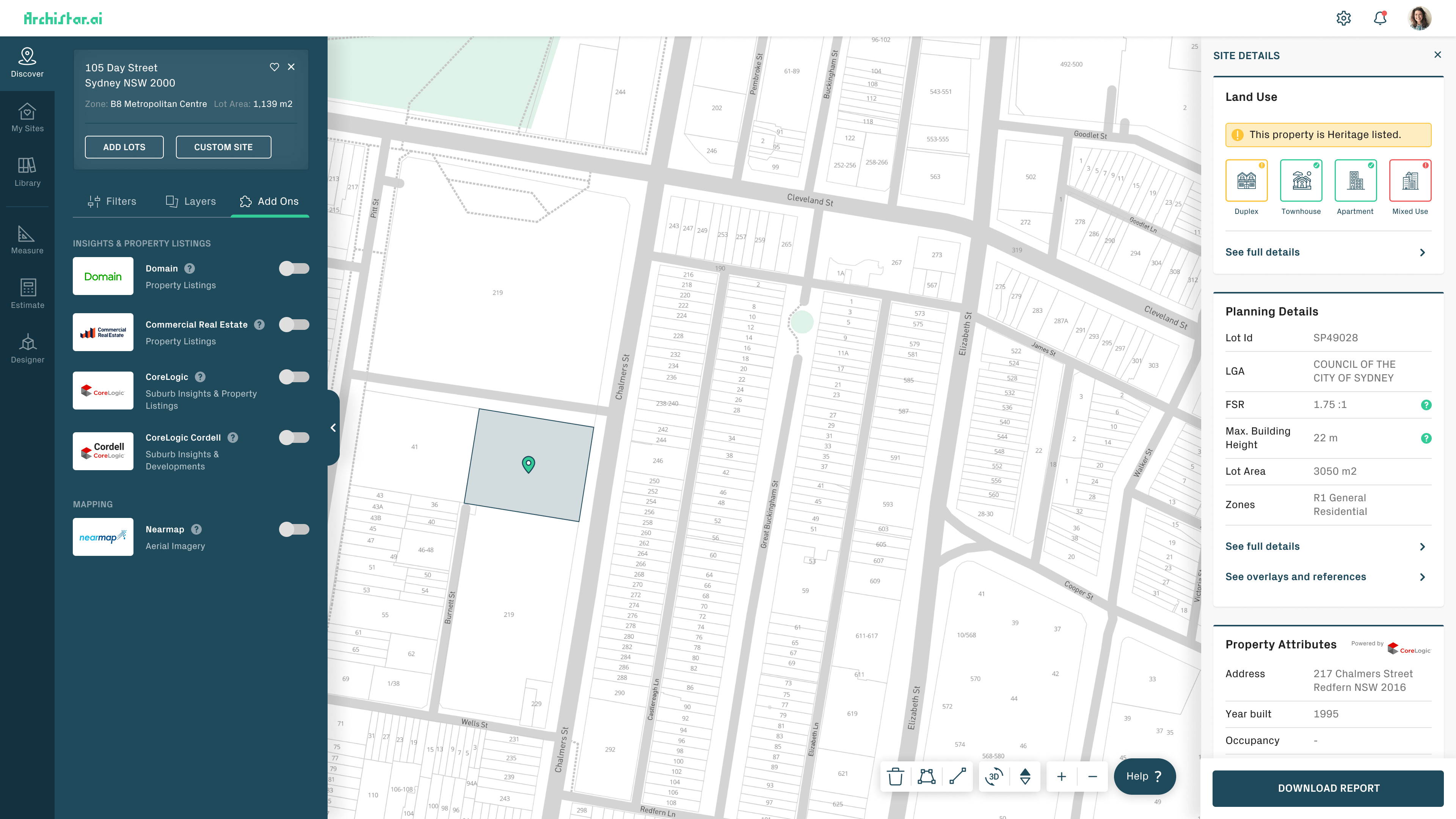
I simplified the architecture here as the current flow for the user felt off and it jumped around too much. I grouped the nav into 2 sections, Search and Tools. Each section has its own dedicated search to search specifically through that area. I also unified the colours from that gradient to address accessibility issues and to create more focus on the UI.
Discover: I noticed that Search, filter, layers and add-ons are all separated, the problem here is that they all work together and instead of jumping around and letting the user just discover them randomly, by placing them all in one place the user can dig deeper and deeper into the platform as they need to and discover them more naturally.
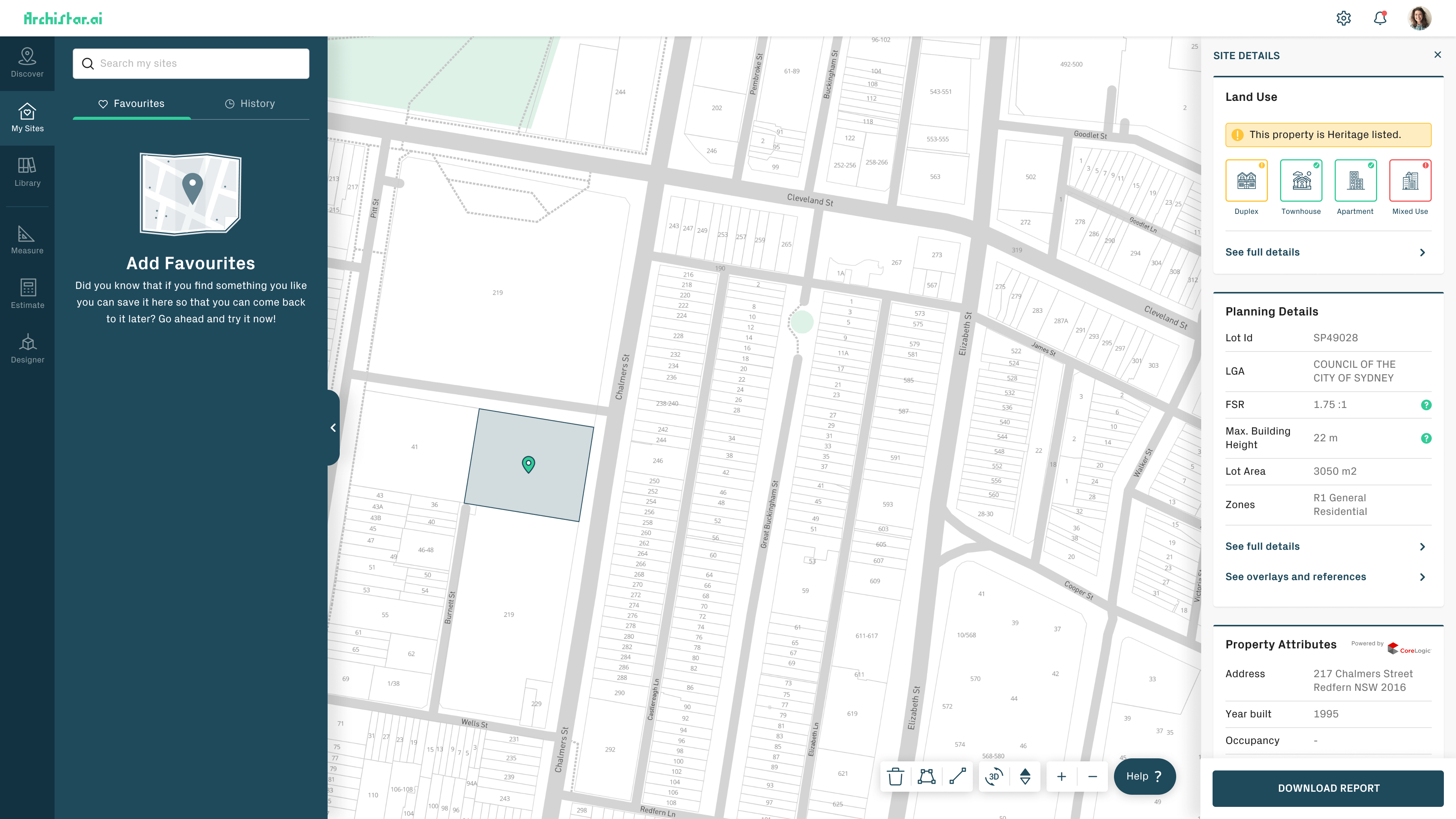
My Sites: Placed this one under discover as the idea is to encourage users to come here to view their history or saved items.
Library: Added search capabilities here too and this is still related to search and discovery, so I left this section here as a backup method in order to search for specific things.
18
UI Design
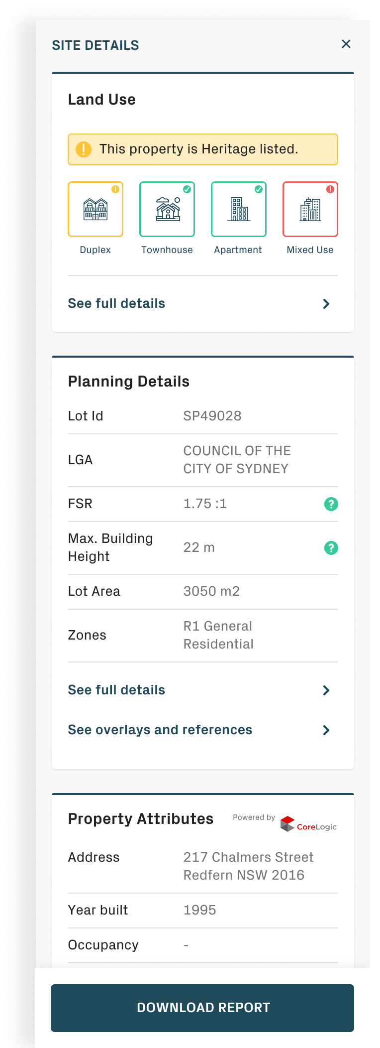
Details
Details simply slide in from the right-hand side now in order to create more focus on the area, separating it out from the navigation as well, as details are not a part of the navigation, this way the user can filter or layer or do more to the platform but at the same time access this details sections without jumping back and forth.
19
UI Design
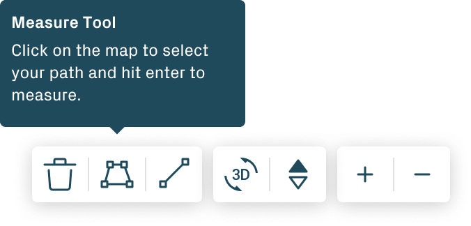
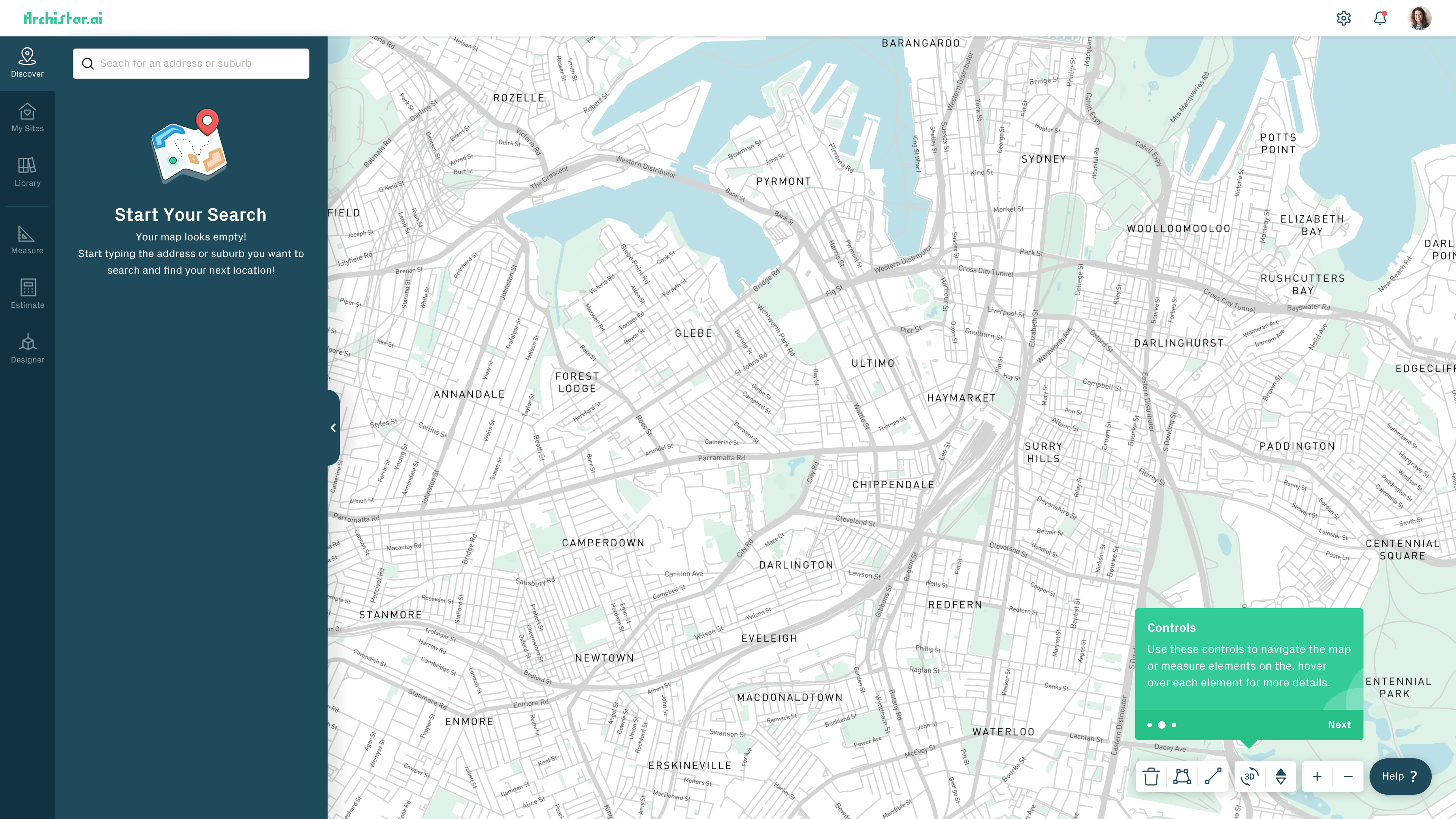
Toolbar
I simplified the toolbar, added bigger icons, made them run horizontally to allow better focus for the new details widget and added tooltips on hover in order to guide users around what each of these buttons will do.
20
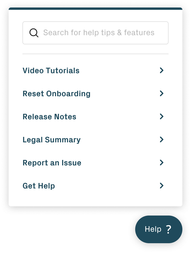
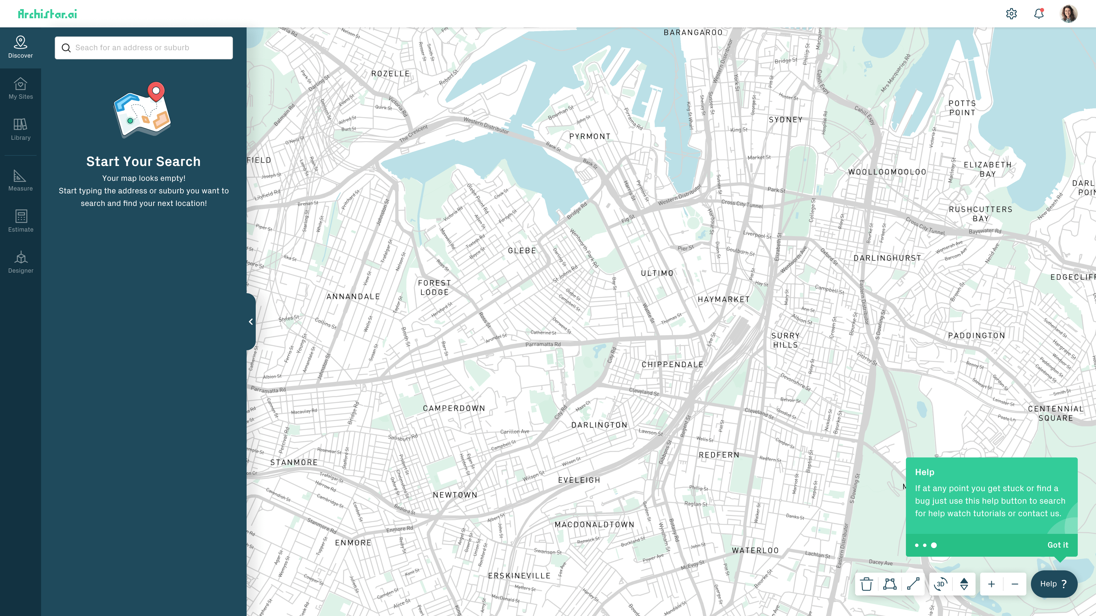
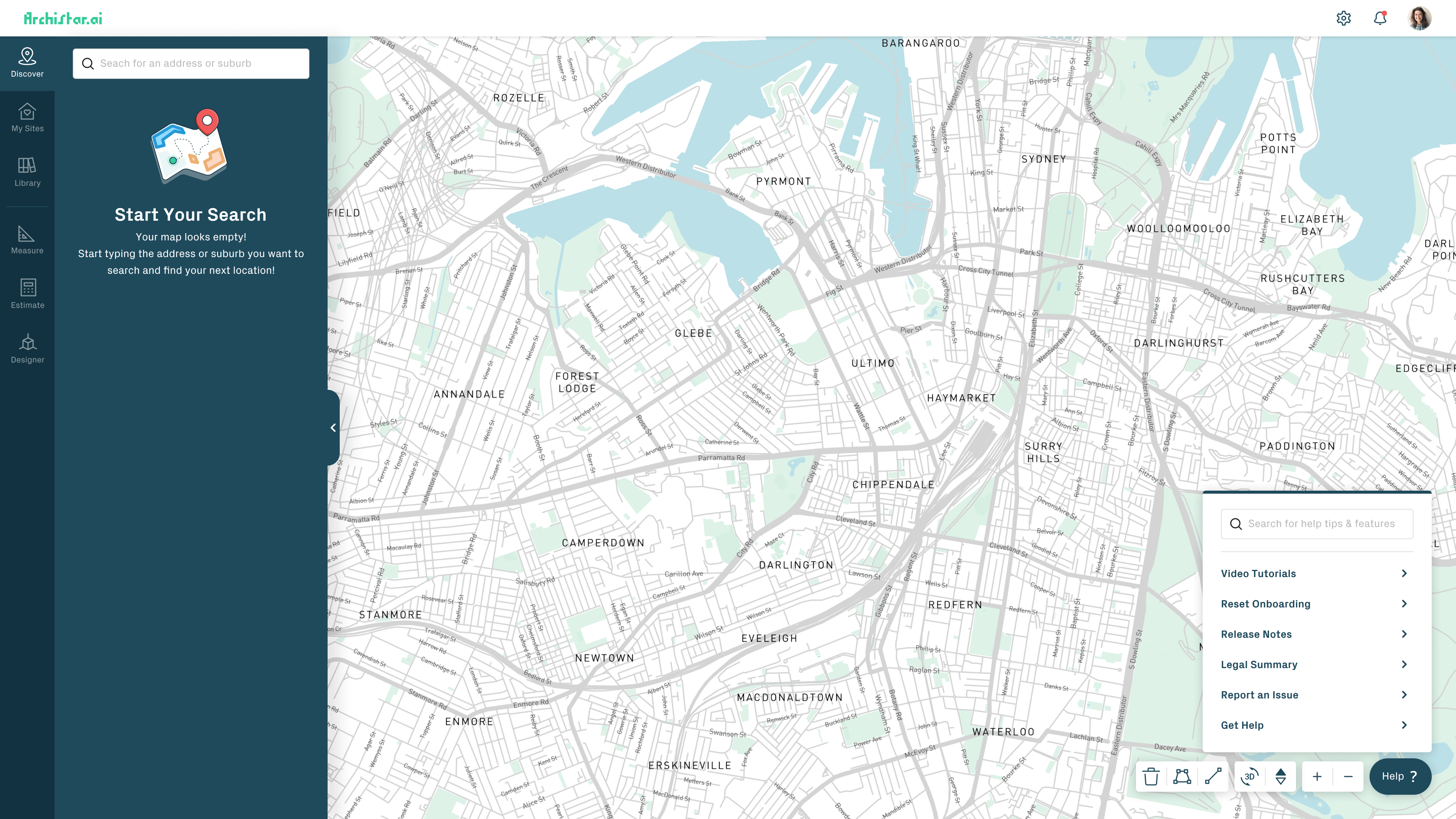
UI Design
Help Widget
The idea of this help widget is to provide as much help as possible for the user without them needing to contact support, this way they can search before calling to sort their issues, this is a forever evolving widget to adapt towards the user’s needs.
21
UI Design
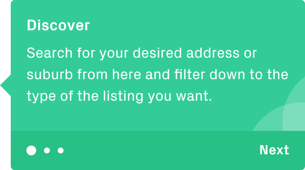
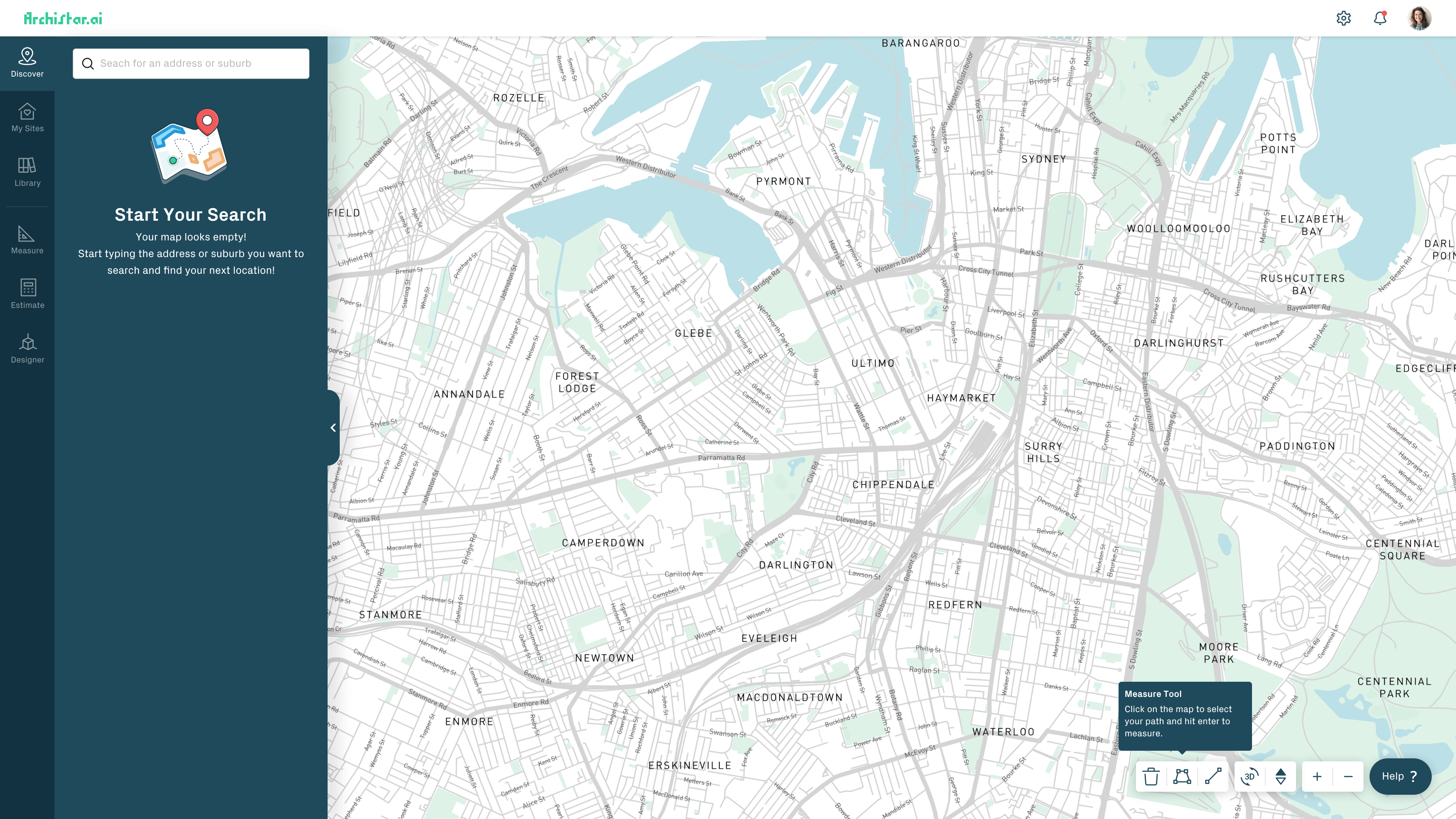
Tutorials
The idea behind this is to be able to handhold the users through their first time experience of using more complex features of this app without it being jarring. Users can skip this if they want to.
22
UI Design
Putting it all together
The final result would be a typical experience of a first time user, bringing what they might want to use upfront, a walkthrough when they see something new, being able to access help when they need it.
22
The End
Up Next
Wow! Time really does fly when you’re having fun. I’m afraid this case study is just about over. But I’ve prepared a few more for you so there’s no need to panic (yet).