Flight Booking
Qantas Mobile Experience
Qantas Airways is the flag carrier of Australia and its largest airline by fleet size, international flights and international destinations. It is the third oldest airline in the world, after KLM and Avianca having been founded in November 1920; it began international passenger flights in May 1935.
01
Overview
About the Project
Re-design the most important section of the qantas.com homepage. From the header, to the top of (and not including) the latest flight deals.
The current Qantas site has a very different Desktop experience to mobile, on mobile I feel quite a bit lost as to what the next steps are, anything that I wish to do on this site would be a 2 step process… Check for flights, click into it, check-in, click into and so on and so forth, ideally a better mobile experience would encourage me to use my mobile phone more often to book on the go, let’s see if we can fix this.

02
Objectives
Identifying the Problem
The current site as mentioned above looks really boring and a bit lost in terms of its goal and direction. As a user I really don’t feel inspired to do much, on top of that there’s no clarity on what the next step for me as a user is (lack of visual hierarchy). It’s almost like, hey here’s a bunch links, why don’t you figure out what to do. Let’s also look at it on different phone devices.
03
Research
The Challenge
Keep important elements above the fold at initial landing on mobile and good visual hierarchy. generally I would start designing for 320px width since generally speaking that is the smallest mobile size most people have nowadays, however cause of lack of time I will be starting on an iphone x size 375px, it is what I have and it is what I will be displaying this design on later.

04
Research
Competitors
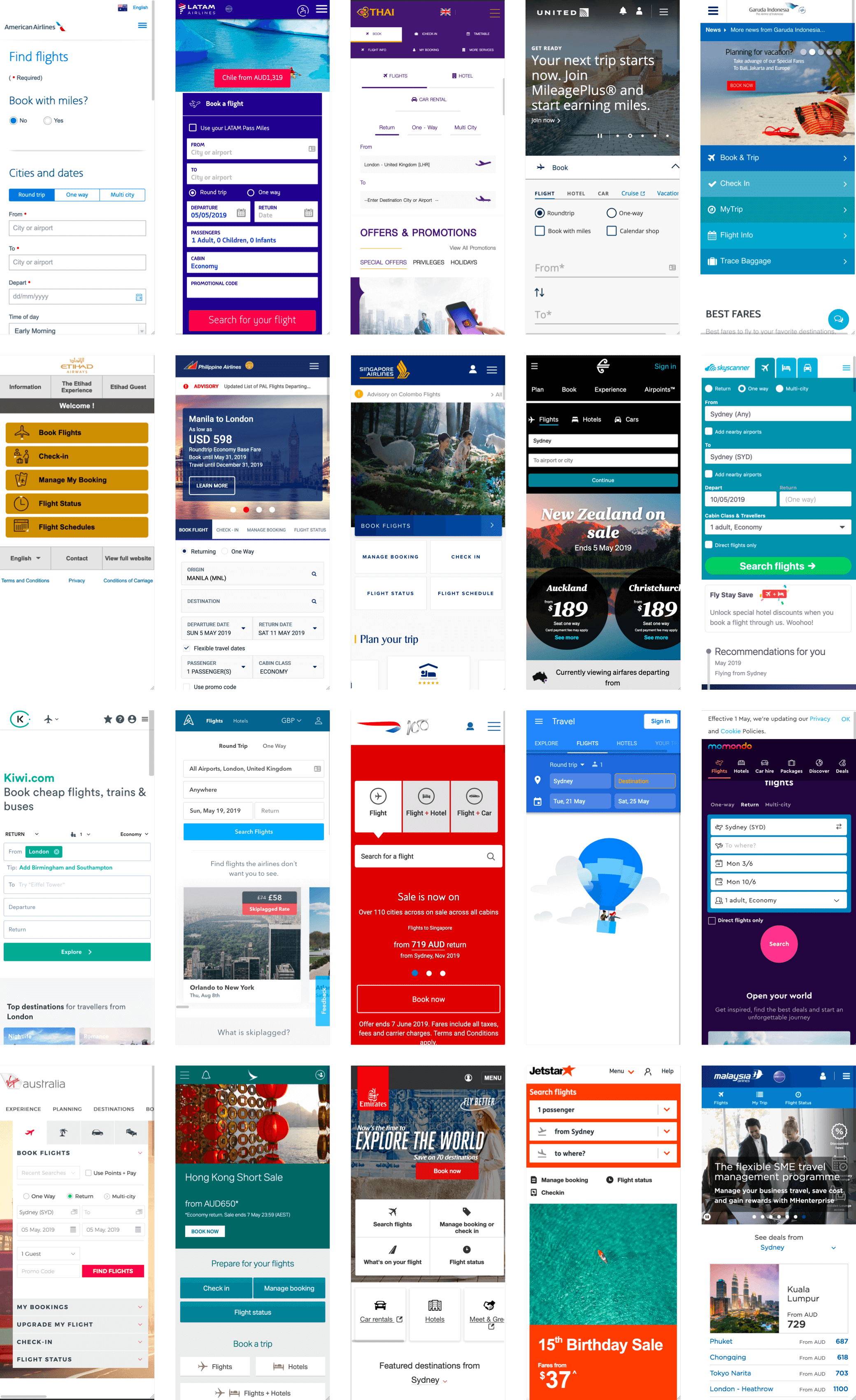
My hypothesis for a good mobile experience for flight booking sites seems to have been right, looking at other people’s sites the main element they push users to is booking and they also place other elements like manage bookings, user account etc above fold as well, even when booking is front and center they have some sort of a visual hierarchy to identify different links, making them easier to read.
05
Product Development
Concepting Ideas
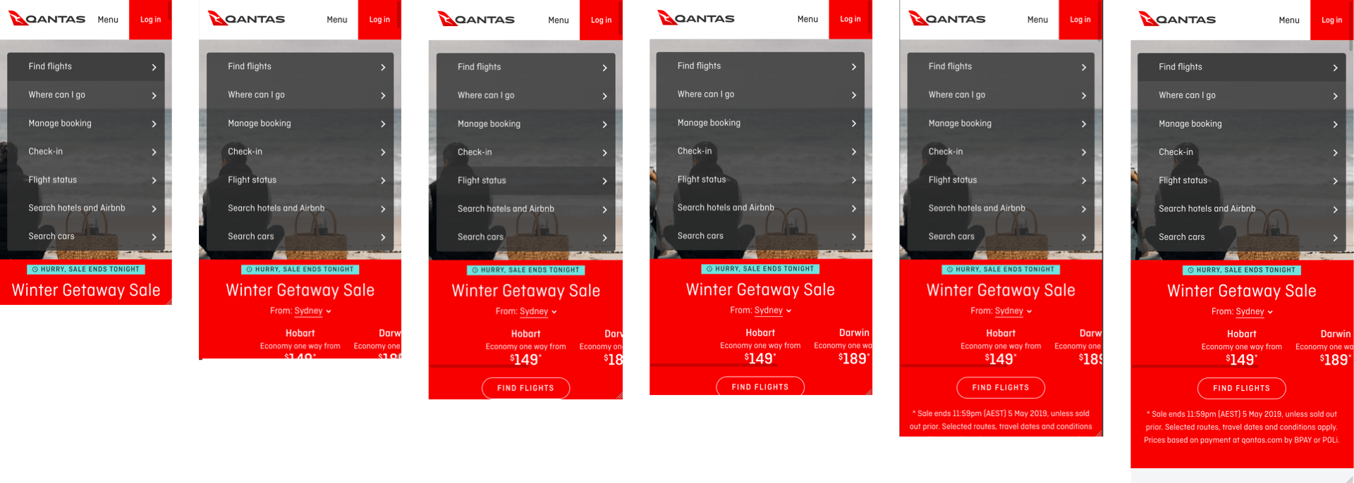
Pulling out the important elements from the desktop site would be a tough thing without data, it does help to create an initial conversation around what could be possible though so let’s have a look at the current desktop vs mobile experience.

06
Product Development
Information Architecture
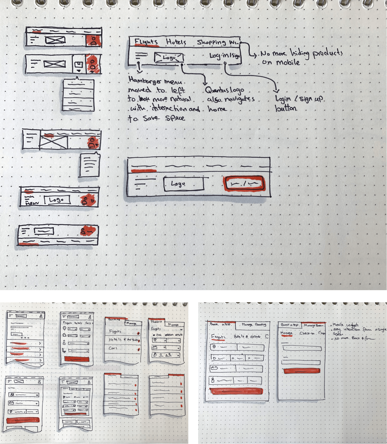
With this exercise I wanted to figure out what elements I want to group together based on a way that it makes sense to use the site on mobile and hopefully this will shape my menu and the booking/check-in widget below.

07
Product Development
Concept Sketch
Sketches are fast, cheap and easy, I can also produce quite a bit of them in a short period of time to test out different approaches. We can also look at what elements we want to push out more. This could get changed based on how the final design looks.
08
Product Development
The Product
From the sketches I formed an idea of what I wanted from this, so let’s see if it is going to work as the final product. But let’s first define all the visual elements that we need.

09
Design System
Style Guides
Qantas is already an established brand so I’ll be grabbing most elements from what I can find on the site, however some things I might change if I feel they might look better otherwise.

10
Design System
Typography
Qantas’ brand also provides a pretty good and up to date typography, so let’s use it.

11
Design System
Color Palette
Qantas also has an established colour palette that you can find on their site. This only took a bit of digging on their site to figure out.

12
Ui Design
Outcome
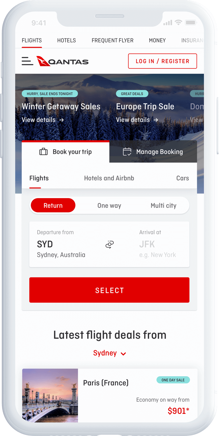
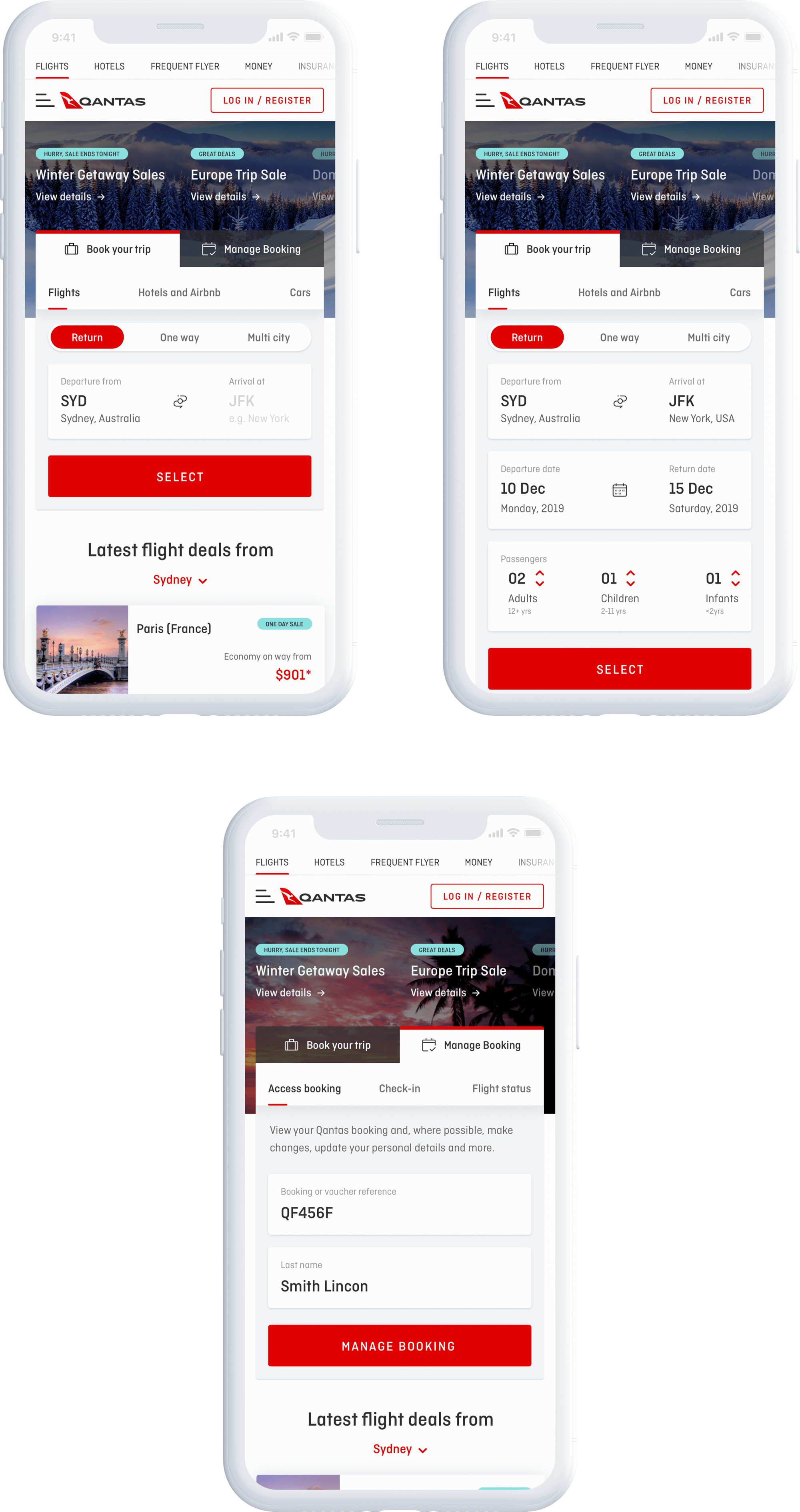
The outcome is this mobile first approach. The idea/hypothesis here is that users want access everything that can access on the desktop site they can on mobile too.

13
Ui Design
Mobile First
The final result is what you see below, the idea here was to implement what I’ve explained above and also to try to have the important CTAs above the fold as you see here.
15
The End
Up Next
Wow! Time really does fly when you’re having fun. I’m afraid this case study is just about over. But I’ve prepared a few more for you so there’s no need to panic (yet).